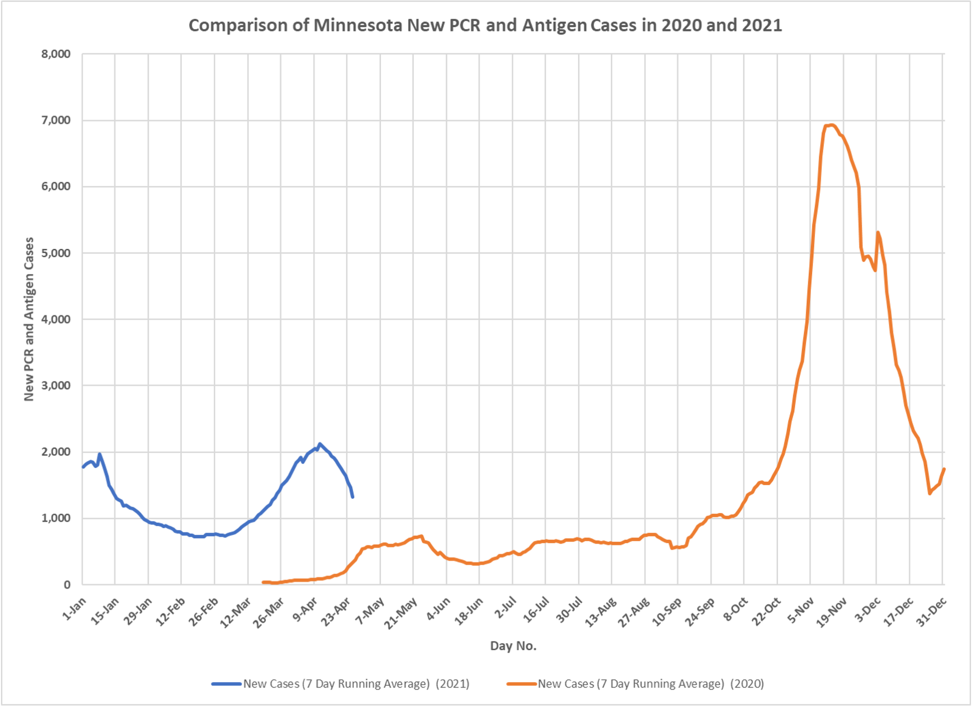
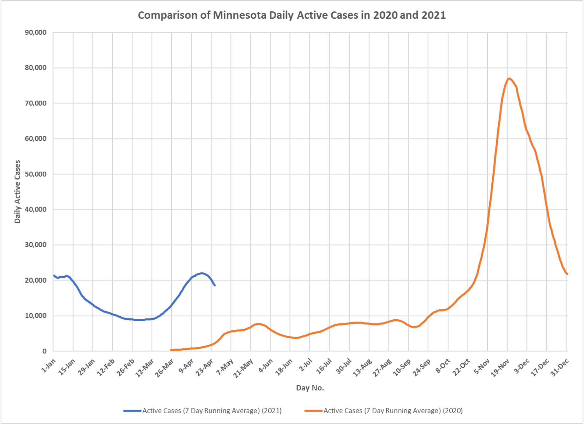
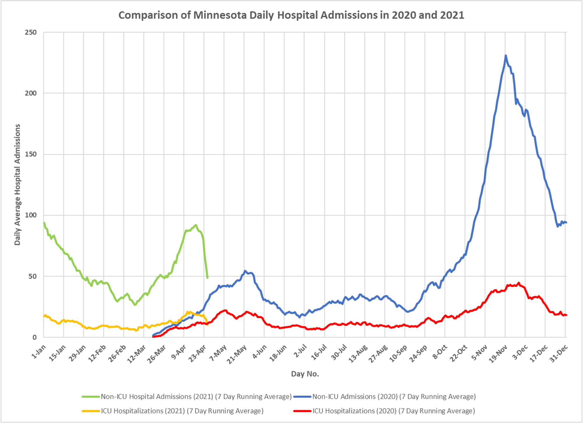
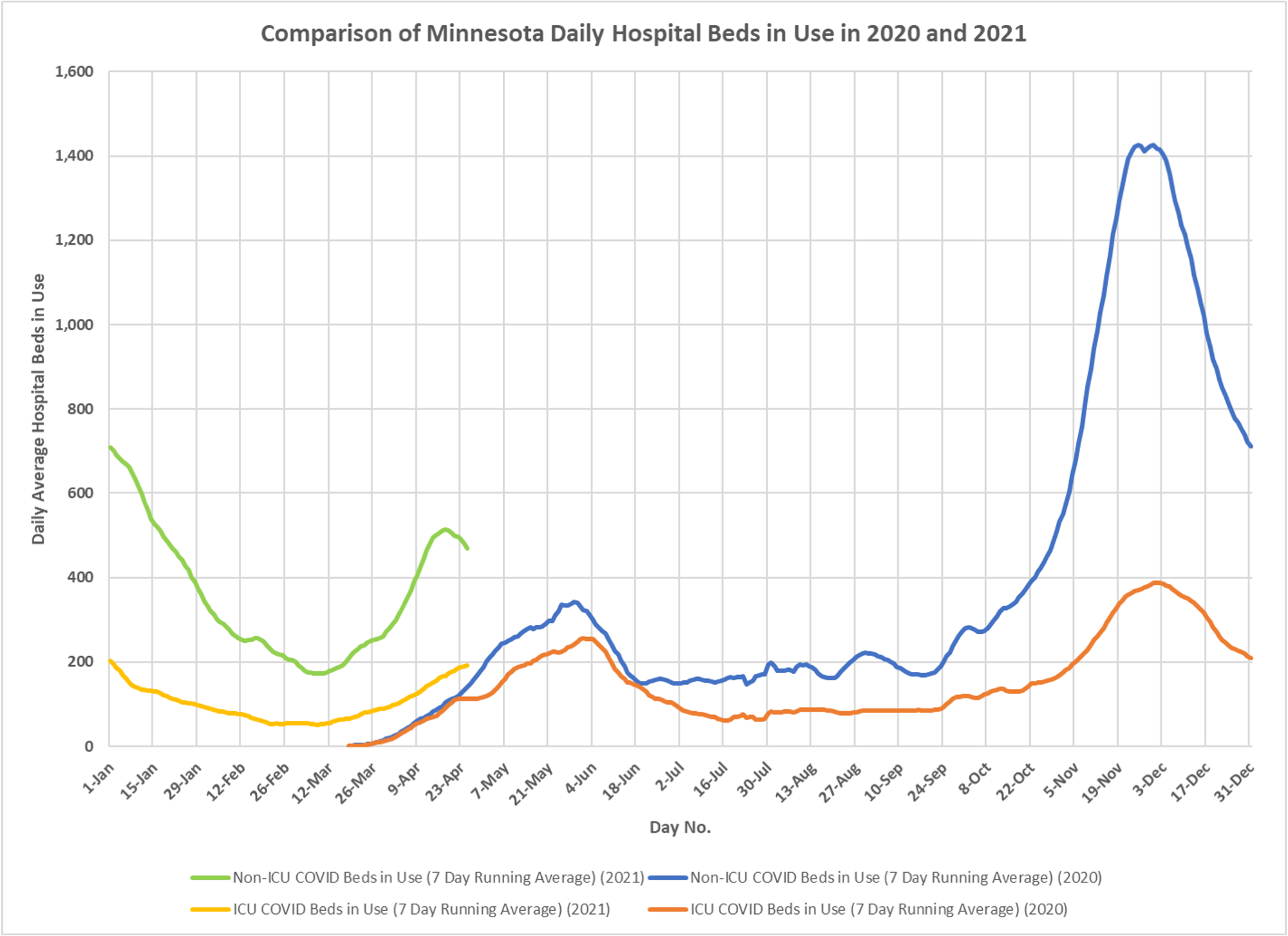
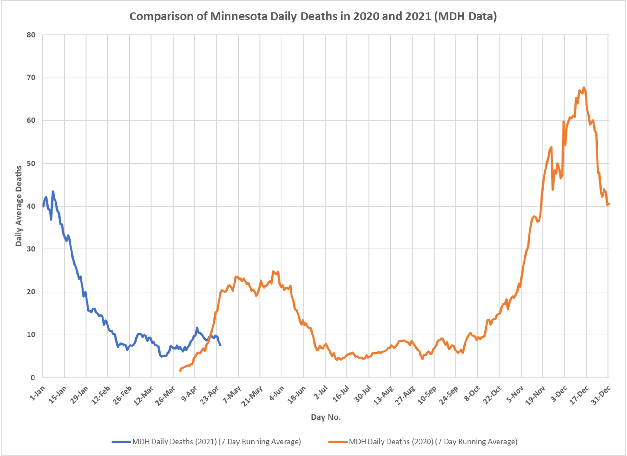
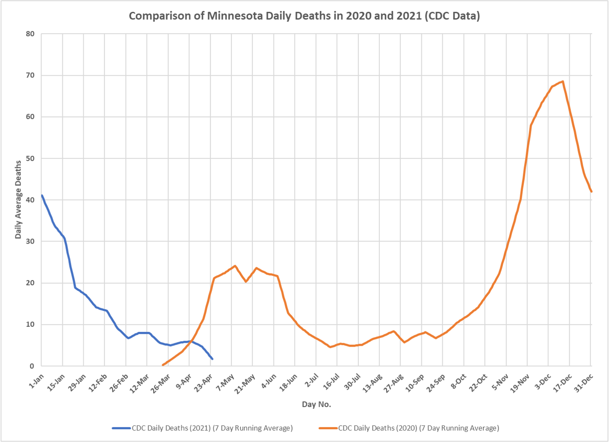
Interesting to look at these. Please note that the wave looks like it started a few weeks earlier this year, which could be the timing of CV-19 introductions last year, but also could be that the optimal transmission conditions got going earlier in 2021. Testing is dramatically different so really hard to say much. Effect of vaccination is seen powerfully in deaths. We are close to 75% plus of the elderly being vaccinated and it is working in regard to the seriousness of illness. Thanks to DD, just a fantastic effort doing all these charts.