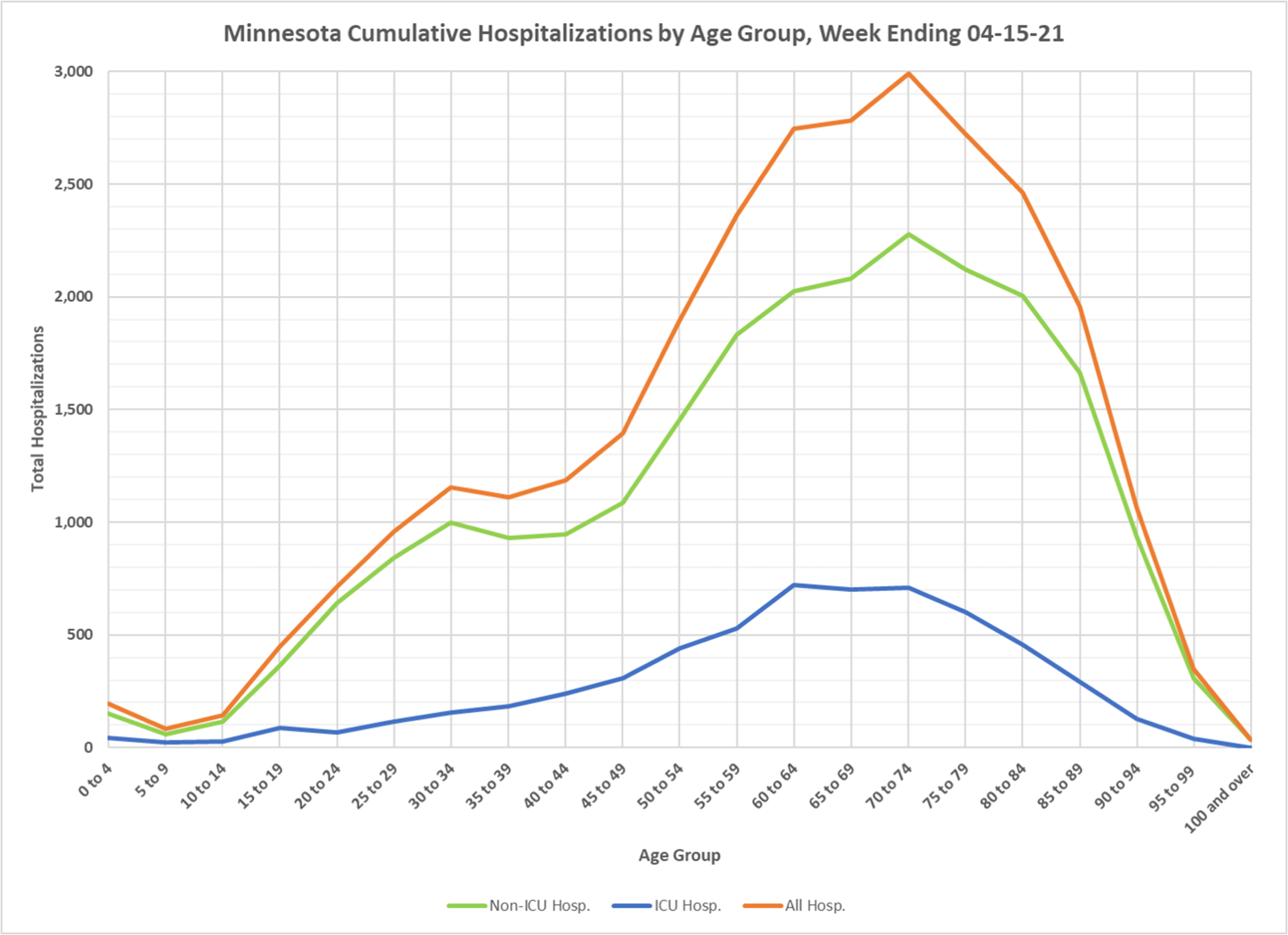
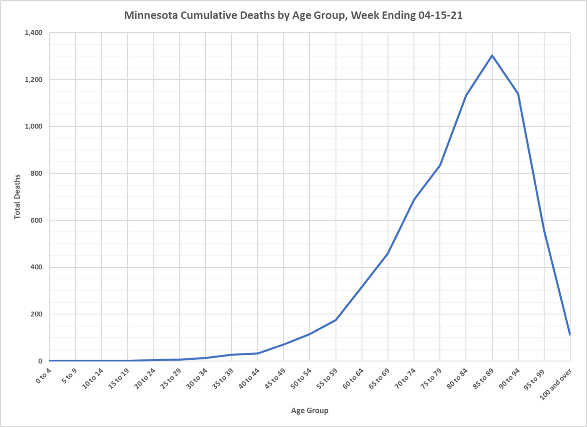
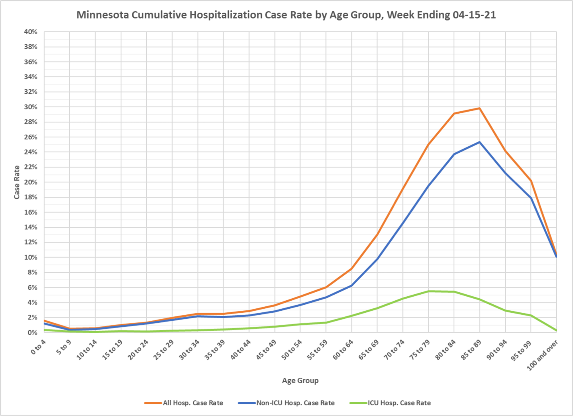
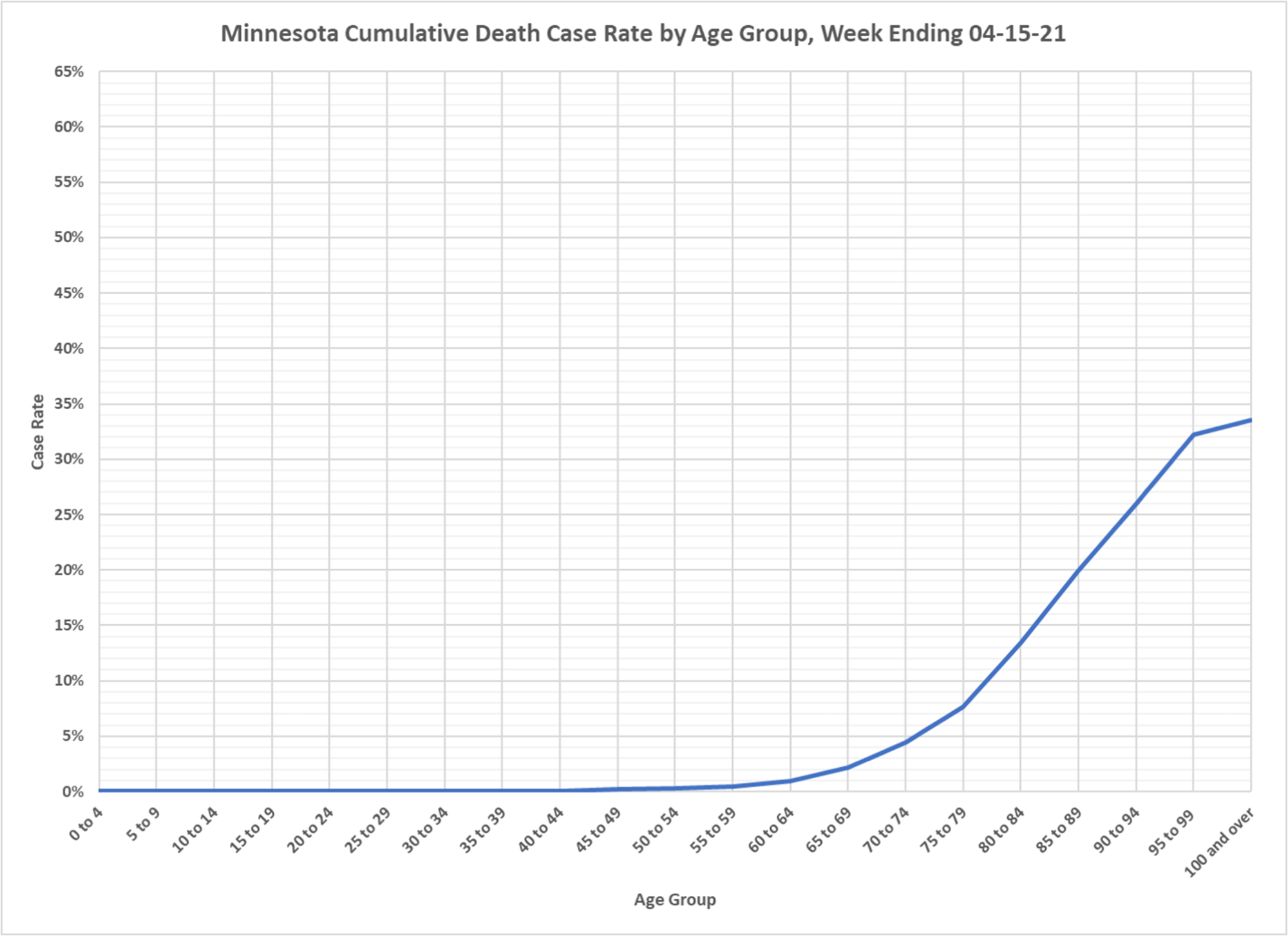
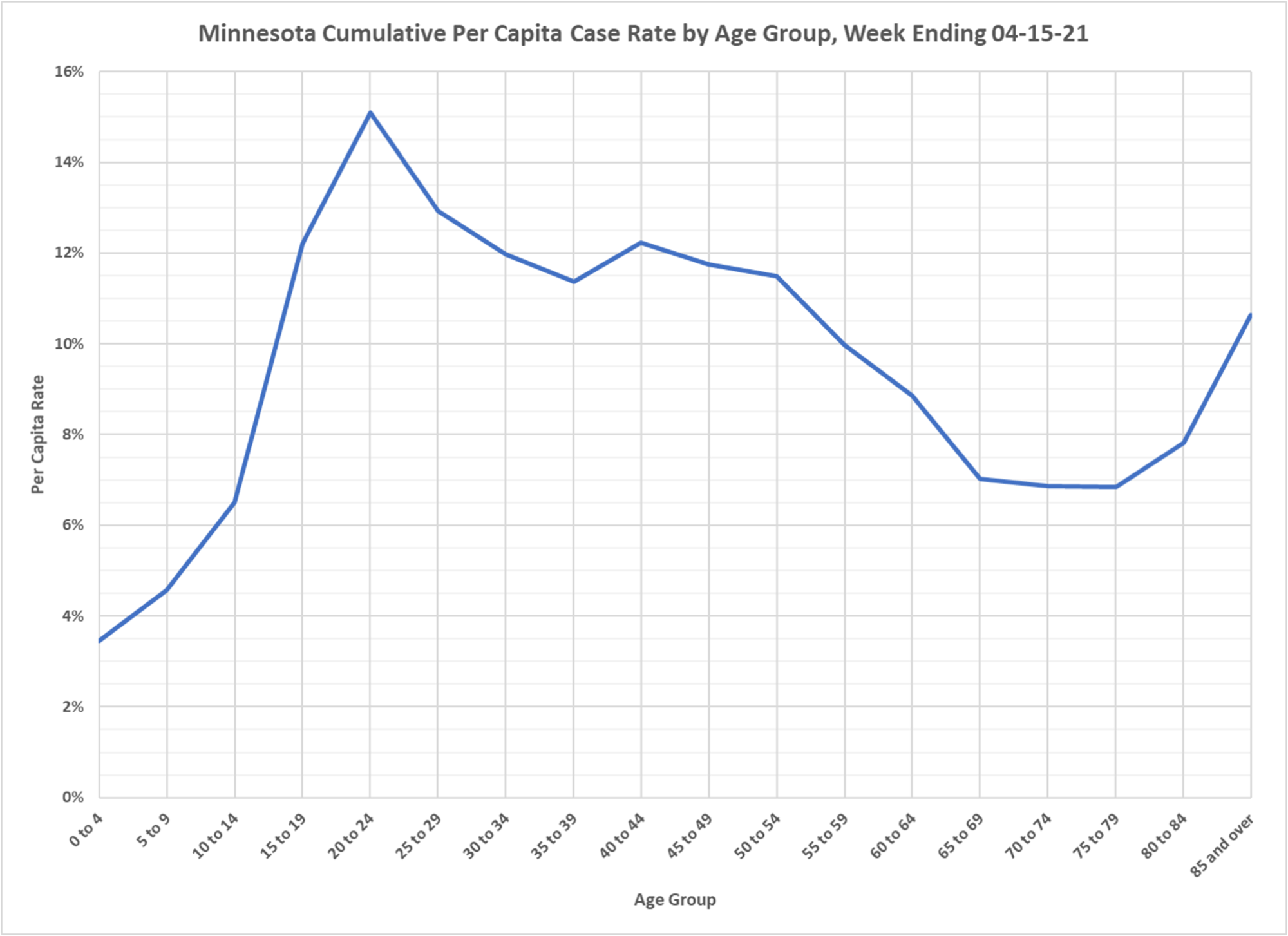
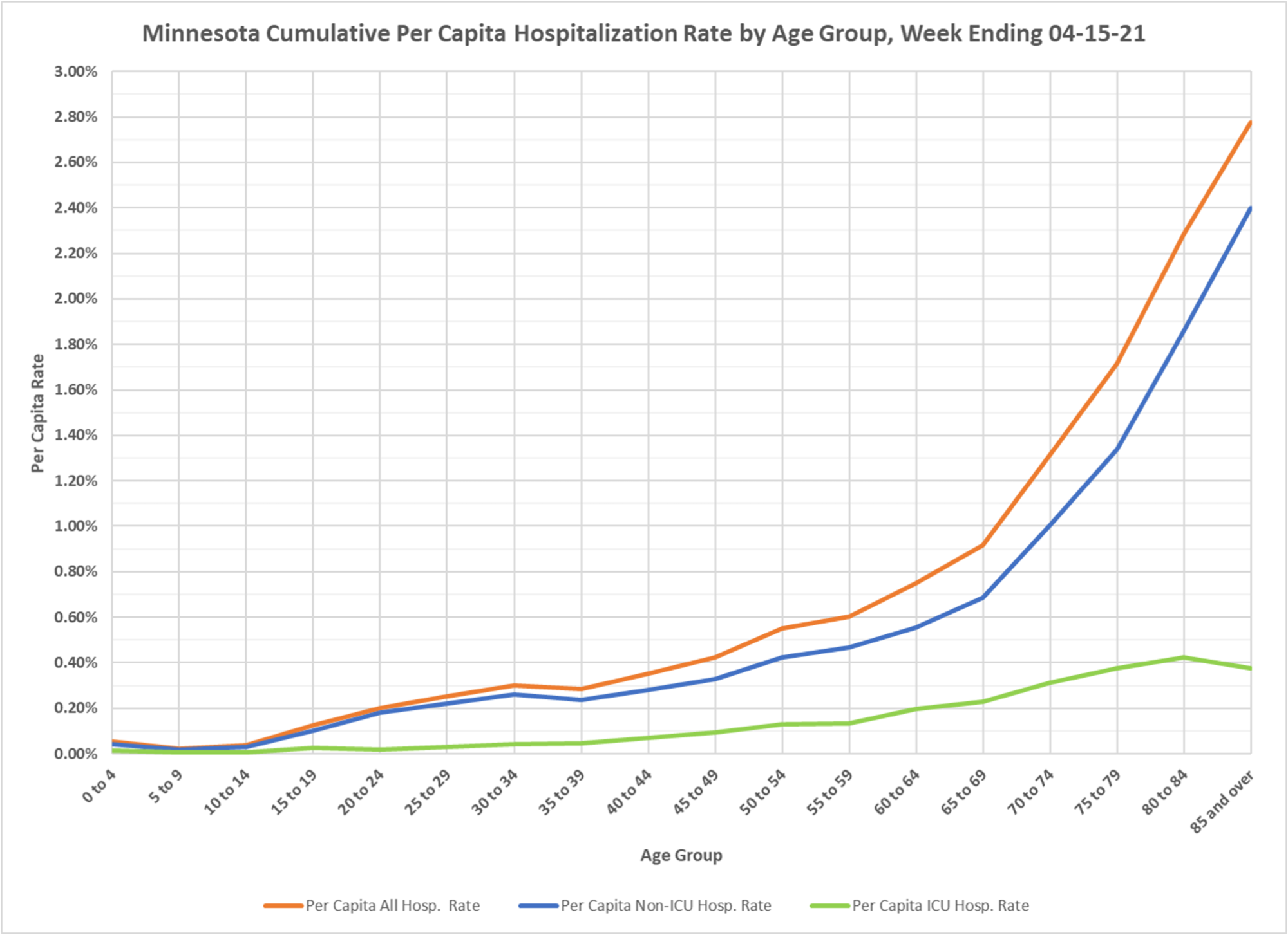
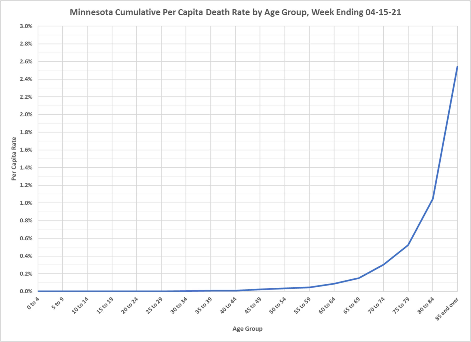
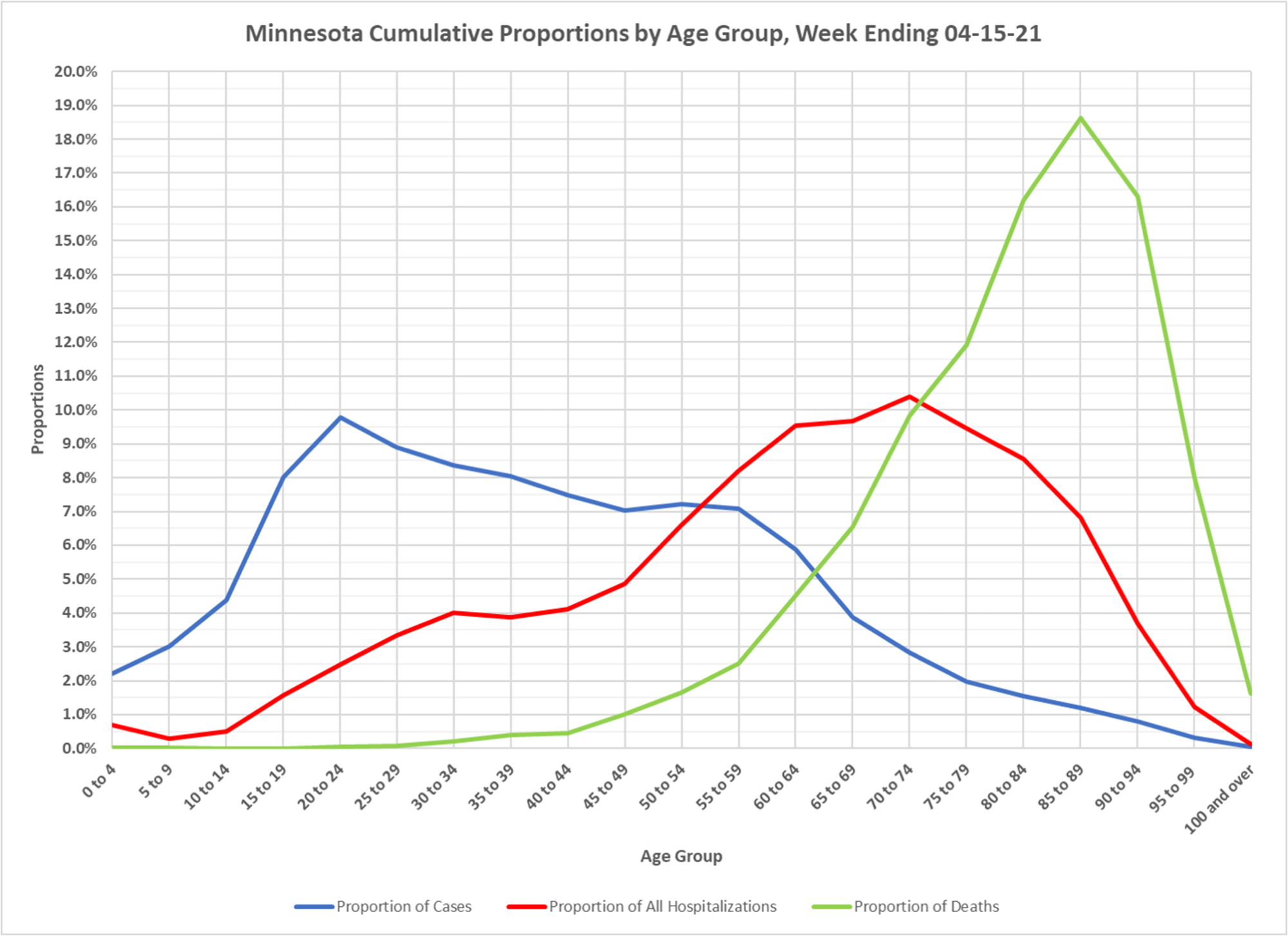
Haven’t seen these for a while. You can see how hospitalizations and deaths across the whole course of the epidemic have been heavily weighted toward the elderly. If you look at the current slides, you see this beginning to change, but when the population is heavily vaccinated across all ages, the remaining cases and outcomes will end with the same weighting they had before vaccination. It is always going to be a disease of the frail elderly. Thanks to DD.

