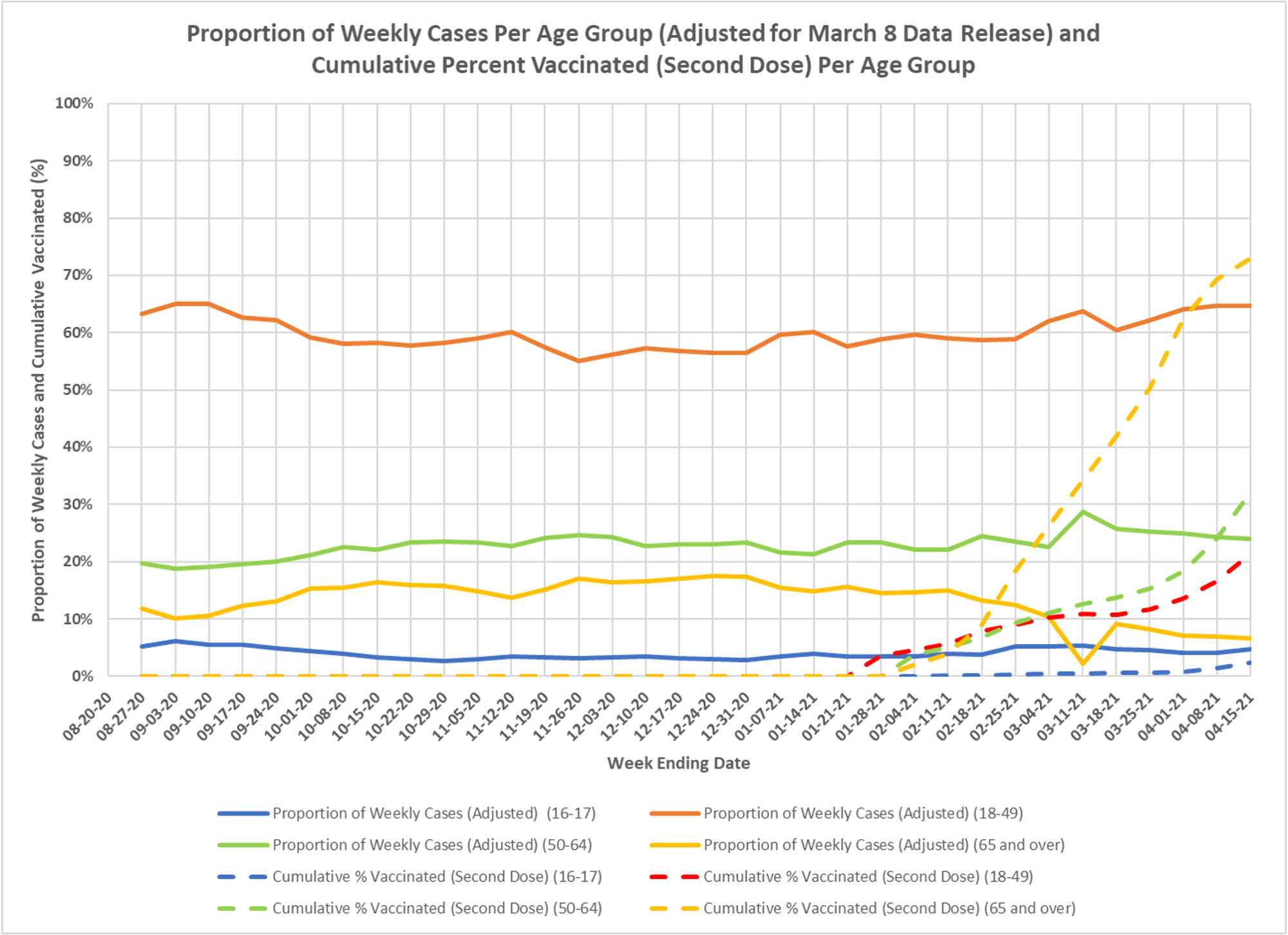
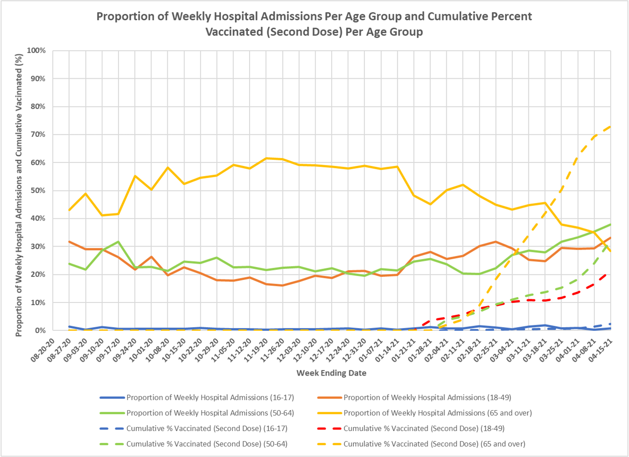
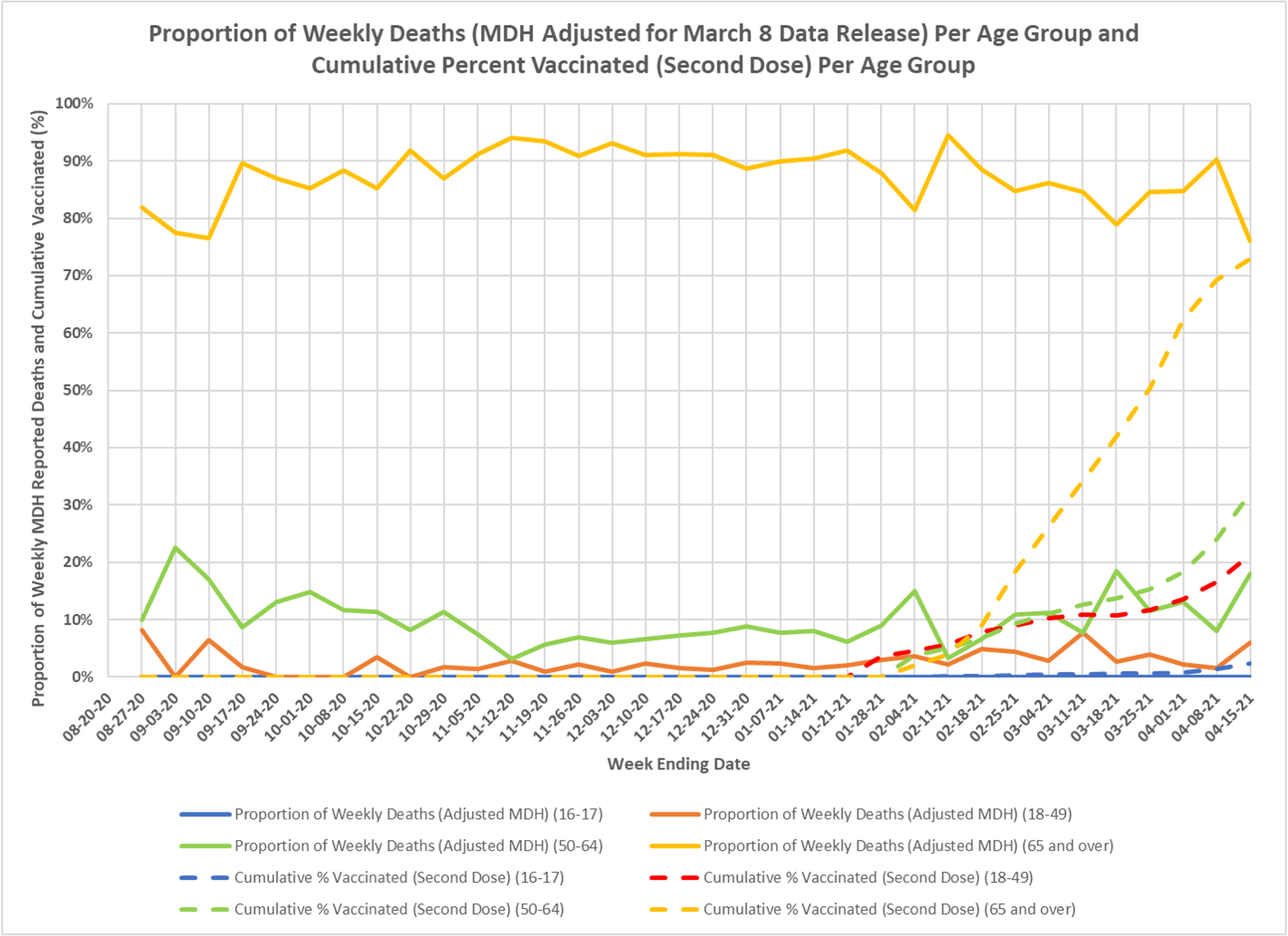
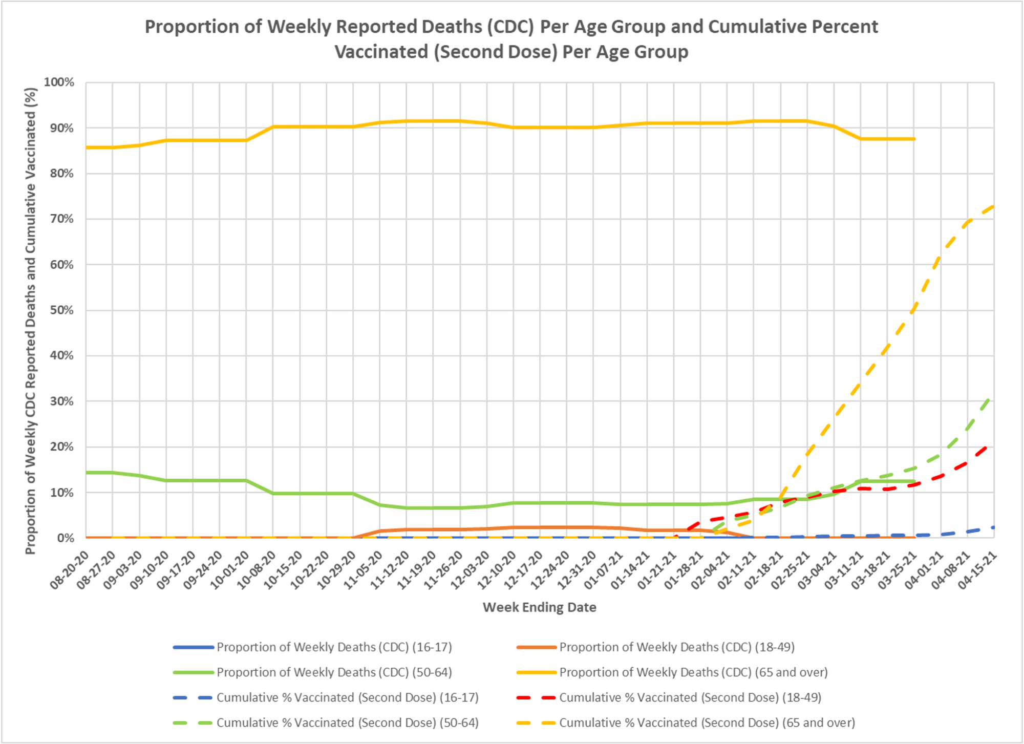
This set of charts, with the usual thanks to DD, gives the percent of all cases, deaths and hospitalizations that each age group represents, again with vaccination rates layered in. You see the older cohort declining in the proportion of cases and hospitalizations, not as much in deaths.
✅ Subscribe via Email
About this Blog
Healthy Skeptic Podcast
Research
MedPAC 2019 Report to Congress
June 18, 2019
Headlines
Tags
Access
ACO
Care Management
Chronic Disease
Comparative Effectiveness
Consumer Directed Health
Consumers
Devices
Disease Management
Drugs
EHRs
Elder Care
End-of-Life Care
FDA
Financings
Genomics
Government
Health Care Costs
Health Care Quality
Health Care Reform
Health Insurance
Health Insurance Exchange
HIT
HomeCare
Hospital
Hospital Readmissions
Legislation
M&A
Malpractice
Meaningful Use
Medicaid
Medical Care
Medicare
Medicare Advantage
Mobile
Pay For Performance
Pharmaceutical
Physicians
Providers
Regulation
Repealing Reform
Telehealth
Telemedicine
Wellness and Prevention
Workplace
Related Posts
Commentary
June 6, 2023
High Cost Patients in the US Population
A timely new report on the concentration of spending across the entire US population.
Commentary
June 5, 2023
Help, I’m Melting, I’m Melting…..Not
Antarctica is gaining ice shelf extent and ice mass, not melting and raising sea levels.
Commentary
June 5, 2023
High Cost Medical Patients
A glimpse at high-cost enrollees in a commercial health plan is revealing.