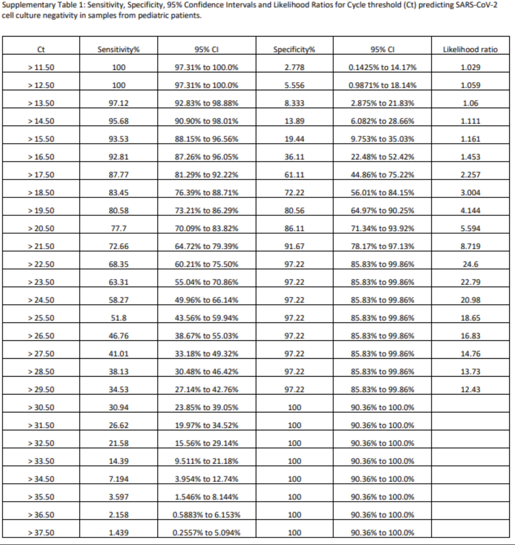
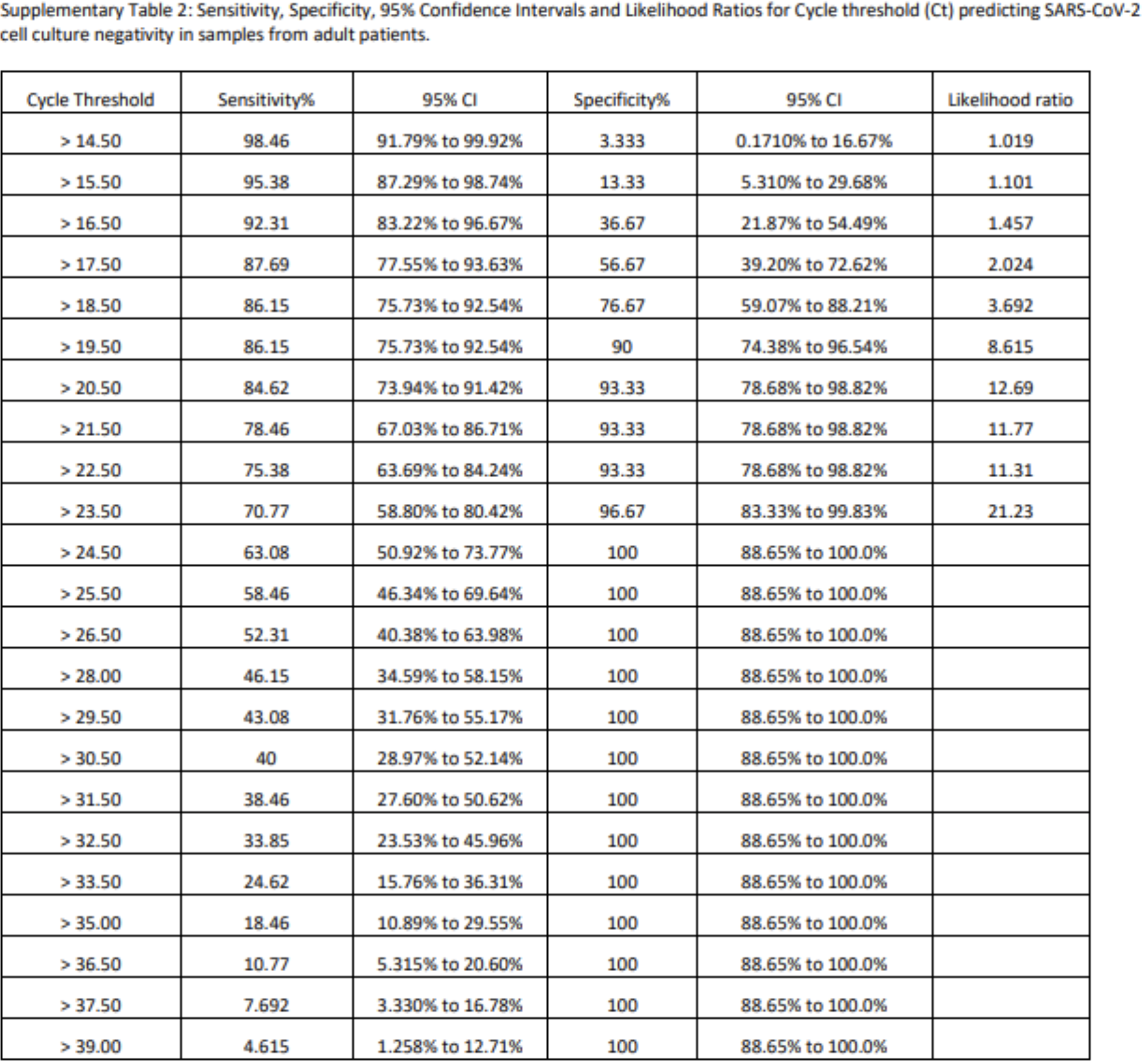
These charts are from the Canadian study on children and transmission. They are from the supplemental material and show the distribution of cycle numbers and relationship to virus viability; that is could virus be cultured. You can see that when you get to 30 cycles, there is basically zero likelihood that a person is actually infected. And really, the likelihood of infectiousness is pretty low starting by 21 or 22 cycles. The first chart shows pediatric patients, the second shows adults. It is very striking how quickly accuracy falls off as cycle number rises. Just a reminder, sensitivity basically tells you how many false negatives to expect, so if sensitivity is 98%, you would expect 2% false negatives. Specificity tells you how many false positives to expect, so if specificity is 95%, you would expect 5% false positives. That is ignoring true prevalence in the population, but that probably doesn’t matter for this study. Now careful with study, read the label, this is likelihood of culture negativity, so you kind of have to invert your thinking, So where you see those 100% specificity numbers, there is no chance that the culture was not in fact negative, i.e. the person wasn’t actually infected.

I’ve long been screaming this… With CDC, health depts, etc saying to use Ct >35, the so called ‘covid death counts’ are total garbage! BAD data. Worthless.
This will go down as the world’s greatest hoax
Kevin,
These tables, even with your explanation, have me completely flummoxed. All the statistical stuff is impenetrable to my teeny brain.
It would help me to have the authors explain in simple English something like this [and I am making up the numbers just to illustrate]:
“We had 37 adults whose PCR test showed positive after 11 cycles. Of those, 35 cultures [95%] confirmed the presence of virus and 2 [5%] did not.”
If that’s not what they are attempting to say, what is? And if I am guessing correctly, what columns correspond to the specific numbers in my illustration.
sorry John, in my email, didn’t reply to last part. I don’t have the study handy and can’t find it in my stack of stuff, I know I have it somewhere. The confusing thing about the tables is you have to read them with the understanding that they related to the likelihood that the culture was negative, whereas normally people would be talking about the odds it was positive, so you kind of have to invert things. I have no idea why they framed it that way.