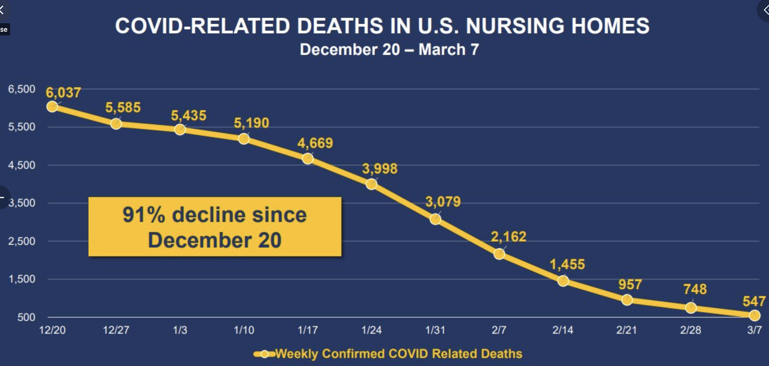
The obvious highest category of persons to vaccinate was long-term care residents, so we should see the effects of vaccination show up in that group first. An extremely high percent of those residents have been vaccinated and the chart below suggests that there is an effect on death. You would need to look at the trend in non-LTC deaths at the same time, and, at least in Minnesota, deaths in that group are not declining as fast. So I believe this is evidence that vaccines are working as intended. Thanks to Phil Kerpen on Twitter for the chart.
✅ Subscribe via Email
About this Blog
Healthy Skeptic Podcast
Research
MedPAC 2019 Report to Congress
June 18, 2019
Headlines
Tags
Access
ACO
Care Management
Chronic Disease
Comparative Effectiveness
Consumer Directed Health
Consumers
Devices
Disease Management
Drugs
EHRs
Elder Care
End-of-Life Care
FDA
Financings
Genomics
Government
Health Care Costs
Health Care Quality
Health Care Reform
Health Insurance
Health Insurance Exchange
HIT
HomeCare
Hospital
Hospital Readmissions
Legislation
M&A
Malpractice
Meaningful Use
Medicaid
Medical Care
Medicare
Medicare Advantage
Mobile
Pay For Performance
Pharmaceutical
Physicians
Providers
Regulation
Repealing Reform
Telehealth
Telemedicine
Wellness and Prevention
Workplace
Related Posts
Commentary
September 20, 2023
How Not to Fix the Educational Crisis
A report proposing to address serious issues with our educational system instead demonstrates exactly why…
Commentary
September 20, 2023
This Review Will Get Slammed by Scientific American Too
The authors of the mask review Scientific American wrongly impugned have now gone after lockdowns.
Commentary
September 19, 2023
Scientific American Is Not Scientific
A Scientific American editorial reveals nothing about masks but a lot about the ideology-driven nature…
The virus may have run out of the frailest victims, while the strong survive. And a vaccine can’t hurt them at this point, and may help a lot.