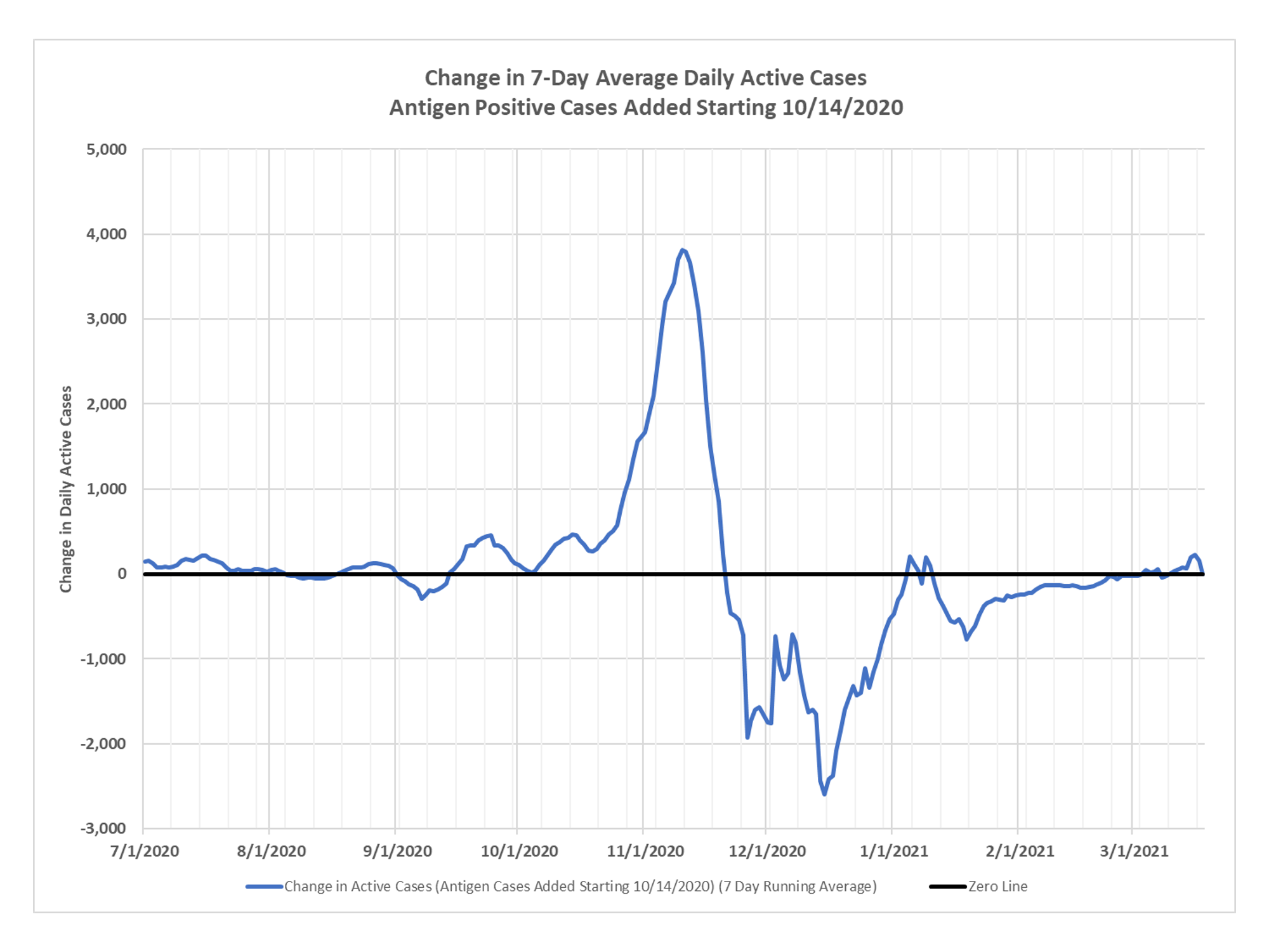
I really only intend to do these once a month or so now, but since the state is making a thing out of variants and new cases, I thought I would give you the active cases chart, thanks again to DD. You can see just the very slightest of upticks. Stay tuned as the battle between vaccination-derived adaptive immunity and favorable viral transmission conditions rages on.


Wait until we see the surge from Spring Break… Then Easter… Then Fishing opener… Then Prom… Then???
For the uptick, were those graphed by event date (onset of symptoms, positive test day, etc) or were they graphed by the day the state announced the cases. As you pointed out last week, mischief might be afoot with the dates attached to the data.
The other state to watch is locked-down Michigan, which also showed a strong uptick last week. It looks like that has already peaked, though, and might start falling again soon (looking at https://datausa.io/coronavirus)
active cases are calculated by taking the current day’s no longer needing isolation number from the daily situation report and the current total death number and subtracting those from the total number of cases by date of specimen collection table 10 days earlier.
sorry, go ten days earlier, take the number of total cases as of that day, subtract no longer needing isolation as of that day and subtract total deaths as of that day.
I wouldn’t be surprised to see an uptick in cases as Coronavirus colds are prevalent in early spring. Hopefully not a lot – and are there a lot of false pos.?
we are definitely in the seasonal favorable conditions for spread
So where are we with the illustrious “R” value? Wasn’t this supposed to tell us the story regarding the ‘spread’ coefficient? Less than 1, we’re winning, greater than 1 we’re losing. Maybe its’ in these numbers and I don’t understand how to derive it.
R has to be defined with a time frame, remember back at the start of the epidemic all the talk was about the case “doubling time”. When you have small numbers it looks scary, but the law of large numbers catches up with you and then the doubling takes forever, so DOH and others stopped using it. Right now the doubling time is at least a year and a half. Same with R, people use it when they think it sounds scary, but they always use it wrong. R supposedly represents how many other people an infected person infects. it changes throughout an epidemic and as I said, obviously has no meaning without a time period. One way to look at it would be using a time period equivalent to the average period of infectiousness, which is quite short. We haven’t had an R over 1 for quite some time by any reasonable definition. Looking at active case trends is a better way to track the epidemic, which is why I use that.