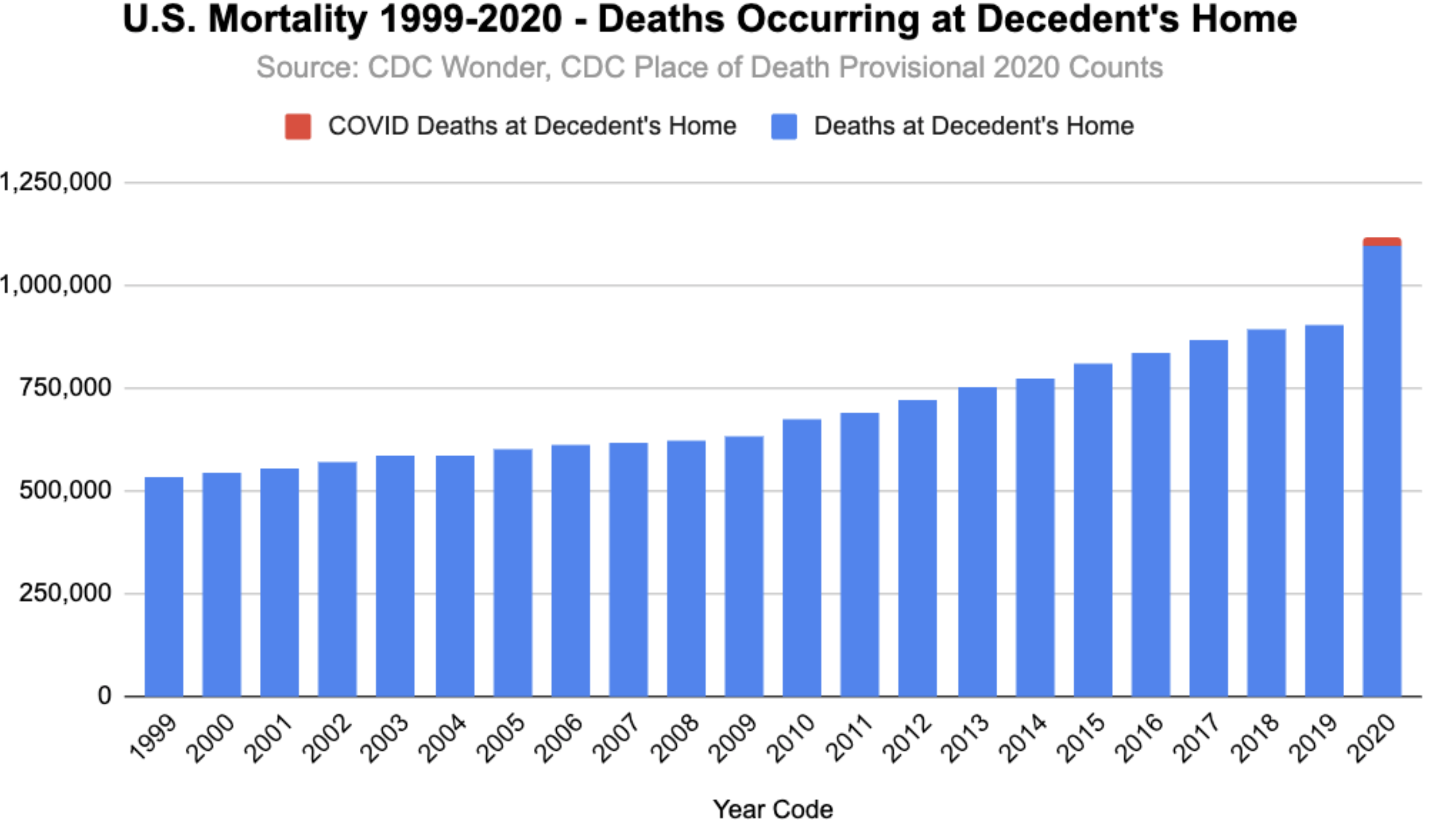
I have mentioned a couple of times before that looking at trends in place of death can tell us a lot about the impact of viral suppression efforts. This chart, from Twitter, shows the steady rise in deaths at home over recent years in the US, both in absolute number and as a proportion. This is a result of a long-standing effort not to have people receive intensive care in hospitals at the end of life. But note the huge jump in deaths at home in 2020 and note how few of those are CV-19 deaths. That jump is almost certainly the reflection of people who died at home because they failed to seek care for heart attack symptoms, low or high blood sugar symptoms, and for other conditions, and also likely reflects a jump in drug and alcohol overdoses. When this gets analyzed more fully, we will see that the attempts to suppress the virus in the long run killed more people than the virus did.

I didn’t realize more people were choosing to die at home instead of undergoing extreme measures in the hospital. That is extremely good news. My 90 yr old father blew through $220,000 in medical bills during the final 2 weeks of his life in the hospital, practically incoherent and connected to machines. What an incredible waste.