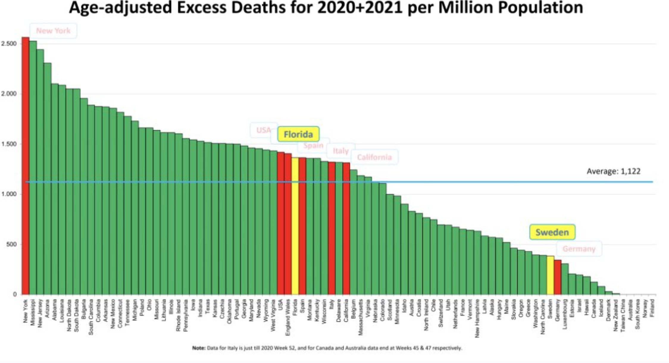
Here is an informative little chart. It plots age-adjusted total excess deaths, not just CV-19, for a variety of countries and the US states. This is how many deaths per million population occurred in 2020 and 2021 to date, for most countries, above the expected number. So not total deaths, just per capita number above expected. Look who is at the very top, Fauci’s shining example of how to handle an epidemic, New York. Look where Florida is, why just below the US average, despite doing everything it could to kill its population, according to the media, Fauci, Slavitt, etc. Minnesota, not too bad, but not great since our IB constantly tells us how we have the best data and have done the best job of handling the epidemic. Oh my, look at Sweden, way down near the bottom, just barely above Germany, which got lauded for its response. How the heck did that happen? If you also minority population adjusted and obesity prevalence adjusted these numbers, Minnesota would look a lot worse. Thanks to Twitter for the chart.

We shouldnt score high on an age adjusted since walz knocked off over 60 per cent of the assisted living elderly who he was supposed to protect.
Interesting. Link / source for this? I can’t read the footnote.
Canada 4th from the bottom. I keep saying this country for some reason wasn’t hit as hard as other places other than the province of Quebec – and even then it would be ranked 31st among states. Of course, officials will say it’s BECAUSE of the excessive measures.
Keep an eye on Europe. They’ve had massive problems with vaccinations (only 29% of French say they would take it if offered) and have cases and hospitalization on the rise again. Looks like they are facing another spring wave. This isn’t over, over there.
Did you notice what country has the lowest excess mortality? Finland, the only country in the world, as far as I can tell, that has a national policy for supplementation with Vitamin D. https://www.iadsa.org/mind-the-gap/english/finland 90% of the population has serum levels of Vitamin D greater than 20 ng/ml and half the population has levels greater than 30 ng/ml. 20-30 ng/ml is considered “adequate.” For a more detailed discussion look for my comment here: https://healthy-skeptic.com/2021/01/29/a-head-full-of-coronavirus-research-part-97/