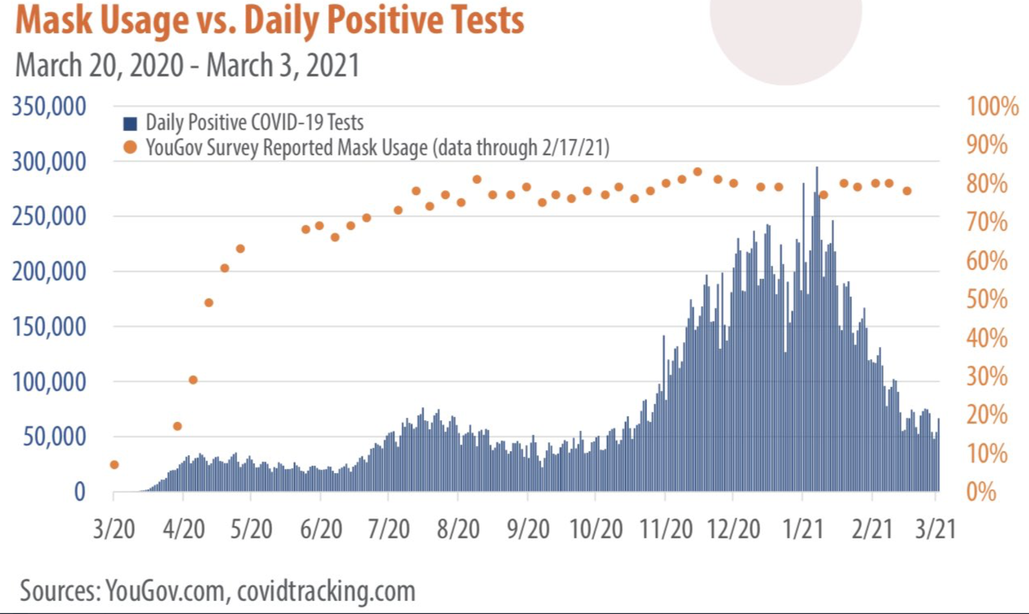
I would like to give this up, maybe I should have for Lent, but, as you will read in the next research summary installment, the CDC’s continuing bullshit research on masks makes it impossible. Here is a lovely chart showing mask usage versus cases. You will note how precisely the curves match each other, if you lived in a 20-dimensioned world. And case curves would have been so much worse if we hadn’t have been wearing those masks. Let me give you a factoid, the curves look like standard epidemic curves and they literally in most states couldn’t have been worse. Thanks to Brian Wesbury on Twitter for the chart.