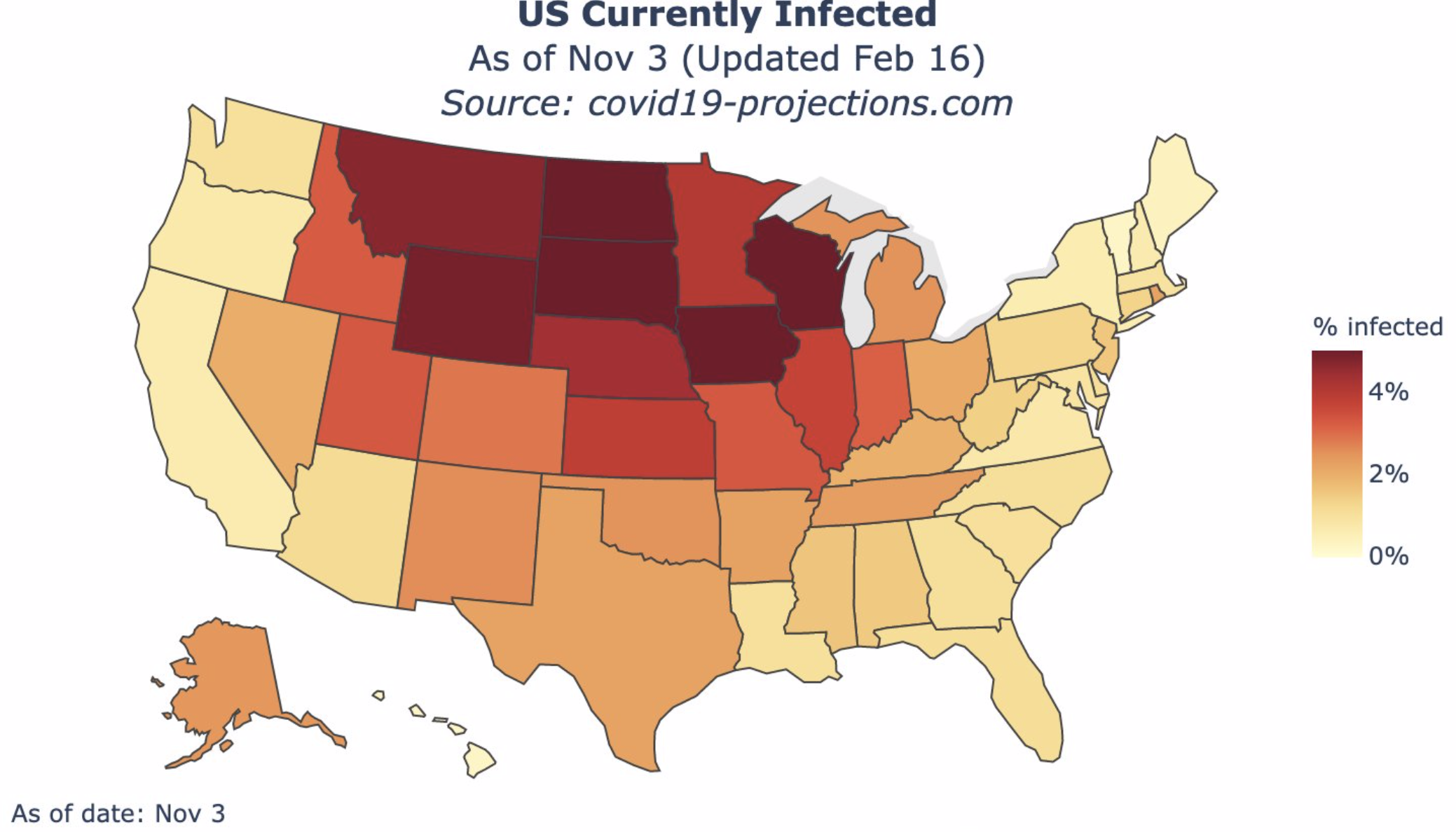
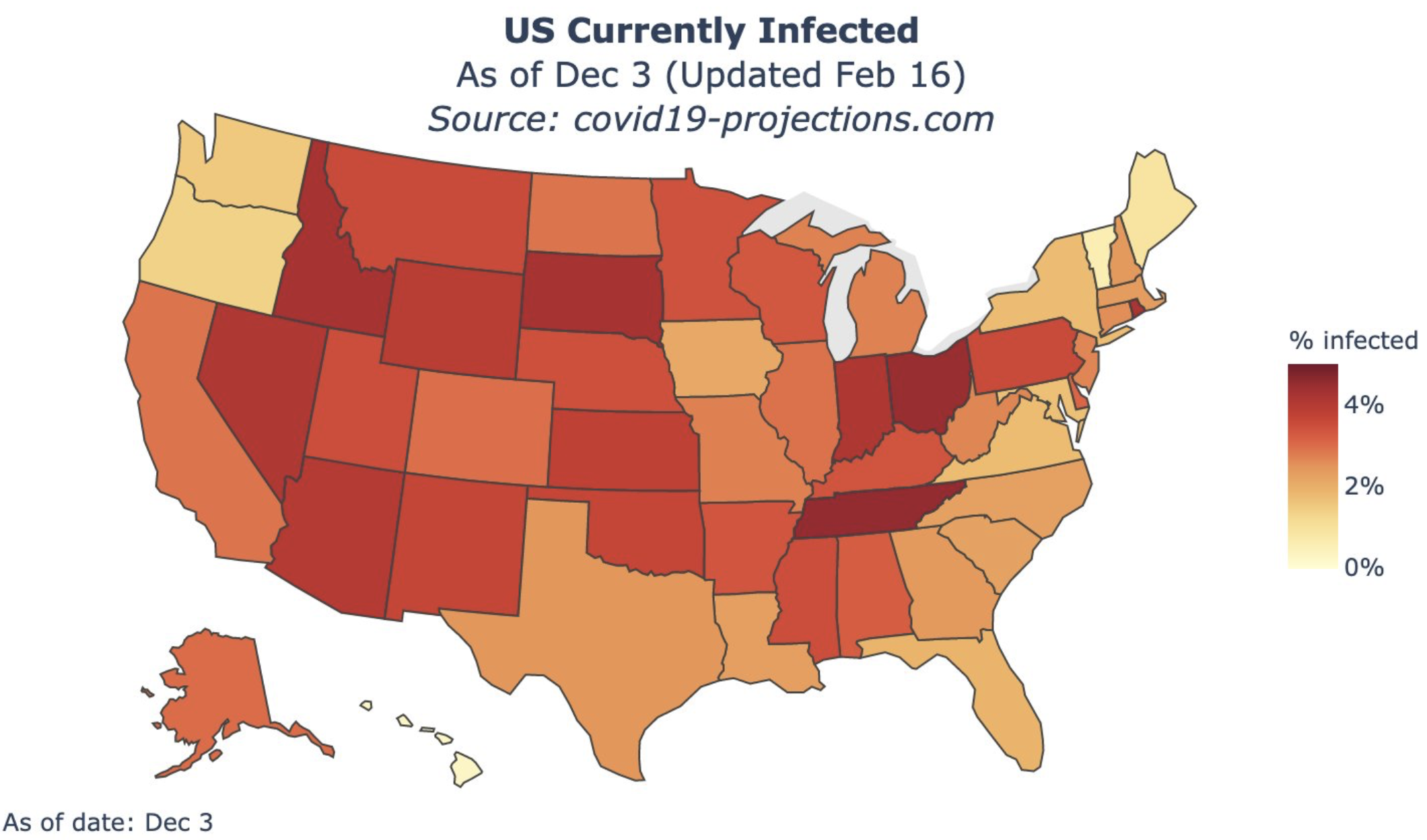
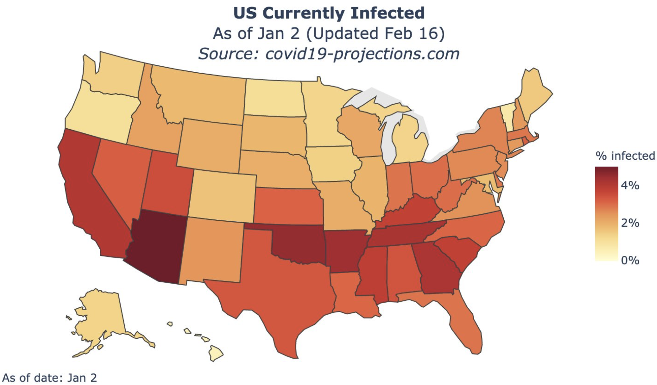
Look at these four charts courtesy Youyang Gu on Twitter, who does very interesting and useful work. It couldn’t be more apparent that there is a strong seasonal/geographic pattern to viral transmission. I wish I knew what little formula is encoded in CV-19 that correlates with optimal transmission. And the truth revealed by these charts is how pointless mitigation efforts are. The charts are spread levels in November, December, January and February, with all data as of today. Great charts.


Join the discussion 2 Comments