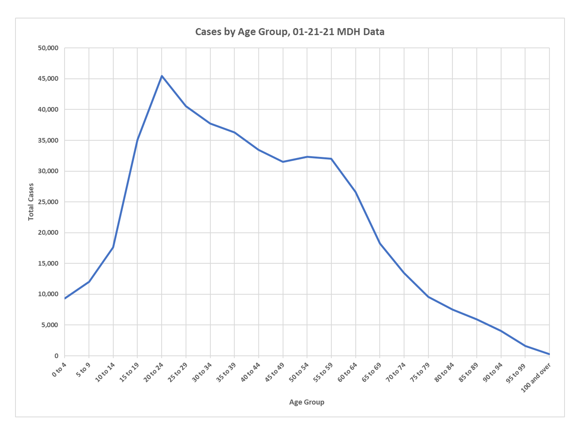
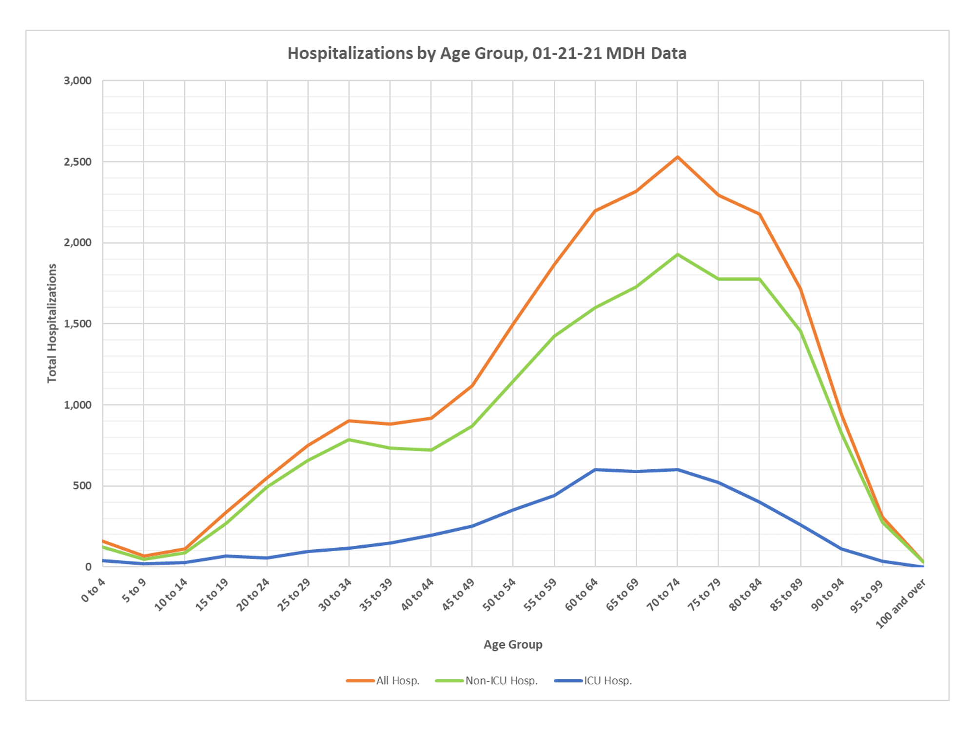
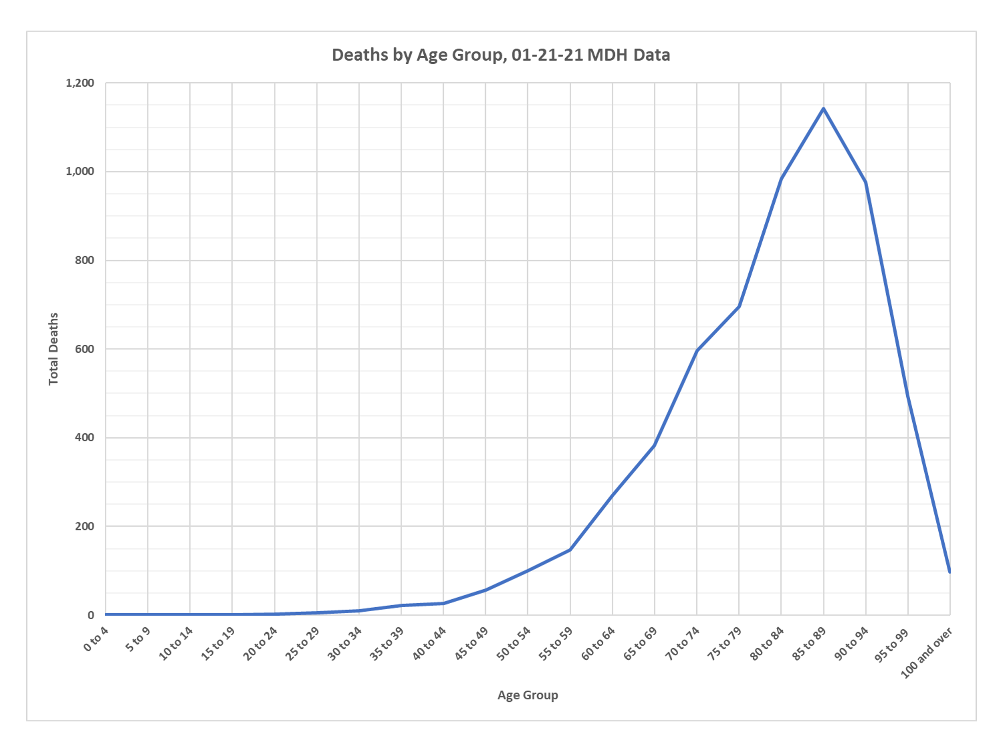
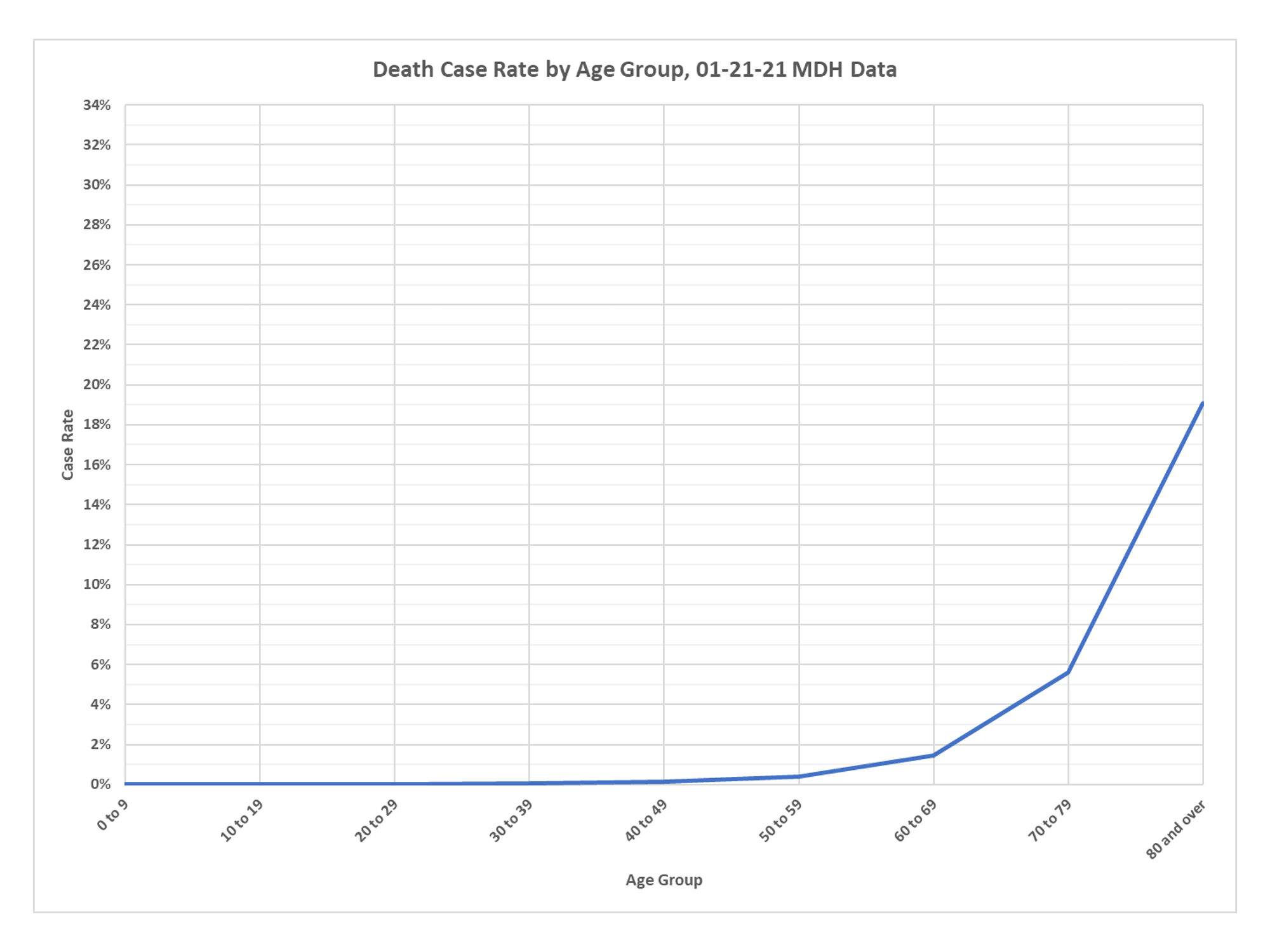
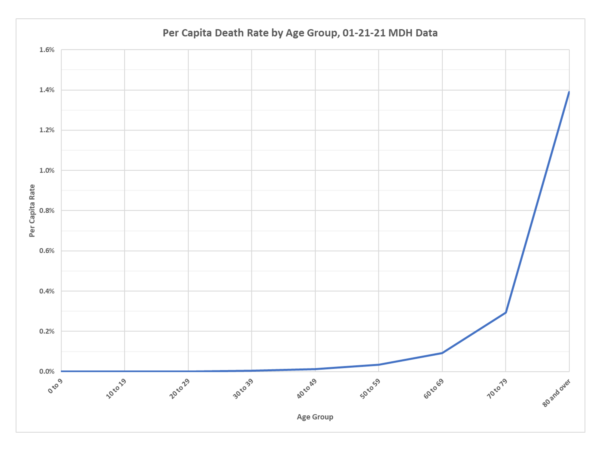
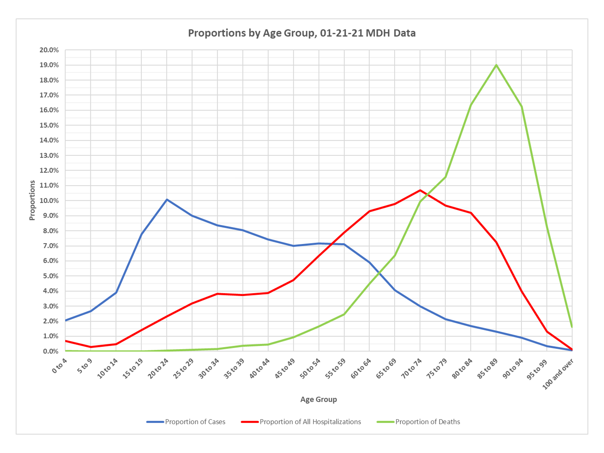
More of my favorite charts showing the extreme age bifurcation of the epidemic. Note the new chart showing the proportion of all cases, hospitalizations and deaths by age group. Cases lumped in the young, hospitalizations in the middle-aged and elderly and deaths in the elderly. Thanks again to DD for all the help on these charts.

I so appreciate all of your posts, logic and research. If only people could think for themselves! Thank you
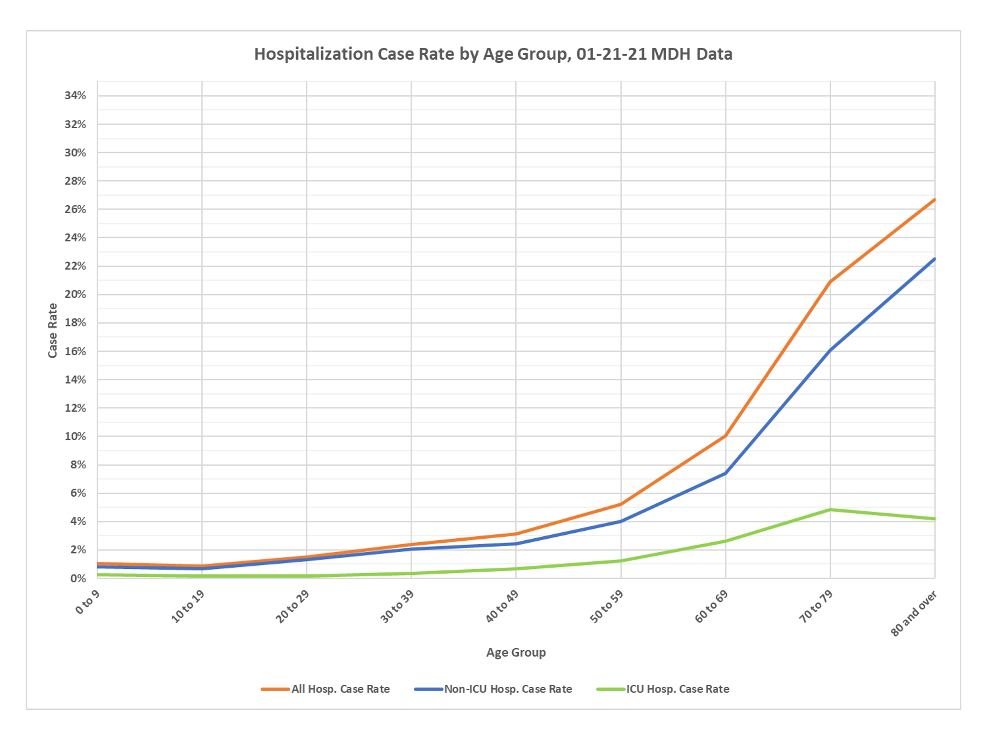
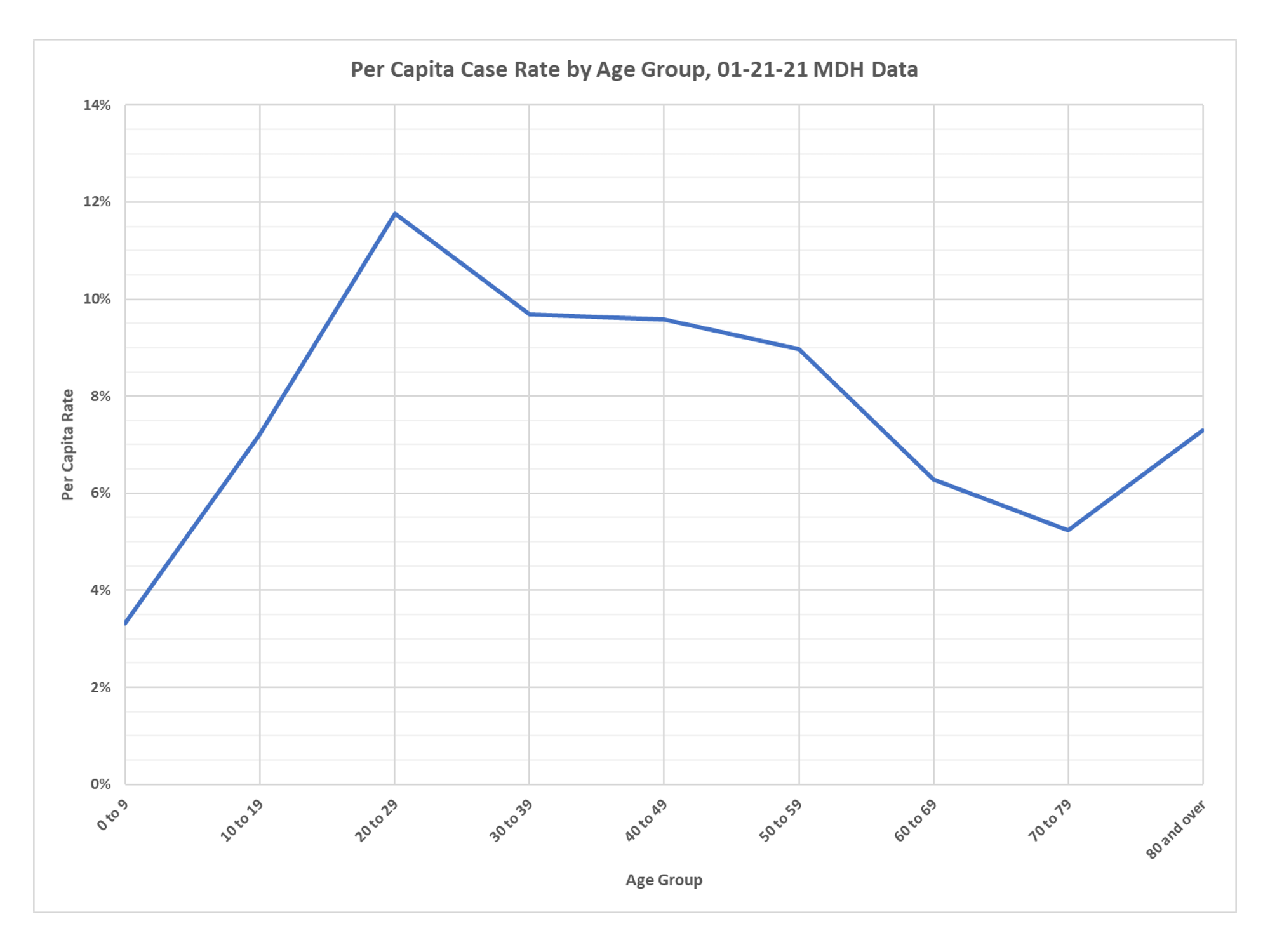
Just a question on the “per capita” graphs: Does that mean, for example, that just under 12% of everyone age 20-29 have had tested positive, but less than 0.2% were hospitalized, and so few died that the bar isn’t noticeably above 0%?
yes, that is correct
One thing I’d love to see but haven’t, though I may have overlooked it. How much of the high susceptibility of the elderly is due to higher rates of co-morbidities? There’s a strong correlation between age and rates of obesity, diabetes, COPD, and heart disease. Yes, independent of that (at least that’s my impression), immune systems also weaken with age. But that might be the least of it.
there are a large number of studies looking at this and it is definitely true that the elderly have more disease of all types, and that the elderly with more comorbidities are more susceptible to CV-19
Where is the source for this? It might be an idea to give a direct link in a reference section.
I only found online a weekly report dated 1/21/21, which was also downloadable as a PDF- but it does not seem to contain these graphs.
I’m also trying to understand the meaning of the ‘per capita rate.’ For example one chart above had between 1.05% and 1.1% per capita hospitalization for ages 70-79. what does that mean? Is that P(70-79 AND hospitalized AND positive test) OR P(70-79 AND hospitalized |(given) positive test) OR P(hospitalized |(given) 50-59 AND positive test)?
One of the charts in the PDF is titled “Demographics: Age” (page 22). From calculations, using numbers on the table there, it seems that
P(70-79 AND hospitalized | positive test) = 1.07% and P(hospitalized | 70-79 AND positive test)= 21%. Those are two very different things!
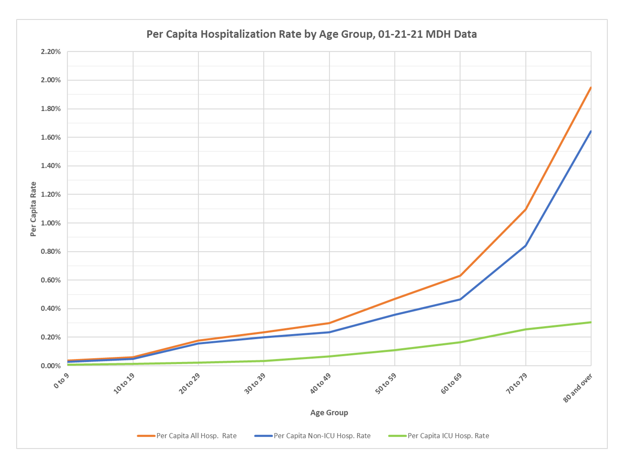
There is also the weird fact that there are more deaths that ICU hospitalizations in certain age ranges – which one would think is a subset and should always be smaller.
The data comes straight from the Minnesota Department of Health website, anyone can create exactly the same graphs. The population estimates are those contained in the Minnesota modeling groups work and came from the state’s data on population by age. Hospitalization is purely defined how the state lists it. As I have noted frequently, there are issues with the attribution of both deaths and hospitalizations to CV-19, but for this I am just taking the state’s own data. You have to look at the headings, one set of charts is the rate per case, as it says, so that is just taking cases by age group and dividing hospitalizations or deaths into the cases. Please note that these are case rates, not infection rates, we don’t really know how many undetected infections there are. The other is cases, hospitalizations and deaths on a population basis, for the population in each age group. The reason in older people that you don’t see as many ICU hospitalizations as deaths is the widespread use of advance directives in Minnesota, these people or their families don’t want intensive treatment at the end of life. Minnesota has a very large number of deaths at the place of residence because of this. I have been after the state to release more detailed information on this and they don’t. The real point of the graphs is to show how low a threat CV-19 is to the general population, compared to the elderly.