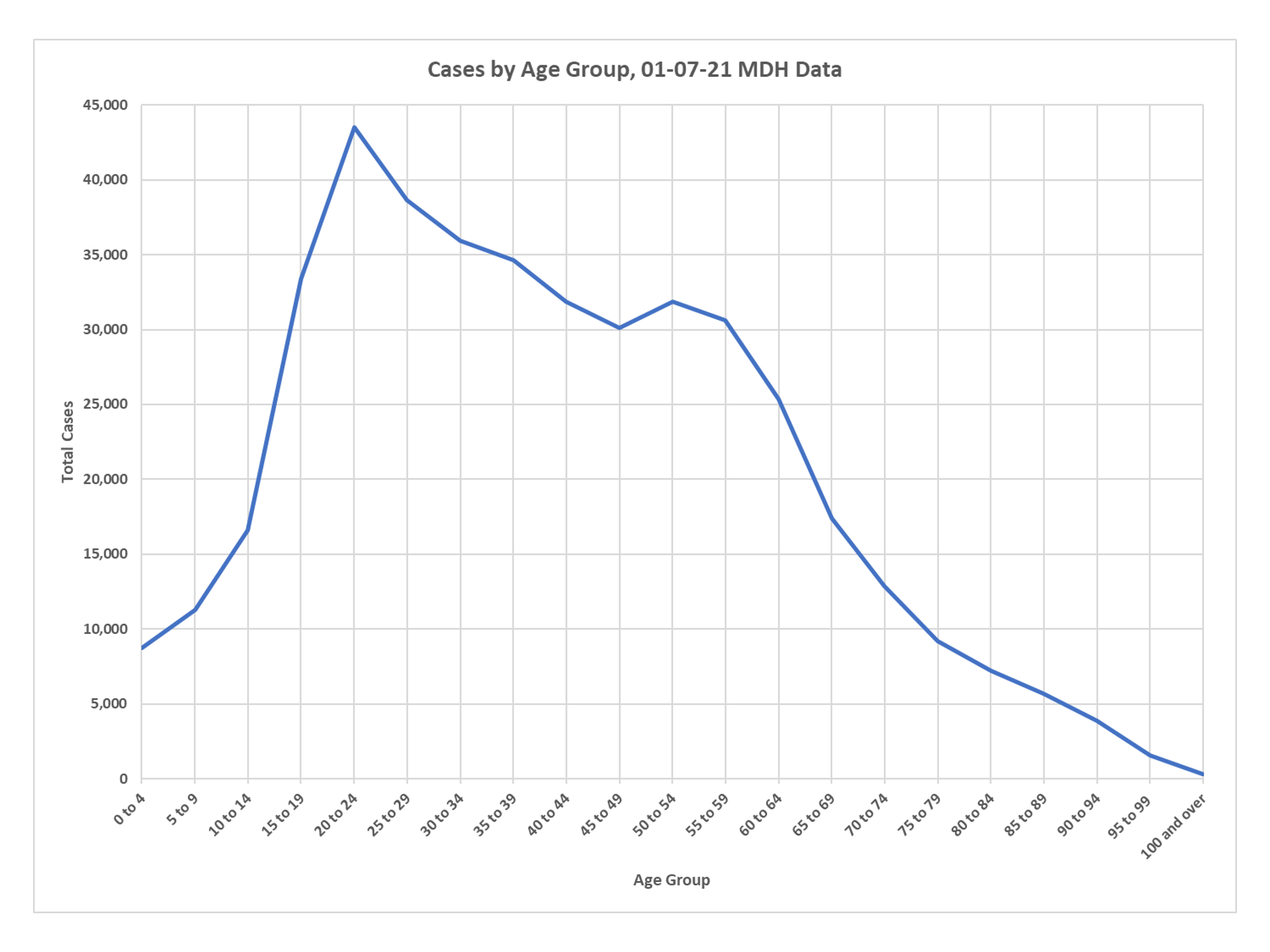
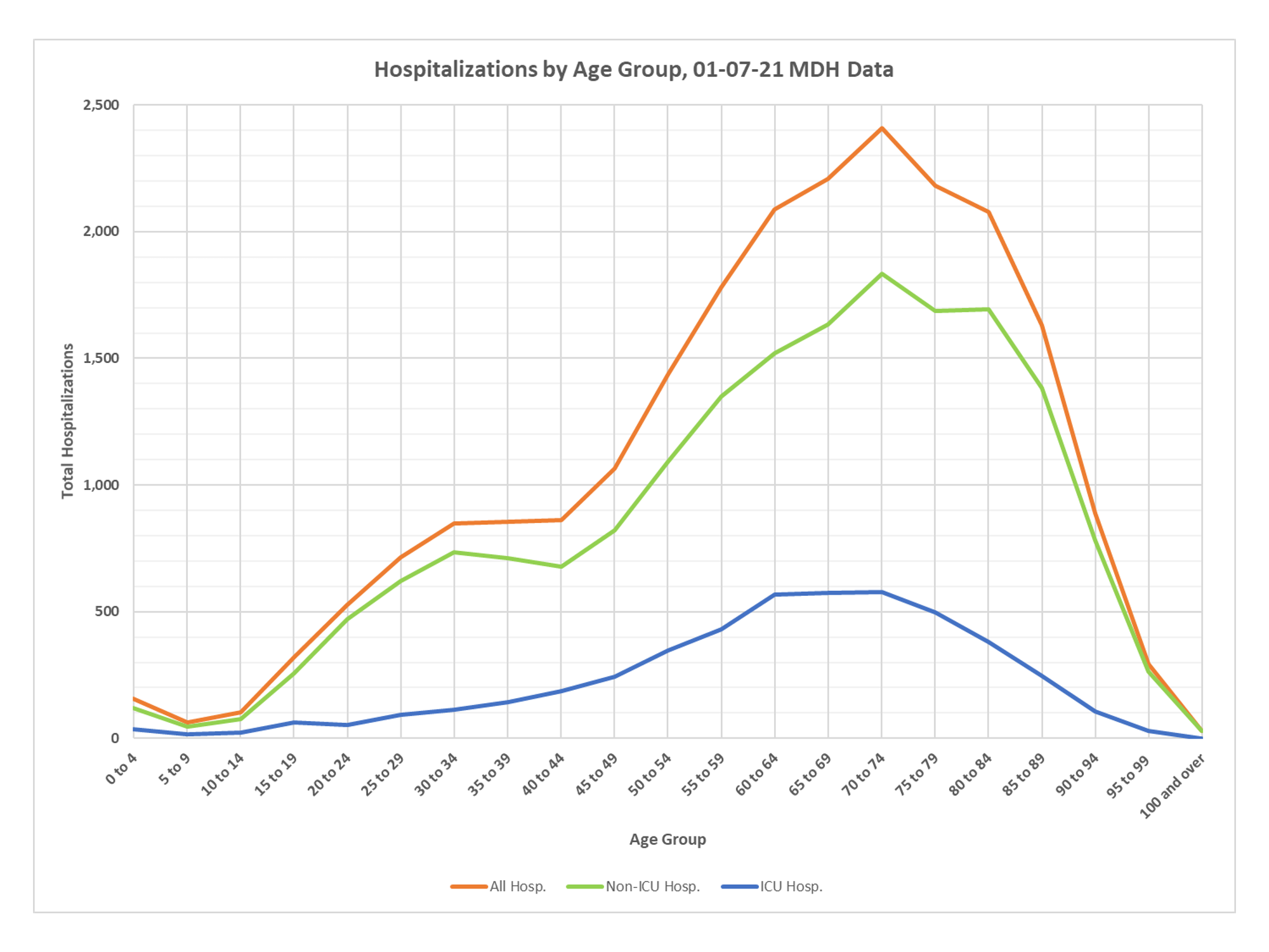
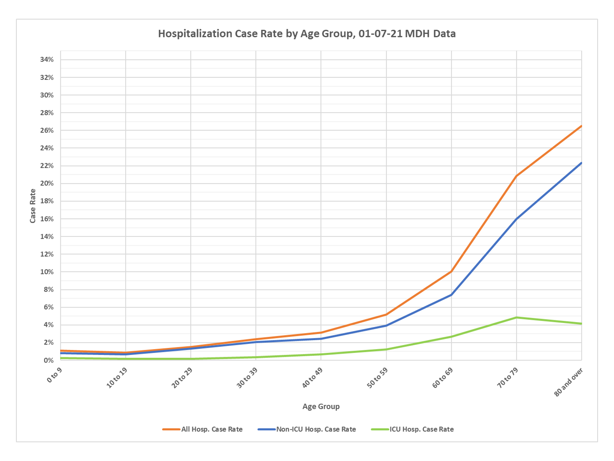
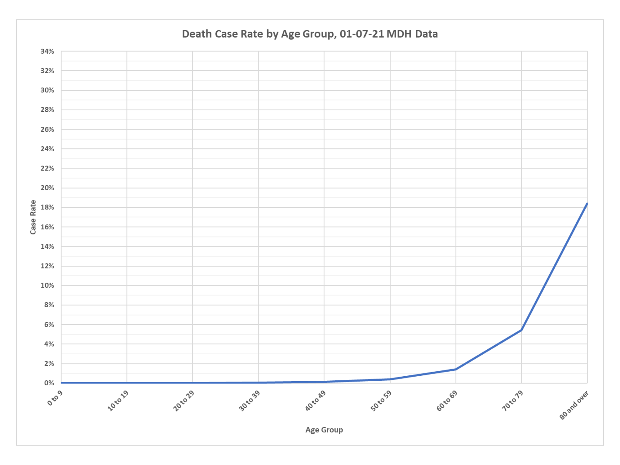
Anyone who doesn’t think this epidemic is wildly bifurcated with all the serious illness and death concentrated in older age groups just needs to look at these charts. And anyone who thinks a younger person living in the community has any serious risk is off their rocker. Thanks once more to DD.
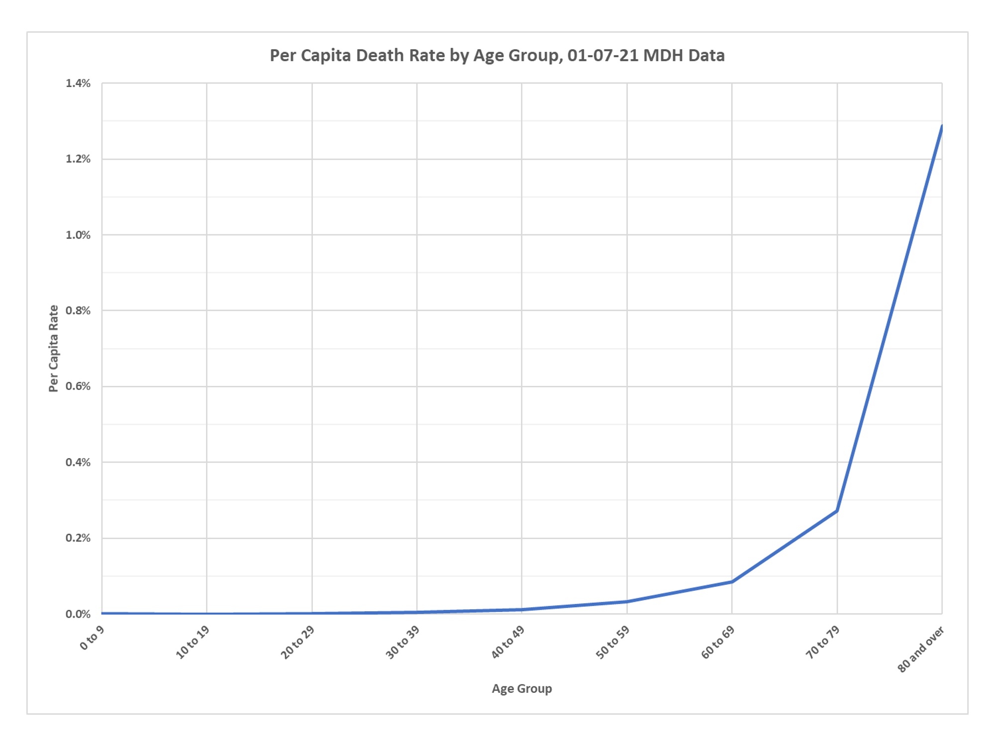
Please note that on the per capita death charts you don’t even get to one-tenth of one percent til the 60 to 69 age group, but also note that we have managed to kill almost 1.3% of our entire population over the age of 80 and that group has a case fatality rate of over 18%, while that CFR, which again isn’t the infection fatality rate, which would be much lower, doesn’t even rise noticeably above zero til the age 50 to 59 group.
Great set of charts.
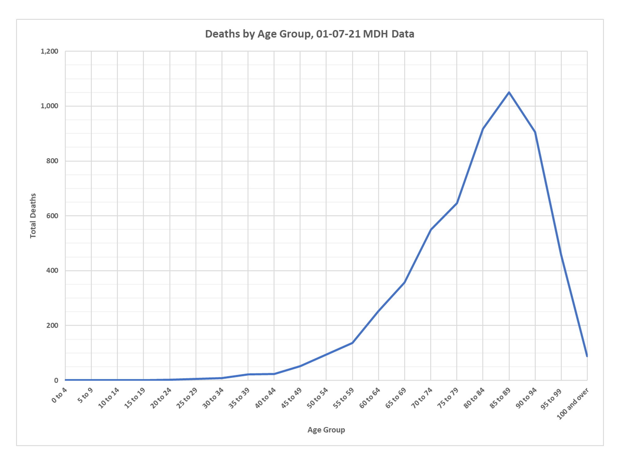


Similar data exists in Indiana. 75% of the COVID deaths are aged 70+.
Deaths and cases are on the decline (albeit slower than anyone would like).
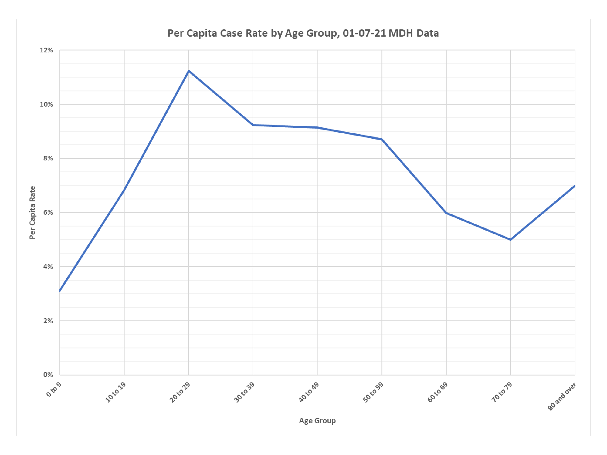
Makes you wonder why some many people under the age of 25 are being tested. Seems like a huge waste of money. Which is likely the reason.
What do graphs have to with SCIENCE! Just kidding
Of the very few who die under age 60, we know that >90% of them had significant underlying conditions. We have now seen five (+?) “healthy” under age 60 health care workers die shortly after receiving the vaccine. Would be a very interesting analysis to compare “infection fatality rate” in the healthy <60 cohort from 'natural' COVID vs. the vaccination fatality rate in the same cohort…I'm guessing we may never get good enough data on the vaccinated population to calculate such figures.