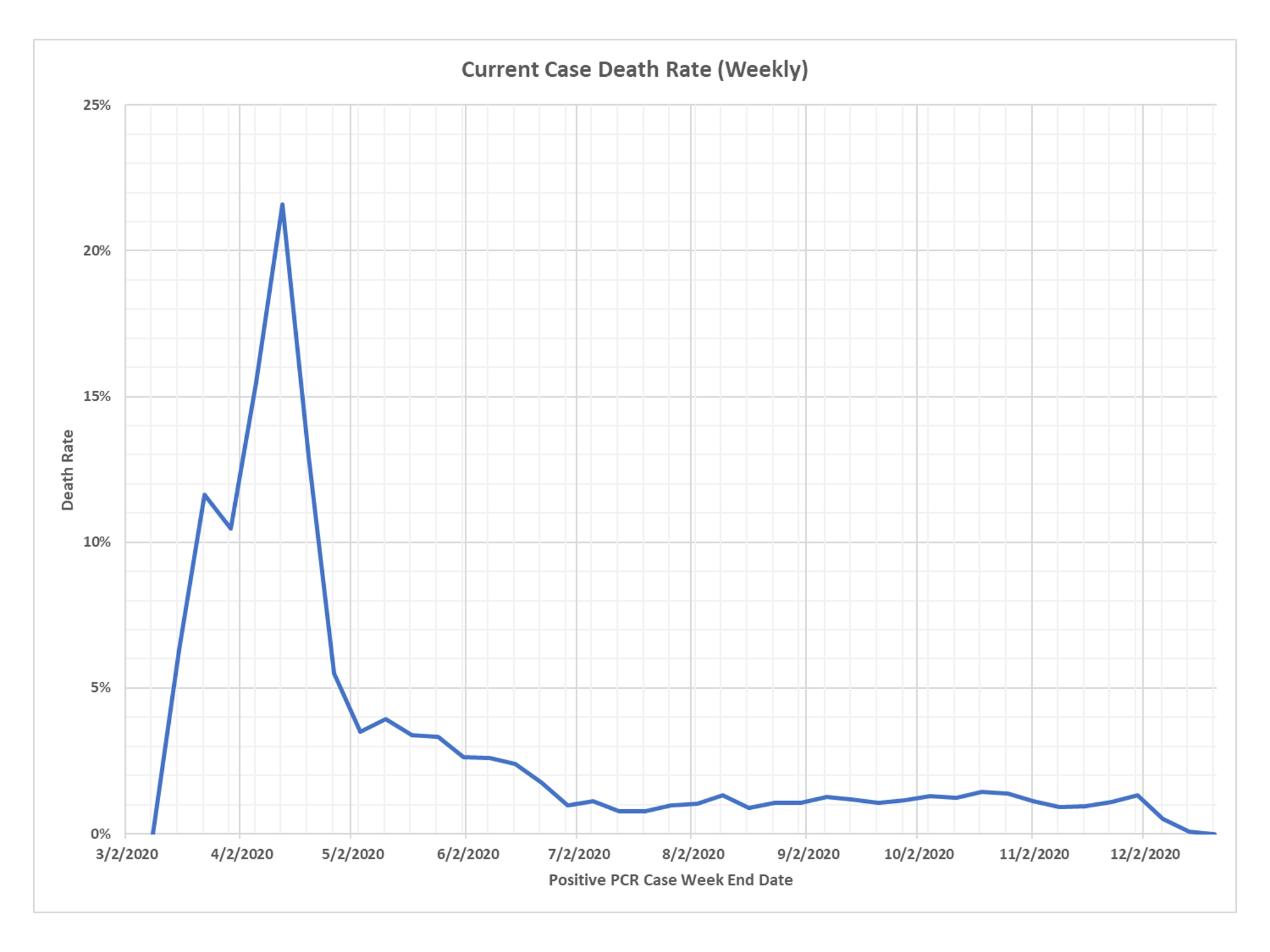
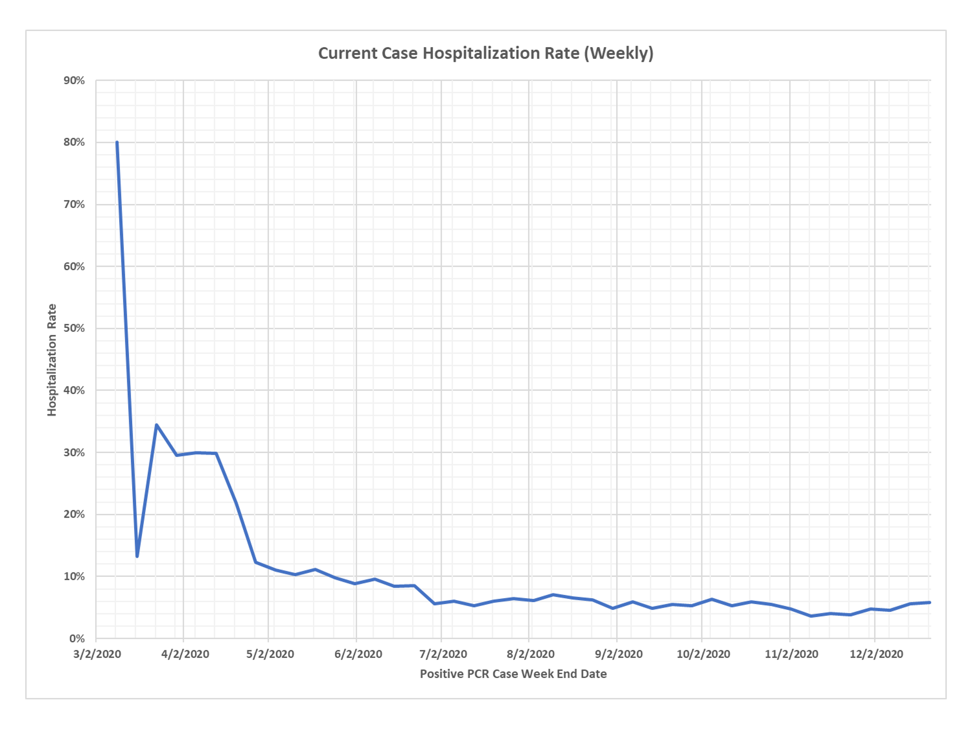
Just a quick couple of charts that demonstrate that the Minnesota death and hospitalization rates for a set of cases have stayed at a low level. This is from the analysis that takes deaths in a specific week, based on CDC data, and they works back to the associated set of cases and hospitalizations based on median lags. Thanks to DD for the charts.
✅ Subscribe via Email
About this Blog
The Healthy Skeptic is a website about the health care system, and is written by Kevin Roche, who has many years of experience working in the health industry. Mr. Roche is available to assist health care companies through consulting arrangements through Roche Consulting, LLC and may be reached at [email protected].
Healthy Skeptic Podcast
Research
MedPAC 2019 Report to Congress
June 18, 2019
Headlines
Tags
Access
ACO
Care Management
Chronic Disease
Comparative Effectiveness
Consumer Directed Health
Consumers
Devices
Disease Management
Drugs
EHRs
Elder Care
End-of-Life Care
FDA
Financings
Genomics
Government
Health Care Costs
Health Care Quality
Health Care Reform
Health Insurance
Health Insurance Exchange
HIT
HomeCare
Hospital
Hospital Readmissions
Legislation
M&A
Malpractice
Meaningful Use
Medicaid
Medical Care
Medicare
Medicare Advantage
Mobile
Pay For Performance
Pharmaceutical
Physicians
Providers
Regulation
Repealing Reform
Telehealth
Telemedicine
Wellness and Prevention
Workplace
Related Posts
Commentary
April 25, 2024
Uh-oh, the Economic Crap Hits the Fan
The economy is slowing and inflation accelerating while productivity declines. What a great combination.
Commentary
April 25, 2024
Another of Your Regular US Debt Sales Updates
The five-year US Treasury note runs into resistance in a weaker auction than that for…
Is the death rate artificially low because the case numbers are exaggerated by the PCR test (and other means)?