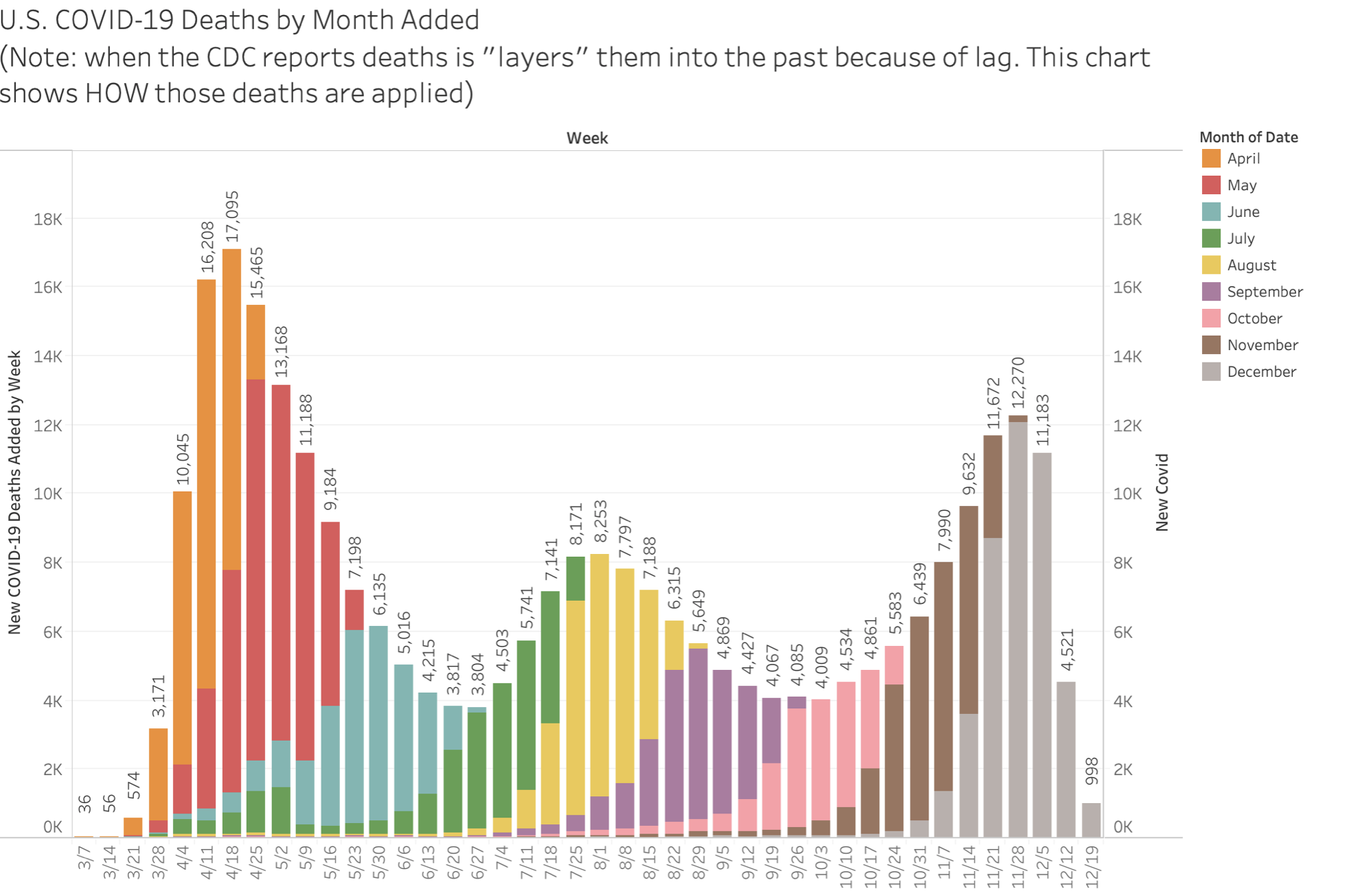
Thanks to Justin Hart for this chart showing the lag in death reporting at the CDC and the states indirectly. (Twitter Link) Let me explain this a little. CDC gets death certificates from the states and loads the information into its files. There can be a lag in the states forwarding certificates and there can be a lag in the CDC loading the data. The months label is the month that the death was put into the week along the horizontal axis. The CDC accurately reports deaths by the week they occurred, not as of the date reported, which is what many states, including the incompetents in Minnesota, do, although the death certificate quite plainly states date of death. So you get a sense of lag and can see that months later, deaths may still be added to an earlier week. I suspect some of this is the states searching to make every possible death a CV-19 death. Gotta keep the terror and hysteria up.
One big picture thing to note is the purity of the curves. First one, sharp up, sharp down. Second wave, in the south and southwest, lower, and slightly gentler but the same classic epidemic curve. Third wave, when filled in, will look the same. Why, you would almost think no one had made any effort to slow transmission, or maybe if efforts were made, they simply didn’t work. Aside from the attribution issues, deaths, and to some extent hospitalizations, give the best picture of epidemic shape, as they are known events, unlike the issues with determining the real number of people infected. What these charts most clearly demonstrate is that all our suppression efforts are pointless, futile, and very costly.

What you really want is the same graphs from prior years with influenza on the Y axis.
You also want total deaths (all causes) on the Y-axis for multiple years. What we’re going to find is 2020 had no excess deaths in total compared to other years. You may find some shifting of the curves depending on when the outbreaks of seasonal illnesses hit. I’m sure some states would love to go back to January and February and re-classify some of their deaths from those months so they could get some of that extra cv19 taxpayer lucre.