The chart below is courtesy Kyle Lamb. (Twitter Link) It is a great look at age-adjusted mortality rates by state. That is, it takes each state and shows what its mortality rate for CV-19 would be if all states had the same population age structure. If it were easy to do the same thing with minority percent of population and average population density and general health status, I think you would see enormous convergence of mortality rates. What is noticeable is that our neighbors North and South Dakota did get whacked hard, but prevalence estimates would also suggest they are completely done with the epidemic. You need to have an estimate of prevalence adjustment to get a sense of the infection fatality rate. Wisconsin, while our twin in many ways, has a slightly better mortality rate. This may be due to lower LTC facility deaths. Ohhh, and look at Florida, wide open and still below the national average. Finally, while Minnesotans love to think we are all woebegonely above average, we are apparently pretty much completely average.
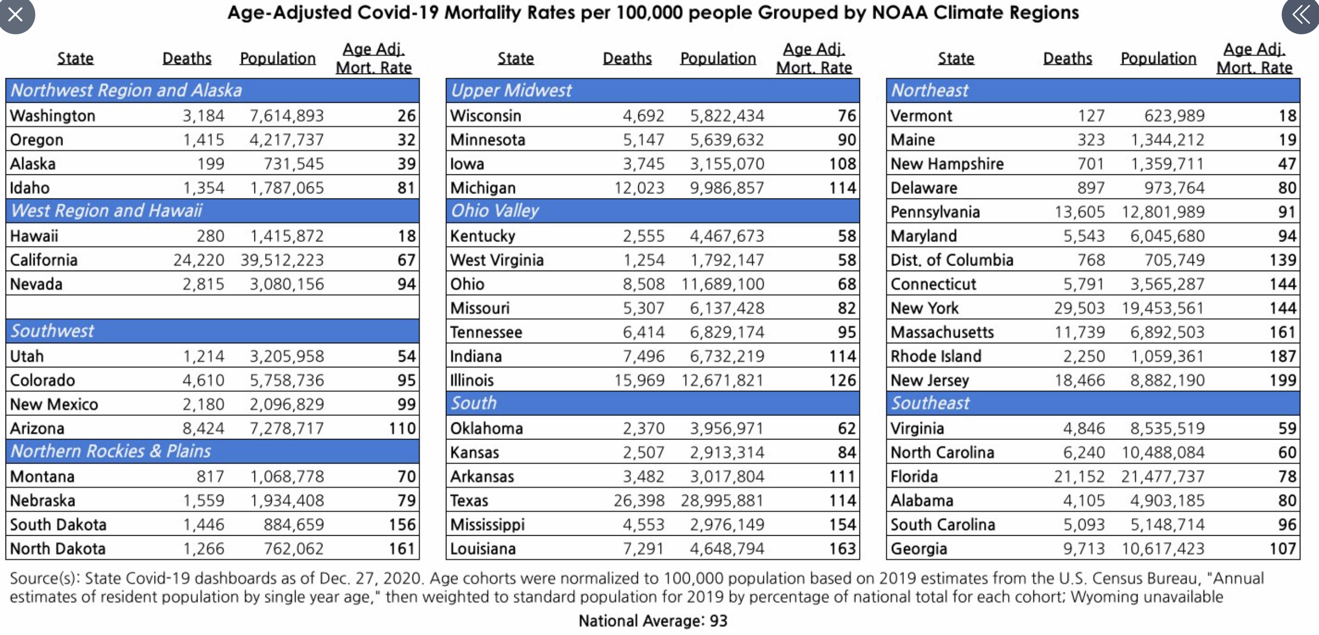

Any thoughts as to why Washington DC is so much higher than the states immediately surrounding it?
DC >> 139
MD >> 94
VA >> 59
WV >> 58
DE >> 80
PA >> 91
All of these states have people who commute to DC, with MD and VA obviously having the most.
a large metro area with more dense population, minority composition? All could play a role. Be interesting to look at Baltimore separately, or Philadelphia.