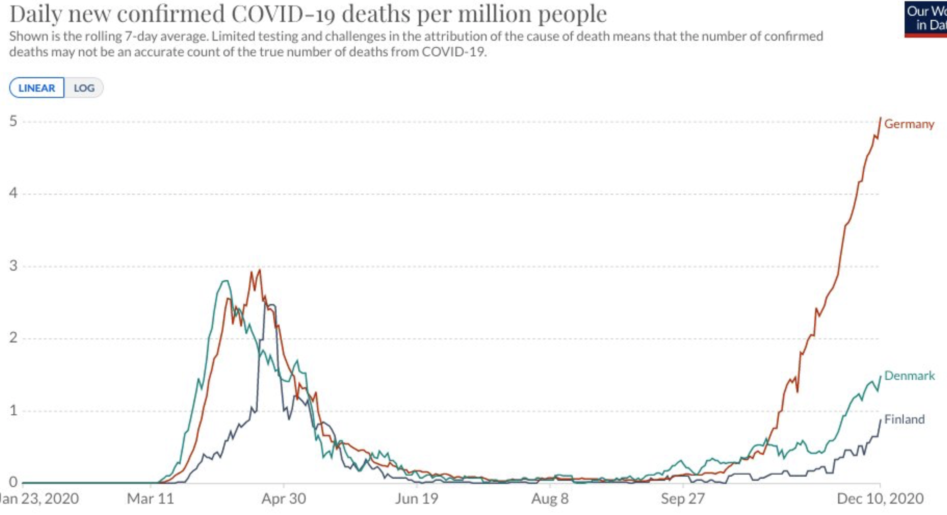
Uhhh, not quite what the chart says. It comes to everyone eventually. Denmark and Finland starting to rise as well. Thanks to Twitter.

Uhhh, not quite what the chart says. It comes to everyone eventually. Denmark and Finland starting to rise as well. Thanks to Twitter.

The Healthy Skeptic is a website about the health care system, and is written by Kevin Roche, who has many years of experience working in the health industry through Roche Consulting, LLC. Mr. Roche is available to assist health care companies through consulting arrangements and may be reached at khroche@healthy-skeptic.com.

Germany at its peak: 5 deaths per million people? vs Denmark 1 and Finland 1/2?
Can we get the source of the chart and the underlying data, please? Twitter isn’t the source, it’s just the medium. I don’t intend this to sound combative, but if I were to forward this info to someone skeptical, I would want to include the source for verification. We should be better than the governor about the underlying data (shouldn’t be hard….).
Thanks, love the analysis generally.
Yeah, I will start putting twitter links on charts I pull from there. This one I believe (may say somewhere on chart) is worldometers data or maybe Our World in Data