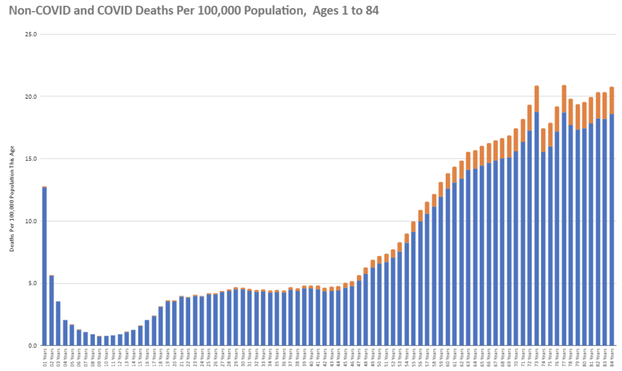
The chart below, thanks to Twitter, shows all deaths in the US this year on a per population for that age basis and indicates how many are CV-19. Remember we are using an extraordinary attribution of death to CV-19 and even so, even among the very oldest groups it is a fraction of all deaths. Among younger people it is unnoticeable. A number of readers have sent me some excellent work they are doing analyzing deaths, in Minnesota and elsewhere. I have been swamped with real work this week but I am hoping to incorporate what people have passed on into some posts in the near future.

“shows all deaths in the US this year on a per population for that age basis”
I don’t think that is quite right (at least, not the way I read it). It is deaths in the age group per 100K of *all* ages, not per 100K of that age. 84 year olds have a 7% chance of dying in the next year. But that does not change the important conclusion: “even among the very oldest groups it is a fraction of all deaths.”
I think it is deaths by the age, the underlying blue curve is the typical death by age curve. Higher mortality in infants and young children, dipping down and then gradually rising as middle age approaches into old age
But the graph only shows a little over one order of magnitude difference between the very young and very old. And it seems to show that people in the eighties have only an 0.02% chance (20 per 100K) of dying in nearly a year. So I don’t see how it can be per 100K of that age.
It might be that I am misreading what you are saying and as a result you are misreading what I am saying.
if I am reading the legend on the horizontal access right, at any age in the 80s there is about a 20 times greater likelihood of dying than for a younger child. I think people are surprised how many children die every year–accidents, cancer, serious neurological disorders. But I also was thinking that the absolute number of deaths of people in their 80s seems low. This was presented as national data, but I wonder. I am going to look at the CDC death reports to see the typical spread of deaths in a year.