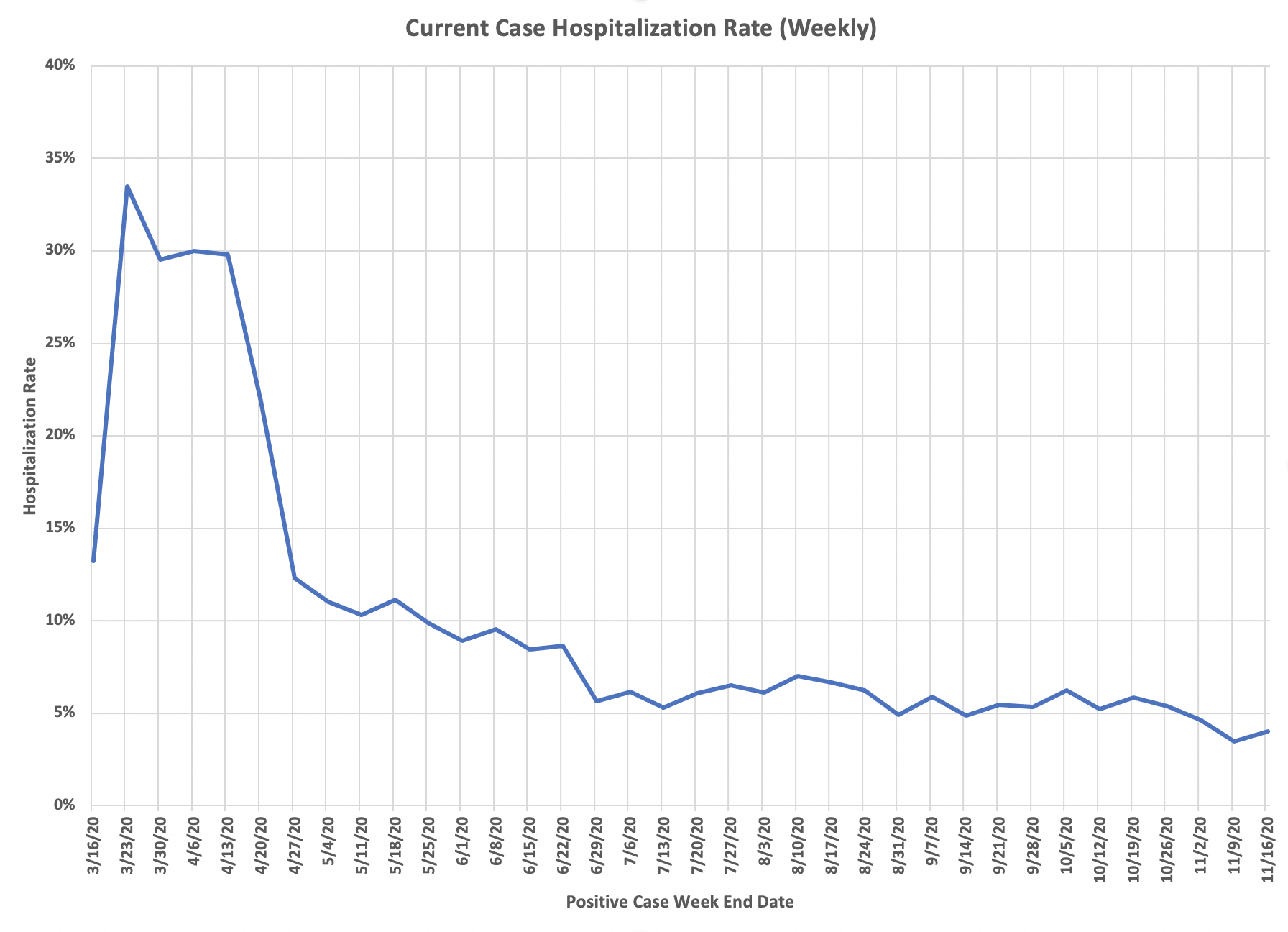
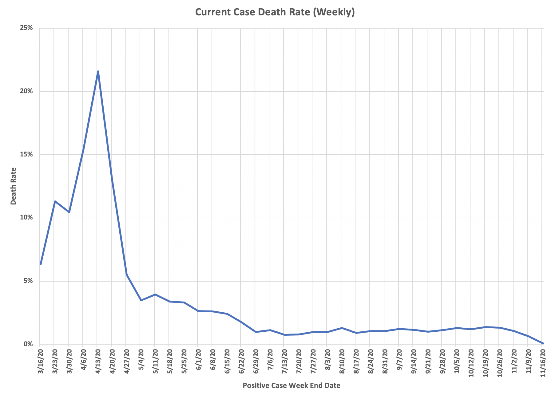
Another analysis that the state should be doing but doesn’t. An attempt to identify trends in hospitalizations and deaths by case cohort. In other words, take a set of cases from a specific time period and identify the outcomes in those cases in terms of hospitalizations and deaths. The state could easily do this accurately. I have to come up with a complicated formula to attempt to ascertain the same thing. Because Minnesota doesn’t give us deaths by actual date of death, I have to use CDC data for this. That data is given by week, with the assigned date being the end of the week, which CDC defines as Saturday. So I start there, then I work back by the typical lag between identification of a case and death and identification of a case and hospitalization.
The CDC gives us this data in its modeling parameters information and I make some slight adjustments for age structure in Minnesota deaths and in lag to identify a case. I went into more detail on these adjustments in the last post I did with this analysis, and the adjustments haven’t changed. Those days are for 12 for deaths and 9 for hospitalizations, in each instance from the date of case identification. So I take the prior 7 days’ cases and the prior 7 days’ hospitalizations from each of those lagged dates to match up with the deaths in a week. A simple way to think of this is imagine a group of people with symptom onset on day 1 who are ultimately going to be hospitalized and/or die. They will likely get tested on day 3, hospitalized on day 6, and die on day 15. But since Minnesota reports cases on date of specimen collection, you need to adjust how you construct the cohorts.
So here are the charts of current cohort outcomes by that CDC week end. You can see in both hospitalizations and deaths that the case rates are remarkably stable throughout the summer and into the fall, despite the dramatic rise in cases. May reflect some fundamental distribution. Based on that, the next step will be an analysis that adjusts the spring case levels to get the same case rates through the whole epidemic. Be interesting to see what that case total is. I believe cases in the spring will be at about two thirds of the level in late October and early November. Another interesting thought exercise is that if only a certain proportion of cases have been detected, what do these rates look like. If the antibody prevalence study was right, there are about six times more actual infections than currently reported in Minnesota, then the death and hospitalization rates are one-sixth of those reflected in these charts. Then think about the age structure issues. I keep saying this, but the epidemic is basically a non-event, certainly not an epidemic, for the general population under age 70. Can’t give enough thanks to Lisa Jansa, and especially DD, for helping with this. The charts are DD’s work and he double checks my often poor work to make sure the analyses are solid.