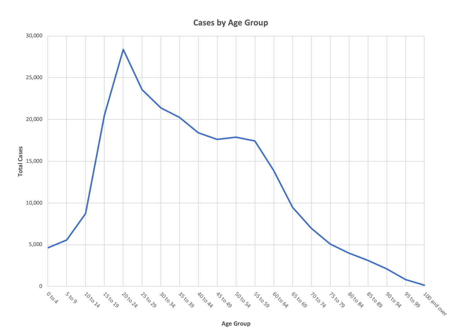
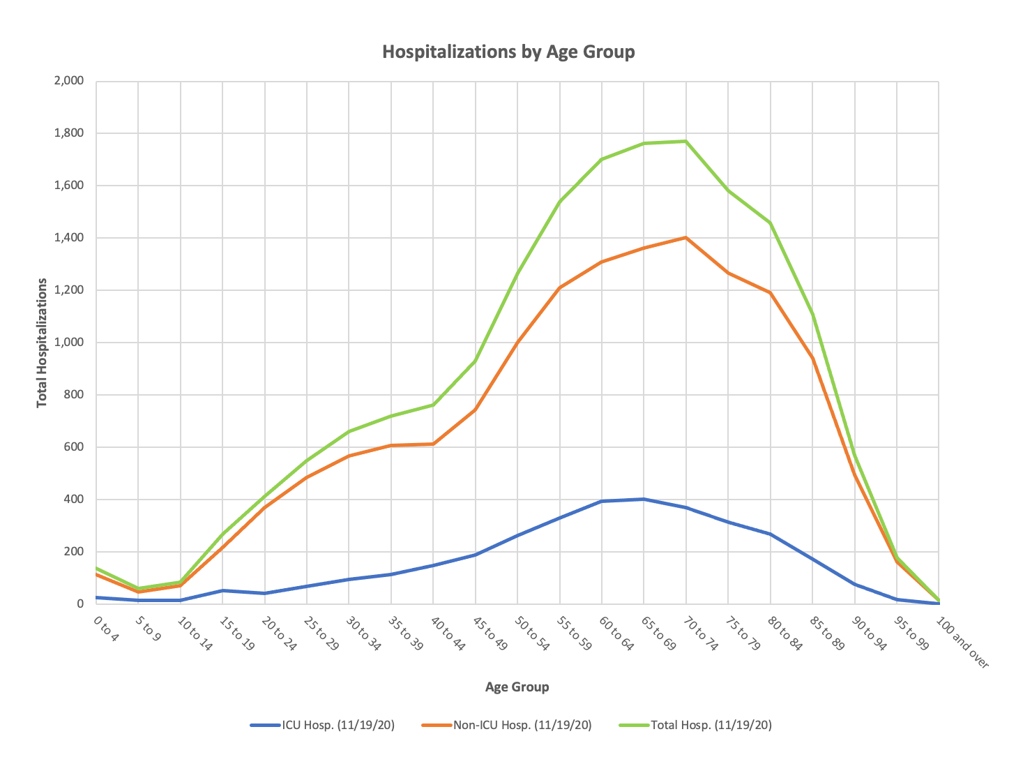
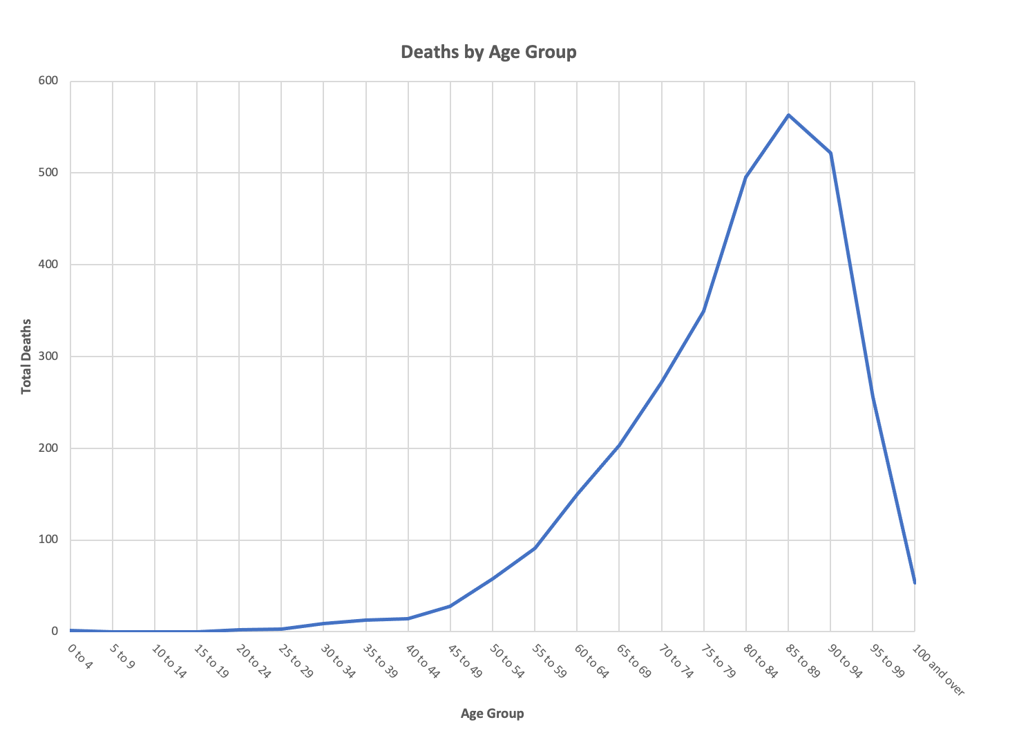
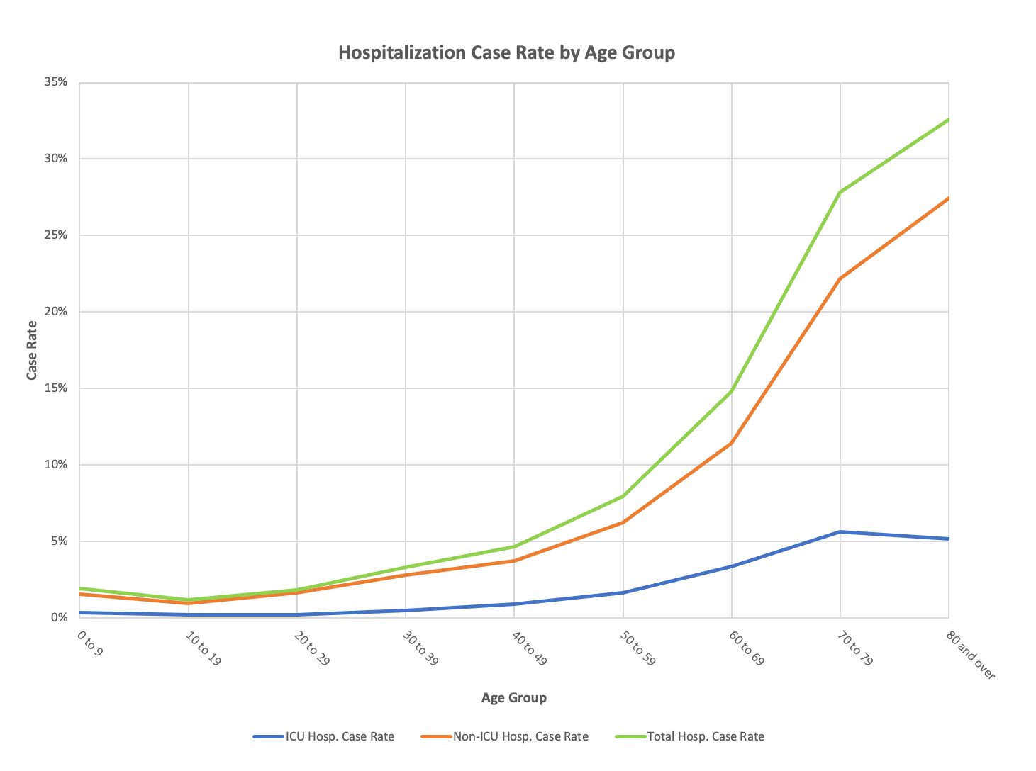
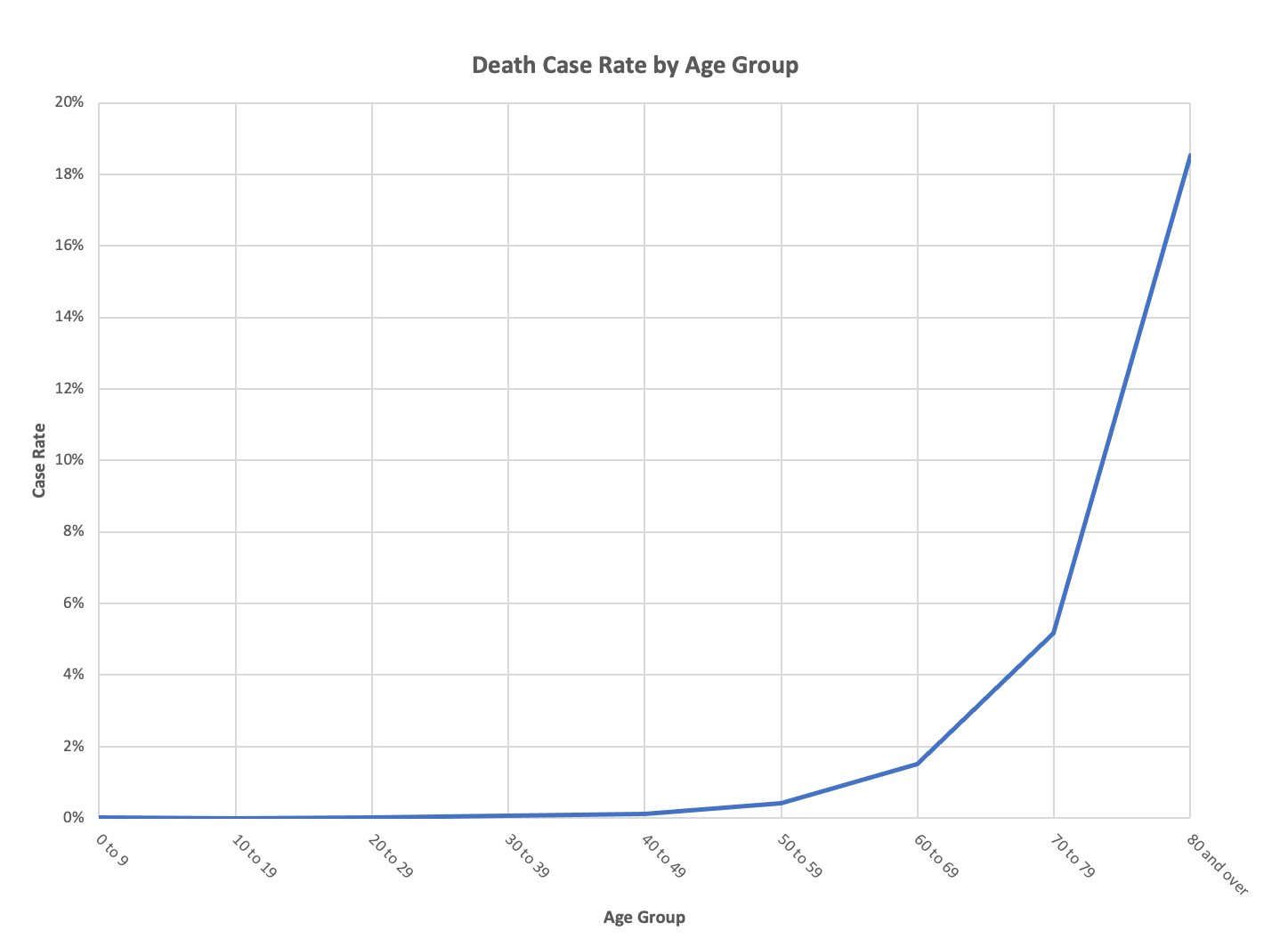
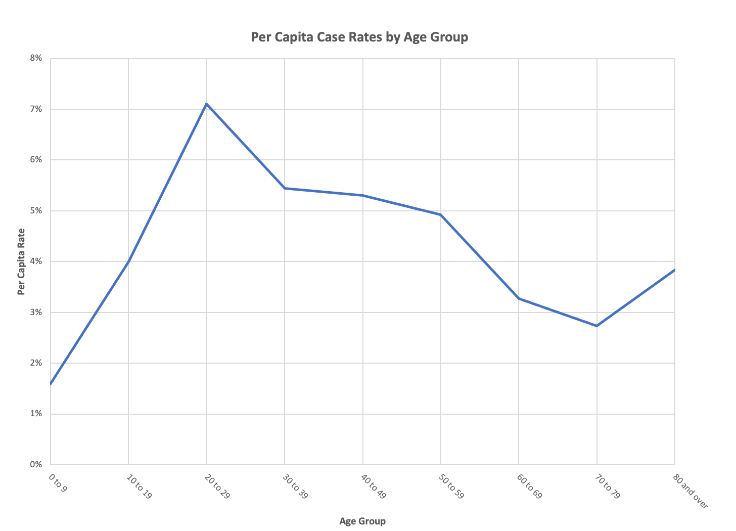
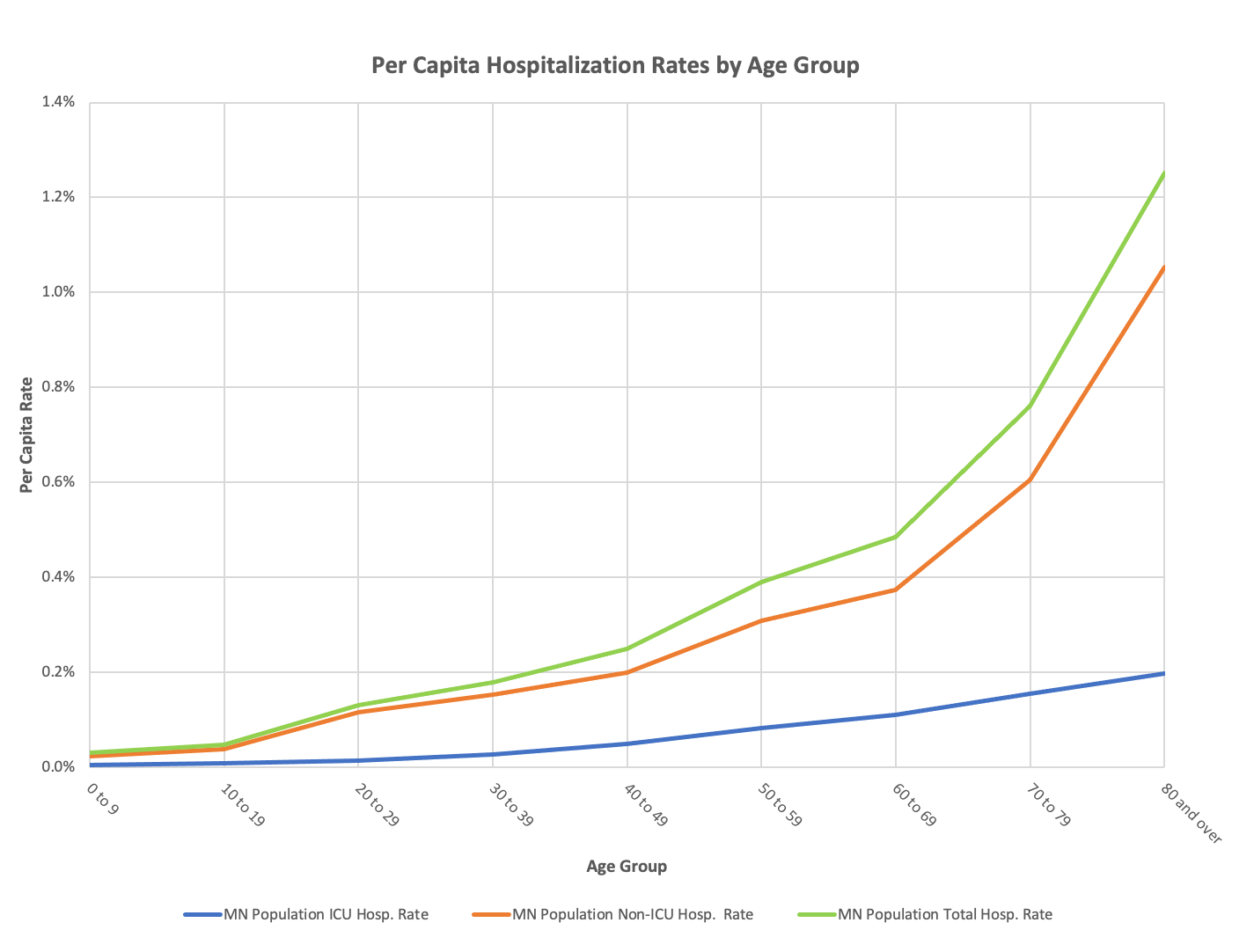
Below are some charts that show the age distribution of CV-19 in Minnesota. The first set show cases, hospitalizations and deaths by age. The next set show the hospitalization and death case rates by age. When I say that the serious illnesses from this pathogen are extremely bifurcated, you can see that here. The third set of charts shows the rate of cases, hospitalizations and deaths on a population basis by age. All this data comes straight from the Minnesota weekly report and the population numbers came from the Minnesota modeling paper. Unlike what the Governor and others at the state, and the hysterical media may lead you to believe, the risk to the general population in Minnesota is truly negligible, other causes of death are far more prevalent. I can’t thank both Lisa Jansa and DD enough for all the work they did to put these charts together and make up for my lack of technical skills.
Look at the deaths in particular. That is amazing skewing to the old. You would see more of this pattern in hospitalizations were in not for the widespread use of advance directives among the elderly. The rate charts show the skewing even more clearly. The population rate charts take the actual population of Minnesota for each age cohort and show you the percent with each of the events–cases, hospitalizations and deaths.
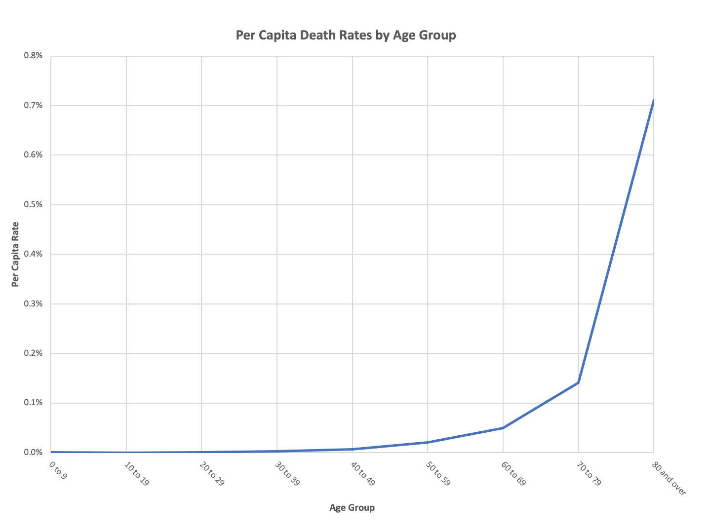

The last graph “Death Rate per Age Group Population by Age Group” is stunning representation of the low rate of mortality. The fact that the death rate percentage scale is less than 1% makes the graph look bad until you examine the numbers. If it was graphed in whole percent’s it would be an unimpressive graph indeed. The line would be nearly flat.
Curious about the next-to-last chart of hospitalization rates by age. The oldest cohort shows a 0.2% ICU rate and a 0.0% non-ICU rate but a 1.2% total hospitalization rate. Not sure I understand. Are there other hospitalizations besides ICU and non-ICU? How does 0.2 + 0.0 = 1.2??
Back in August I made a graph showing that, in the US, Covid19 with the US reaction to it did not cause deaths in any age group disproportionate from that age group’s normal deaths.
Blog posting: https://www.tranzoa.net/~alex/blog/?p=978
SVG Images: https://www.tranzoa.net/alex/blog/images/age_deaths.svg and https://www.tranzoa.net/alex/blog/images/big_age_deaths.svg
The idea is that these images don’t show a bubble in old-folk deaths during March/April when, presumably, the US had a bubble in C19 deaths.
Hope this helps.
But, running the stacked area graph program on current data says, “If you don’t want Covid 19 to single you out when it has nothing better to do, don’t be 45-64 years old.”