This is one of the most important charts I work on. Big thanks to everyone who helped me get the no longer needing isolation numbers and to DD and Lisa Jansa for help on spreadsheets and charts. Active cases is the people who could be infectious and spreading CV-19. The trend in that number is important for managing your response to the epidemic. Why the state of Minnesota doesn’t give that number to us is beyond me. I calculate it by taking total cases as of a day, subtracting the no longer needing isolation for that day and the total deaths as of that day. As usual, Minnesota doesn’t make this easy. The total cases for a day is best found in the table of cases by date of specimen collection, and those numbers change daily as new cases are apportioned out to the days the specimen was collected. You may recall from the lag analysis I did a couple of weeks ago that it can take a couple of weeks for most of the cases from a particular day to be identified. So the last few days of the analysis at any one time are going to be subject to significant revisions. The no longer isolating number, thanks to DD for ferreting out this calculation information from DOH, basically changes from day to day by rolling off new cases from 10 days earlier and a couple of other factors. It shouldn’t change much over time, but there is simply no way for me to access information on this, as there is no comparable table to that of cases by date of specimen collection. Then total deaths would also be subtracted, as they obviously aren’t an active case. So the formula is total cases as of a day minus no longer isolating on that day minus total deaths on that day. Now right now total deaths is a small part of the formula but again, the state insists on giving us deaths by report date, not actual date of death, so it is a little out of whack too. But I think we are directionally close.
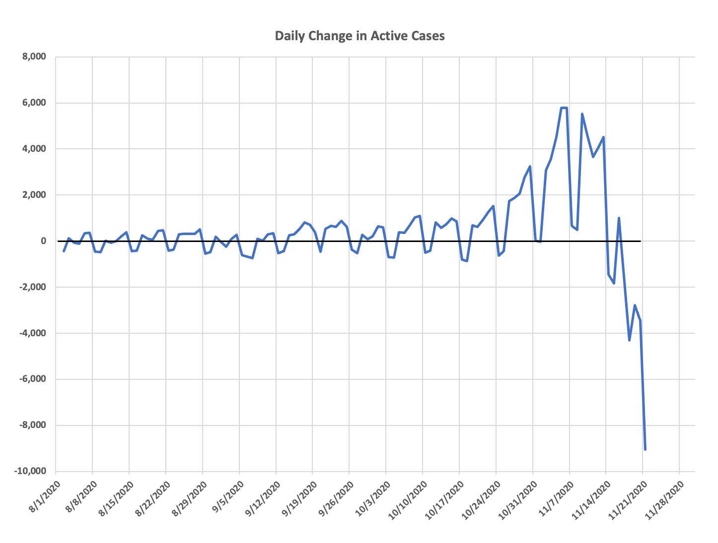
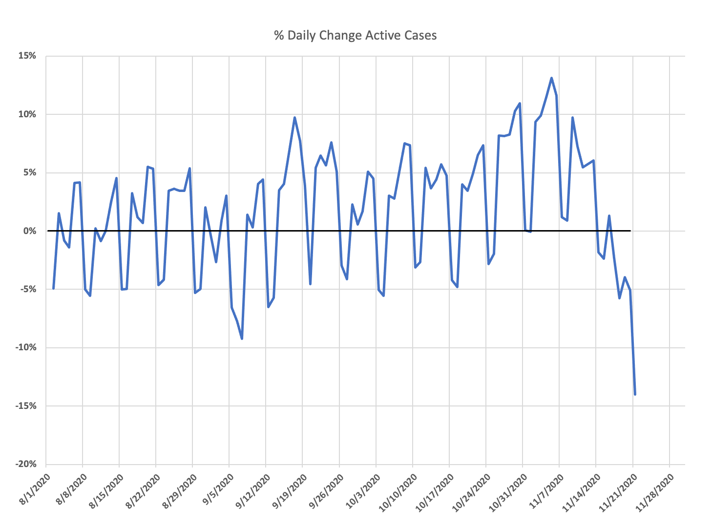
The charts below show active cases since August 1, the raw number change from day-to-day and the percentage change from day to day. Gives you a really good picture of how many people may be infectious out there. If you think we are under-detecting cases, multiply by some factor, I wouldn’t use more than three right now. You can obviously see negative or positives in the changes in active cases. When infections are growing rapidly, you will see positives as more new cases occur than old ones roll off. When things have plateaued or cases are declining, you will see negatives as more cases roll off than are added.
What the charts show now is the rapid growth in active cases mirroring the rapid growth in new cases. It is taking about two weeks for active cases to double, not exponential growth but pretty fast. Given what we know about asymptomatic spread, the actual period of infectiousness and other factors, I would consider this to be an upper bound on the number of people who have the potential to infect someone else. In reality, it is likely to be half or less that number. And undetected cases aren’t going to matter much, they are almost certainly asymptomatic, therefore not big spreaders.
The daily change in numbers shows that weekend effect that is actually interesting to think about. Realistically, the number of people who develop symptoms should be the same every day of the week, so this likely reflects forced health care visit and employment testing during the week, meaning there are a number of false and low positives in there. The weekend totals are more likely to reflect real symptoms and infectious people. Again, ignore the last couple of weeks, when I update this next week, those will be more accurately filled out as the case report lag ends for those weeks.
And the percent change per week is the number to really watch, it gives you the acceleration/deceleration trend. That trend bounced up in mid-September, plateaued at a slightly lower level, and bounced up a bit in the last few weeks.
Look at when the rise in active cases began. If this doesn’t show the raw seasonality of CV-19’s ability to infect people I don’t know what would. We cross the fall equinox and bam. Can’t help noting what a big difference that mask mandate made in the speed of growth, really slowed it dramatically.
I will update this regularly, at least once a week. I have thought about my own dashboard to show important stuff you can’t get from the state.
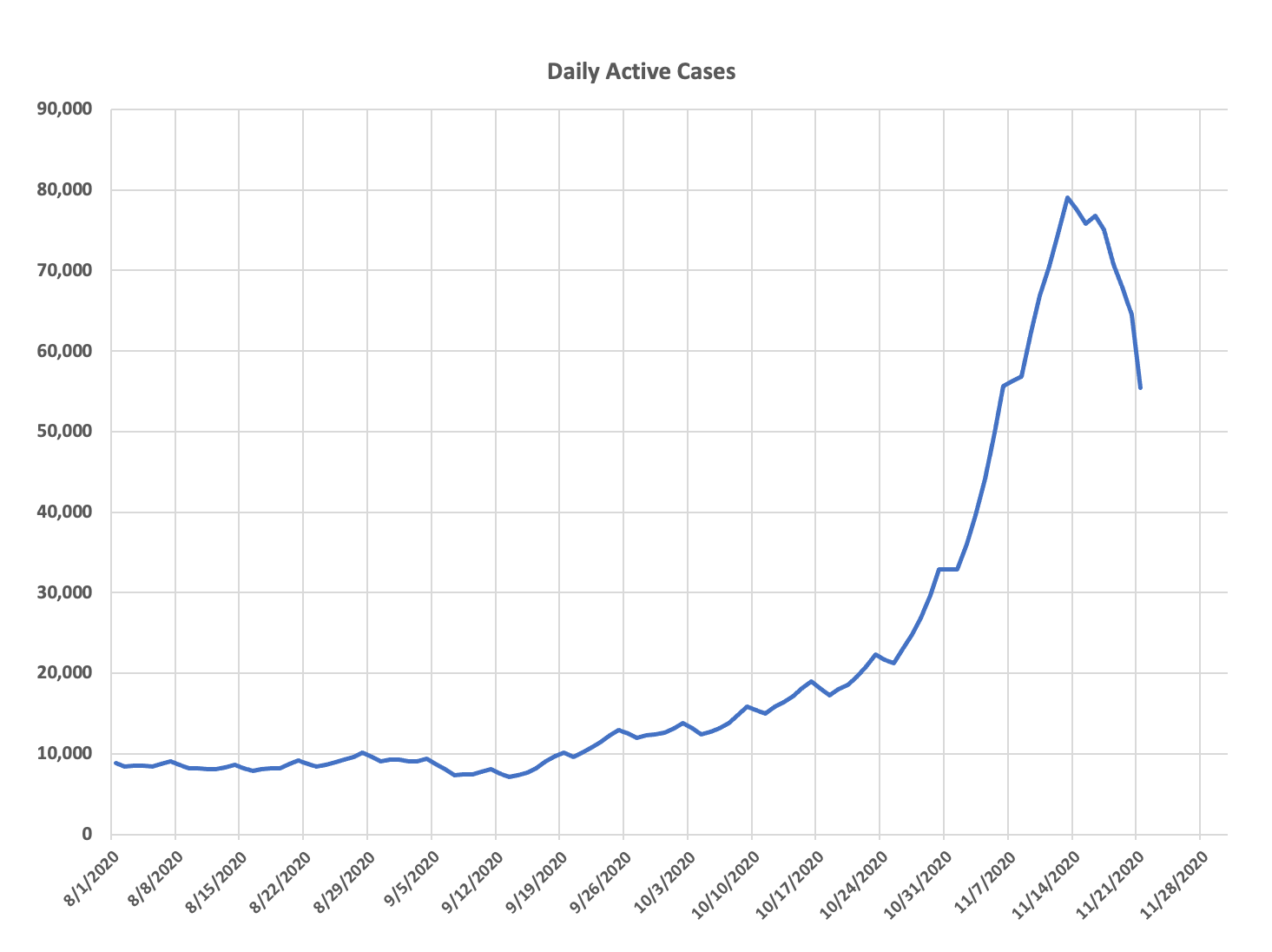

One additional data point on this topic to review is the active number of cases against the general population of the state. If you use a round number like 5,700,000 as the population, and divide the active cases against that, you get the general percent of the population that is active. During the period of time when the active case count was hovering around 10,000, the percent was approximately 0.15%. During the recent swell when active case count was around 80,000, it was almost 1.4%.
Just another way to see the round numbers of “how many out of one hundred” are potentially active.
And if you’re interested in considering this information at a county level instead of the state level, which is helpful considering the recent swell has been more among the rural areas instead of the metro, the state’s weekly report does break this down by county. It uses the same 10-day roll-off formula that is reported at the state level. For example, as of the 11/19 weekly report, Hennepin County had 0.9% active, whereas Aitkin County had 1.5%. Just some numbers for reference.
” Gives you a really good picture of how many people may be infectious out there.”
I wish we could go further with the data: how many people *not* in a confined environment, such as jails and nursing homes, are out there walking around? If 10 prisoners at a local jail have covid, it should have no bearing on whether a favorite bistro in the area should be shut down. Those prisoners are not going to be working in the kitchen or sitting at tables sipping chardonnay. Likewise if it is sweeping through a nursing home, those cases shouldn’t be used to decide to close in-person classes at a nearby elementary school.
What do you speculate as to why the virus surged when the season changed? Consider the difference in seasonal weather between Minnesota and Arizona.
Arizona’s CV-19 surge lagged months other U.S. regions. Our first “big wave” of cases began in early July and abated in August. Our “second wave” began in November and it shows signs of having peaked (though it’s too early to be sure).
One theory for Arizona’s July surge was that many Arizonans got sick when they were forced indoors by the intolerably hot outdoor temperatures. But since the fall equinox Arizona has experienced ideal “outdoor” weather. It’s been perfect–low 80’s with no humidity.
I am guessing, and it is just that, that the amount and intensity of sunlight may be a factor as well, but honestly I don’t think anyone has a really good explanation for the geographical pattern. Why the south and southwest got hit so hard in summer is interesting. Humidity is high and so are temps, which the virus doesn’t like, so maybe the indoor thing is the explanation
Your second wave in Arizona coincided with the migration of the Snowbirds starting to arrive from the North. That changed your population by introducing new people from outside your area. Once they are most there, the rate will start to fall.
It’s an amazing trend. The outbreaks have very much tracked to the climate conditions (too hot, too cold) that forces people indoors.