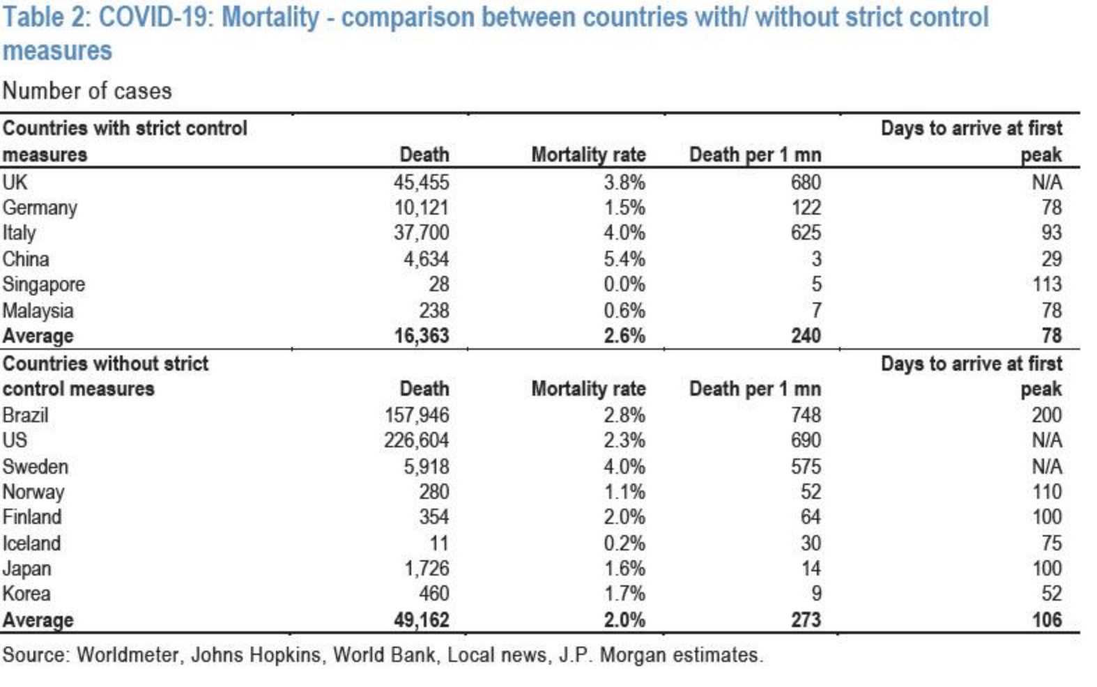
The JP Morgan report should have laid out a very clear picture for everyone that lockdowns simply are a bad tool, may make even the health toll of an epidemic worse. Here are a couple of charts from that report. The first shows cases in different countries. Interesting to see the varying patterns. Remember that testing variation has a lot to do with this. But if you think about the level of attempts to suppress the virus in each of these countries you would see great variation there as well, with no consistent association with cases. Brazil is interesting because they weren’t too tough and may be done now. India was tough, but also may be done. Hard to know with the geographic factors that seem to affect spread enormously. The second chart shows mortality and again, if you look at lockdown strategy, if any association is there, it is for more mortality with stricter lockdowns. But I would again urge caution in inferring causation in either direction.


I am sending this information to my county executive Barry Glassman, Harford County Maryland. In a county of 255,000 people we have 4.500 cases and 81 deaths. Only 29 in the hospital and a few ICU beds and yet they have closed public parks to organized sports, can be in the park if social distant, govt empl to work remote, schools closed….I can’t take it. I wrote to him and said enough. Get out of my way, give me information and stop all the unconstitutional mandates and lockdowns. Our governor is worse.
Wondering if Brazil is low as they are entering the spring/summer season?
That is another possible explanation, but antibody prevalence surveys suggest that in the cities at least, they may have been well over 20% prevalence, which would slow transmission.