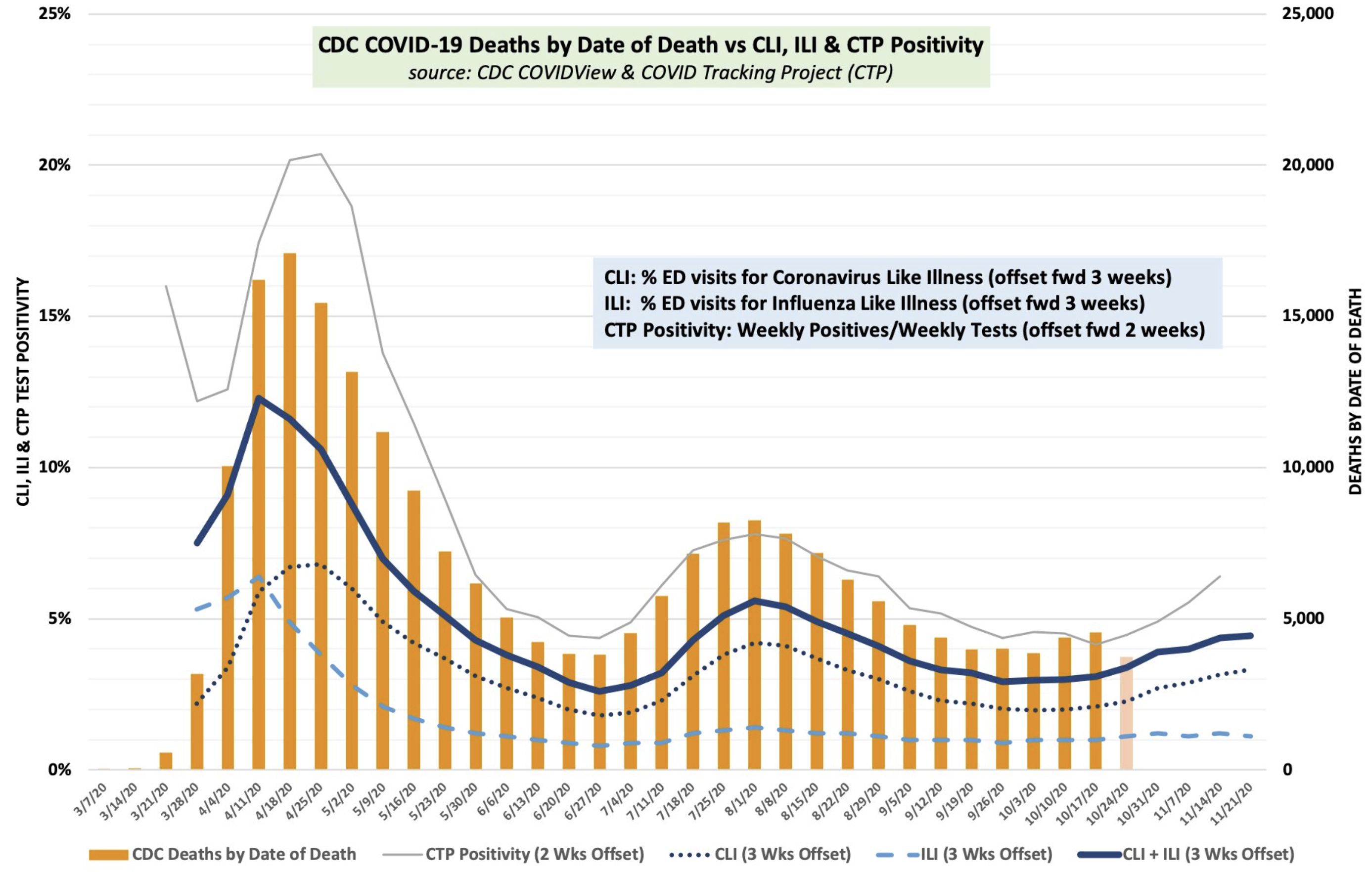
This chart, courtesy of TLowdon on Twitter, gives an interesting perspective on how the current case swell has not turned into as many deaths. Note also the correspondence to visits for either influenza-like illnes (ILI) and Covid-like illness (CLI). The non-death trends are offset to account for average lags from one event the other. This would suggest that we are already plateauing in cases. Note too that if this chart is an accurate depiction of the course of the epidemic, that the second surge was significantly lower that the first and this one appears lower than the second. So far so good, for not having to worry too much about a long winter wave of cases. But again, this is an unknown virus, so we will see.