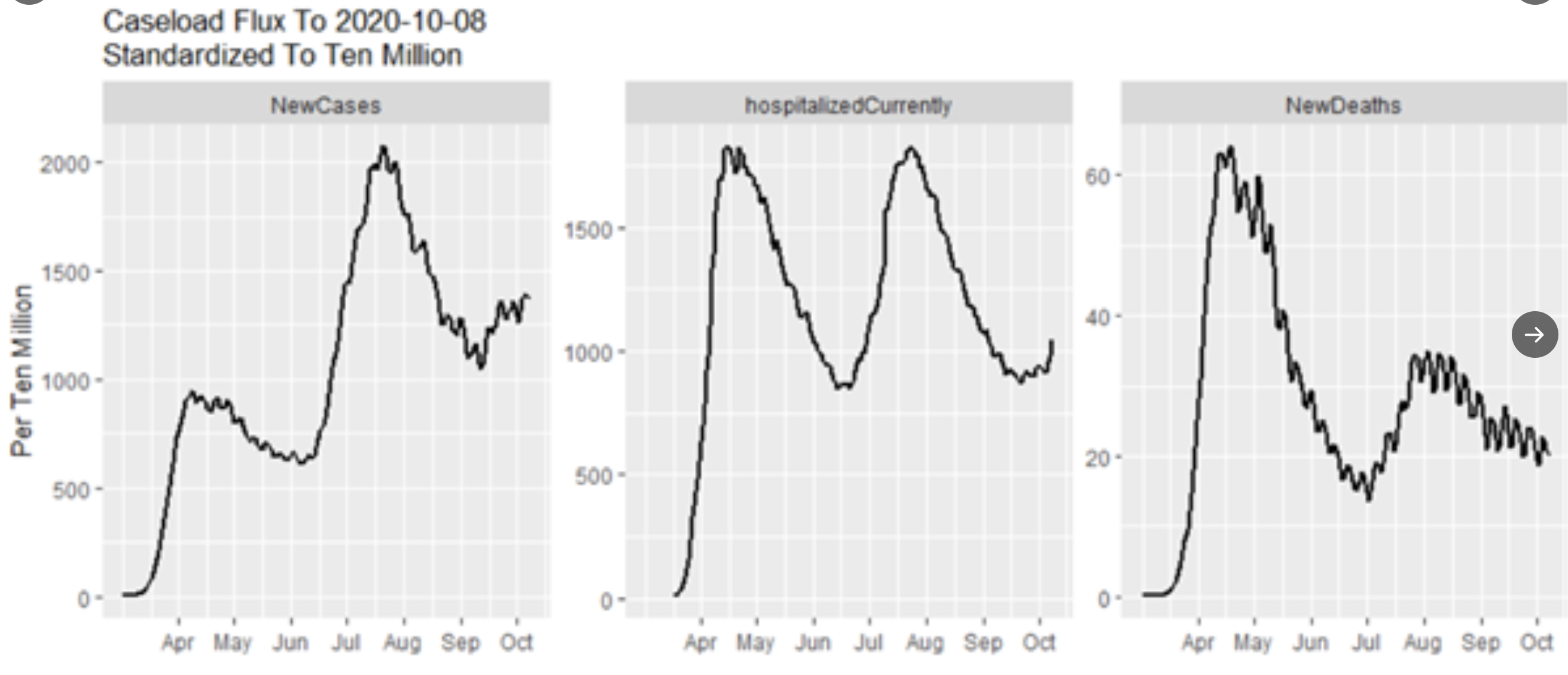
Bunch of charts and data coming in the next couple of days. Here are two charts, thanks to Steve McIntyre on Twitter, which reflect the course of the epidemic in the US. The first shows cases, hospitalizations and deaths per ten million of population across the US. Unclear if the deaths are date reported, but I believe they are since the data is from the Covid Tracking Project. You can see that cases are likely influenced by level of testing and appear much higher in the Southern wave than the Northern one. Hospitalizations, as readers have pointed out, tend to be a more reliable indicator of actual severity, were relatively even in the two waves and have not yet risen substantially based on the increase in cases. And deaths have stayed at the lower level, again, at least so far, with no uptick. So when you look at this data, it is important to remember that “cases” have a lot to do with testing levels, false and low positives, and other factors. Hospitalizations can be gamed some, but are the best indicator we have of disease severity trends. And deaths obviously tell us something about ultimate outcomes, but have been heavily gamed in a way that boosts the numbers. Deaths as a percent of cases may be down because of lower average age of cases and those hospitalized, better treatment protocols and the front-loading phenomenon I have discussed before.
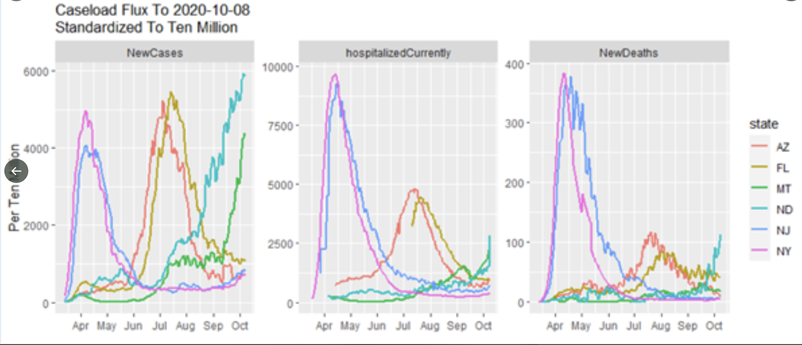
The second chart shows a few select states. You can see how basically unperturbed the traditional epidemic curve was in places like New York and New Jersey. And those were places where the number of cases detected and show on the chart is likely a very small fraction of all cases in those states. No matter what Andy Slavitt says, these states did nothing to flatten the curve. The Southern states appear to have as many cases, but this is a testing artifact. Clearly did a better job with hospitalizations and deaths. And the states experiencing a current rise in cases also show the effect of the massive amount of testing we are doing, but appear to be still climbing in hospitalizations and deaths. And again, I would really like someone to figure out exactly why the geographic pattern is what it is.