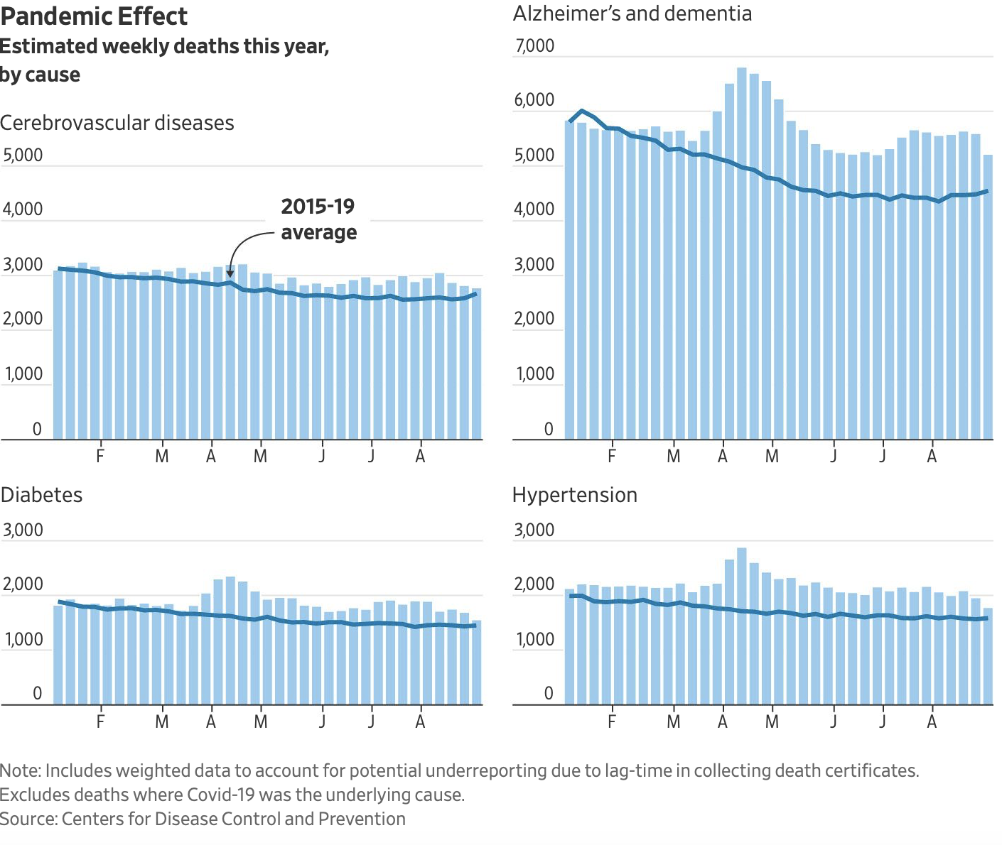
From the CDC and the Wall Street Journal story, this chart shows excess deaths in certain categories, where the blue bars rise above the trend line averaging prior years. Note especially the impact isolation is having on Alzheimer’s and dementia patients.

To quote all the fear mongers, politicians and voodoo science the number of “cases” is rising but for this increase they have NO response. Thanks to Governor DeSantis who boldly proclaimed this will never happen again. We will never shut down florida
In Florida they like to “Baker Act” people with dementia and thus tap into their Medicare.