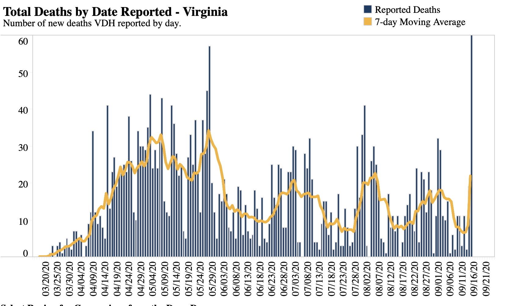
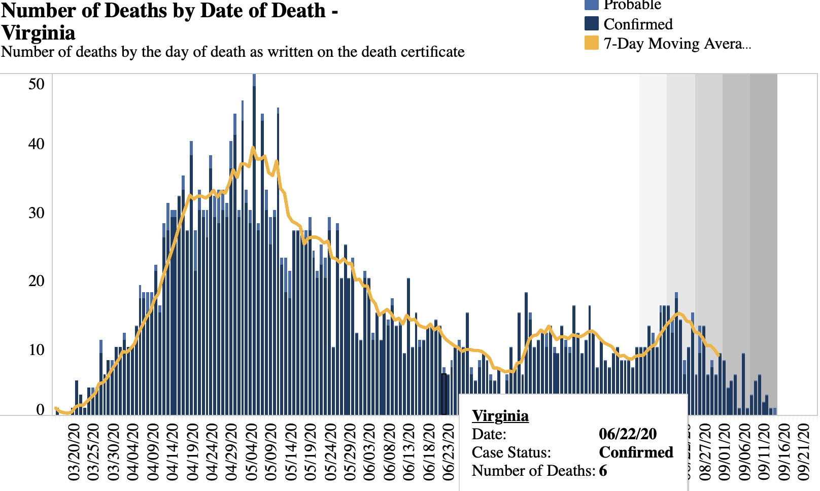
Minnesota is a little bad this way, Virginia is crazy. Look at these two charts, the first is deaths by date reported. Looks like Virginia just constantly is having a steady stream of deaths, with somewhat of a peak earlier. Now look at the second chart, deaths by date of death. It is very clear that there was a big serious case wave with deaths and then it dropped off quite a bit. The difference between the charts also tells you just how many deaths are being treated as CV-19 ones long, long after they occurred. Apparently this is happening in many states and accounts for a very large number of the deaths currently being reported, giving a misleading picture of where we actually are.

Can it be the health commissioner is misinterpreting the data? I ask because he’s on record saying he’d mandate a vaccine without exceptions. ‘Public health over private rights’ as he put it. /Lionel Hutz shudder.
It is amazing that so many governmental agencies, commissioners, and staff are all throwing the same “Hail Mary” pass down the field. Blatant lies, manipulated data, gibberish about risks, moving of goal posts, avoidance of any discussion about goals.
Again, we can see they are not very good risk managers. But what happens if their long pass down the sideline is dropped? Has no one thought about their reputational damage and how long it will take to earn it back? Are they all that close to retirement on a nice, fat, government pension?
Both methods give a poor view of what is happening. The first because it reports deaths on the day reported and so it doesn’t tell us how many occurred on any particular day. The second because a large percentage of deaths in recent days and weeks have not yet been reported and when they are, it will change the picture dramatically. The CDC data closes in on relatively final data at around 6 weeks. We can look at today’s graph from the beginning of the pandemic up to about 6 weeks ago and be confident of that picture.
To get a better view of the recent pandemic, estimate the percentage of deaths which are reported 1, 2, 3, etc., days after the actual deaths and build a model graph based on those ratios. I took the easy way out and plotted the number of deaths initially reported by the CDC each week. This isn’t perfect but it should give a general idea of what is going on. It required going back through each weekly update and taking only the latest week on each table. It turns out that the truth is somewhere in between the two graphs which plot the date of reported death and the actual date of death.