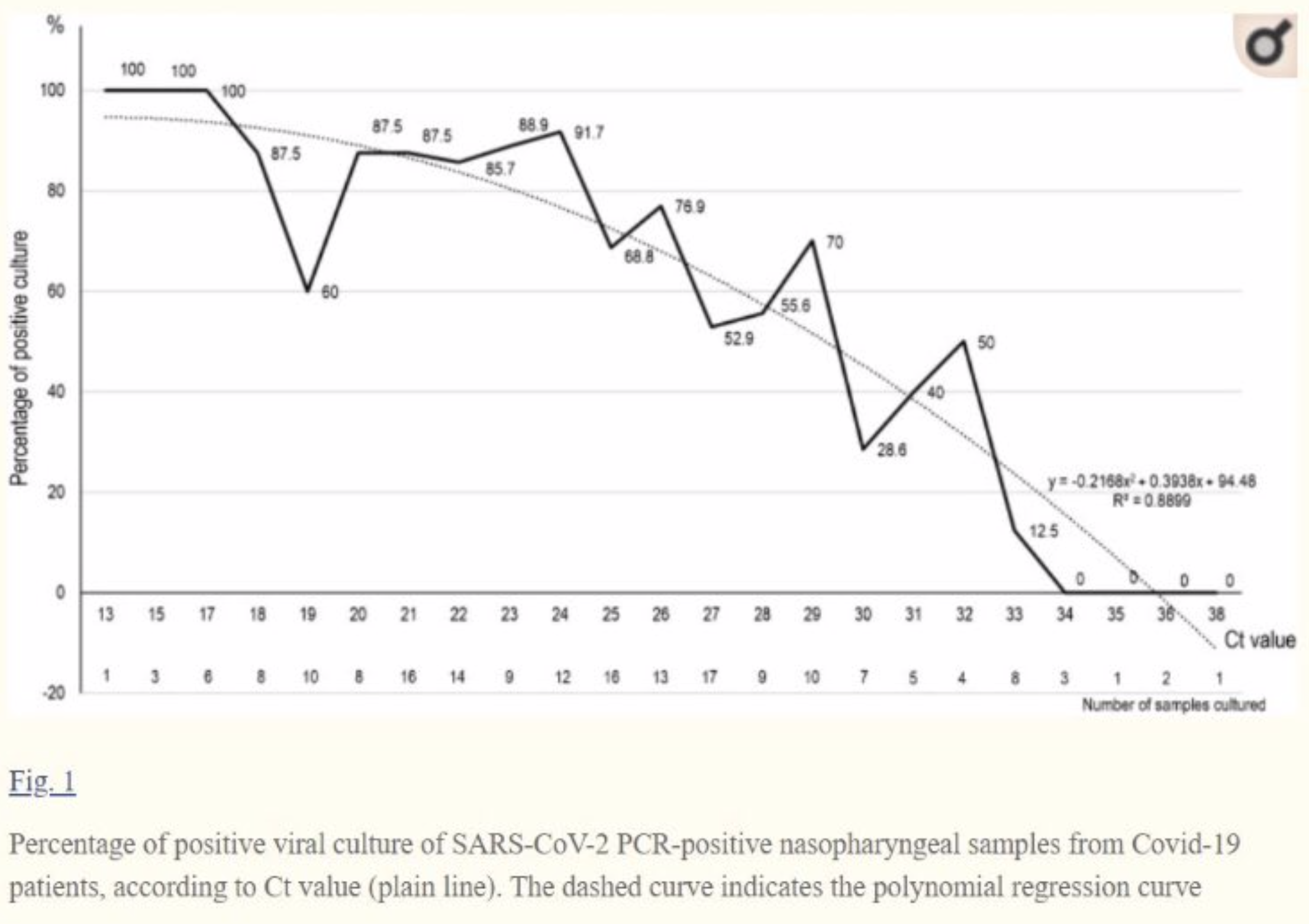
Here is another graph of PCR Cycle number versus culture positivity. Here is why I am beating on this. People take case positives and make decisions that drastically affect people’s lives based on them. Close schools, close businesses. Quarantine and scare the hell out of people. Culture is the gold standard method to determine whether there actually is viable virus in a sample. These studies and graphs are the best I can find showing the relationship between cycle number and culture positivity, and they cluster around the same relationship, suggesting that cycle number can be used as a proxy, but cautiously. As I pointed out in the earlier post, over 30 cycles is getting questionable, at 35, you are getting mostly non-infectious “positives”.
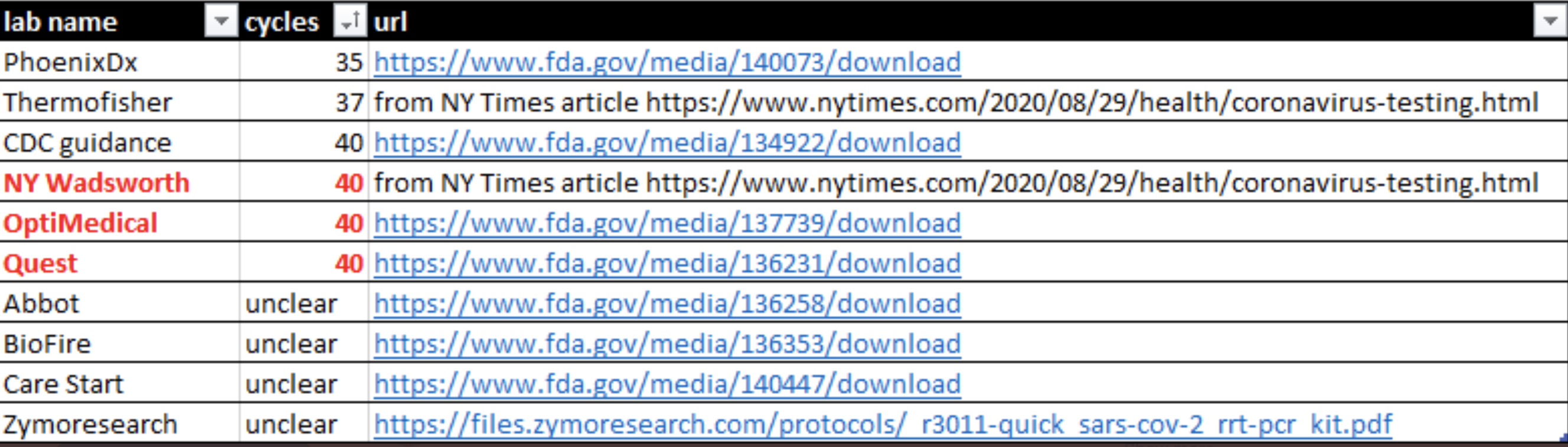
Below the chart is a screen shot, thanks again to Twitter, of cycle times major labs say they are using as their threshold. Now you see what the New York Times article was about–we are probably getting a lot of “cases” based on non-infectious test results.