I am tracking the CDC reports for Minnesota on the week in which a CV death actually occurred and comparing it to the Minnesota date of report numbers. In the several weeks of CDC reporting since I last posted on this, it is amazing how many deaths continue to be from weeks ago, and especially those posted by the CDC in the last week. You don’t see it in the table but I did a pull a week ago from the CDC spreadsheet, and a large number of deaths were added to those earlier weeks just in the last week. I don’t know if that is certifiers being slow in getting certificates to Minnesota, Minnesota’s slowness in reporting to the CDC, the CDC’s slowness in processing, revised death certificates, or what, but it is fair amount of change from a pretty long time ago. The total lags can’t be long, because Minnesota is reporting 1699 deaths as of the end of the last week the CDC is posting deaths for, and the CDC has a total of 1671 Minnesota deaths. So this week when there was a day the state reported 17 deaths, and a couple of weeks ago when the state reported a 12 death day, all of those deaths were likely coming from much earlier.
15 new net deaths were added for weeks in April between my CDC pulls!! 17 were added to May. Another big jump in June. Below is the chart showing the difference between date reported and date of actual death, with a line based on each of the CDC pulls, and a supporting table. Interestingly, without mentioning it, in the weekly report Minnesota started adding a chart of hospitalizations by week in which the hospitalization started and a chart of deaths by week in which they occurred. Unfortunately there is no underlying table reported, so you have to guess at numbers and can’t easily calculate how they change from week to week. The state should just give us all the data by date of death.
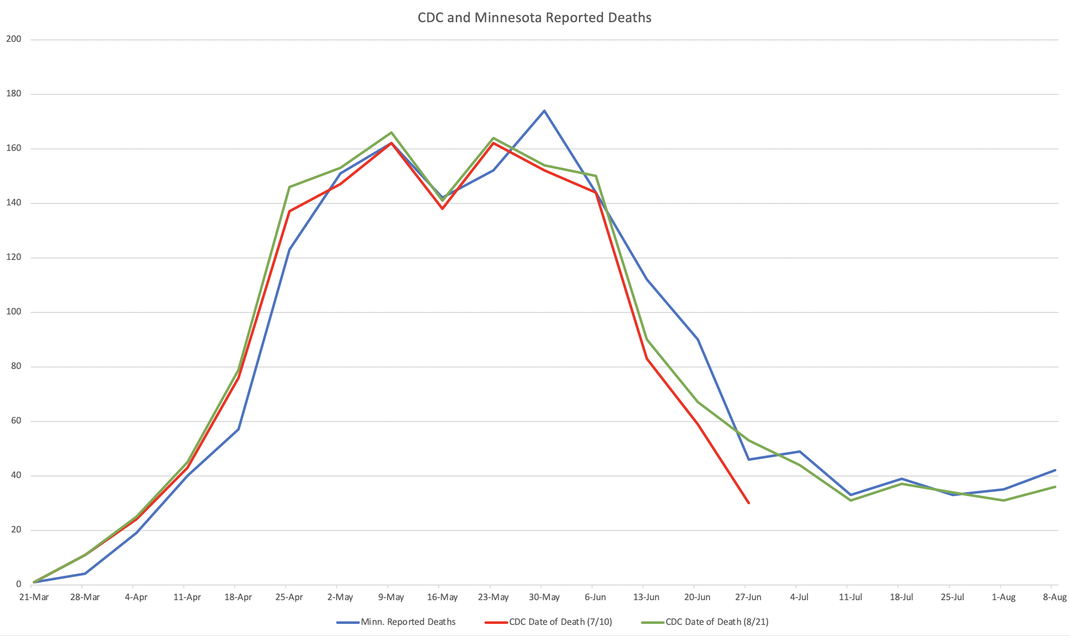
| Week Ending | Minn. Reported Deaths | CDC Date of Death (7/10) | CDC Date of Death (7/31) | CDC Date of Death (8/21) |
|---|---|---|---|---|
| 21-Mar | 1 | 1 | 1 | 1 |
| 28-Mar | 4 | 11 | 11 | 11 |
| 4-Apr | 19 | 24 | 26 | 25 |
| 11-Apr | 40 | 43 | 44 | 45 |
| 18-Apr | 57 | 76 | 78 | 79 |
| 25-Apr | 123 | 137 | 145 | 146 |
| 2-May | 151 | 147 | 151 | 153 |
| 9-May | 162 | 162 | 165 | 166 |
| 16-May | 142 | 138 | 140 | 141 |
| 23-May | 152 | 162 | 163 | 164 |
| 30-May | 174 | 152 | 153 | 154 |
| 6-Jun | 144 | 144 | 149 | 150 |
| 13-Jun | 112 | 83 | 90 | 90 |
| 20-Jun | 90 | 59 | 65 | 67 |
| 27-Jun | 46 | 30 | 50 | 53 |
| 4-Jul | 49 | 43 | 44 | |
| 11-Jul | 33 | 30 | 31 | |
| 18-Jul | 39 | 31 | 37 | |
| 25-Jul | 33 | 18 | 34 | |
| 1-Aug | 35 | 31 | ||
| 8-Aug | 42 | 36 | ||
| 15-Aug | 51 | 13 |

I noticed this same thing in South Carolina a few weeks ago when I started reading some local news sites to see what the prevailing “wisdom” was regarding schools reopening. Of course every local news site in Charleston has a scary looking false color microscope image of a Wuhan virus particle front and center. Superimposed on that terrifying image is the daily case and death count. The death tolls seemed high to me so I checked the data on scdhec.gov and saw that the majority of the deaths had happened some day or week in the past.
I believe reporting on the deaths deliberately obscures the date context to make trends appear worse to the casual observer.