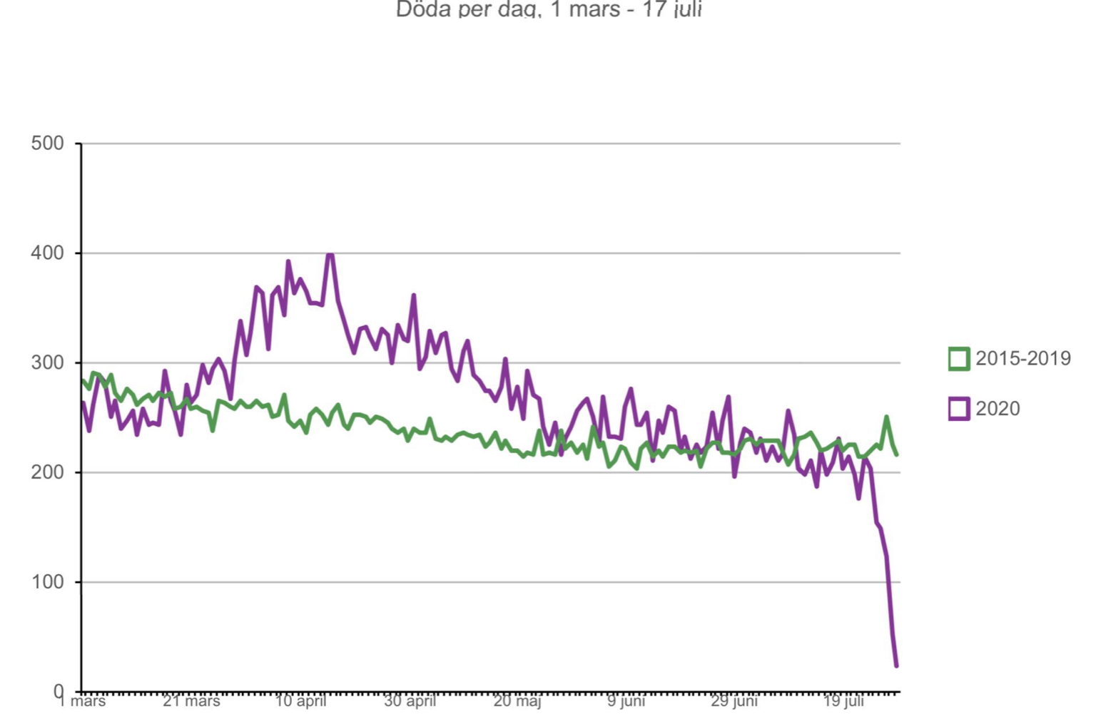
Here is another cool chart courtesy of Twitter. What is especially noticeable is how daily deaths rose above the average in the first part of the epidemic, up and down the steeper peak, and then dipped below average as it hit the long right hand tail. Data lags make the last few days not complete and accurate, but I would expect that total deaths will be below average for some time, due to deaths of the frail elderly being pulled forward by coronavirus. I expect we will see this kind of chart in every country, including the US, in which total deaths may appear to dip below average after the worst of the epidemic has passed. This will complicate excess deaths due to lockdown being understood. Not only will the analysis need to be done by cause of death, but looking at age and where people lived as well. The deaths pulled forward will be among the very old living in nursing homes, often suffering from dementia.

Another courtesy of Twitter, Yinon Weiss. That same death trend seems to be happening in NYC. And Stockholm has twice the population density of NYC. Sweden never shut down. Yinon concludes:
“No matter the intervention policy, hot spots decline when reaching ~15% antibody expression
Given a sufficiently large sample size, all hot spots stopped at 20-25%
Masks, businesses, schools, etc. all fail to explain it”