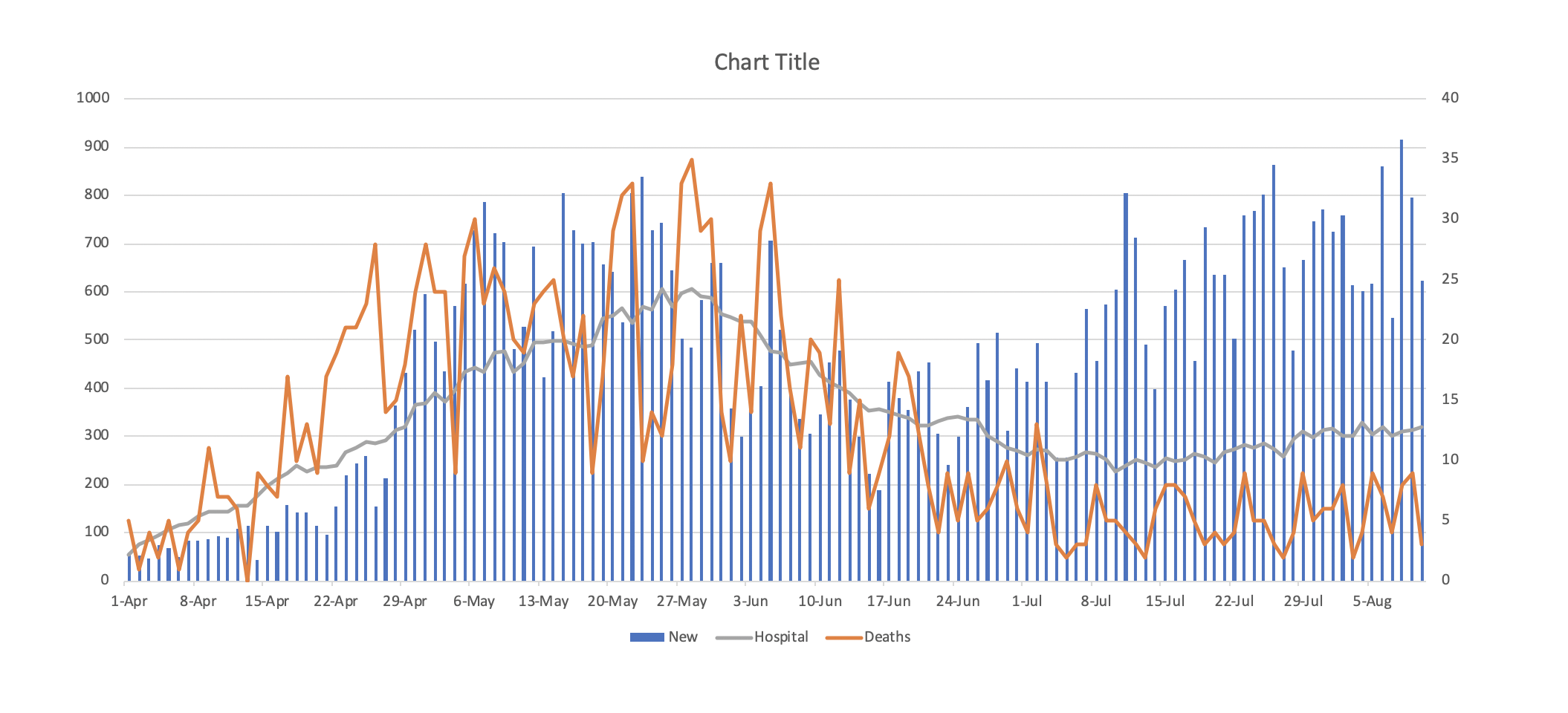
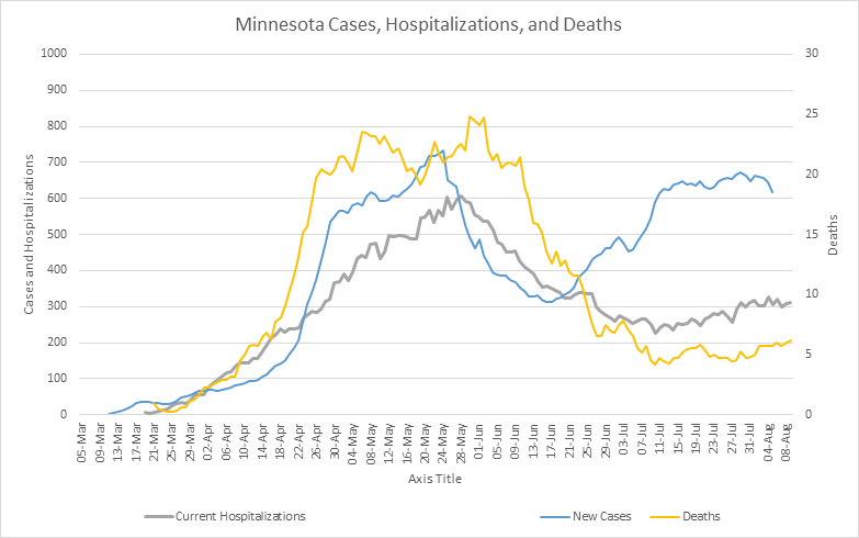
I am very comfortable looking at all kinds of data, I think I have a good sense of what is important to understand about the data and I try to appreciate both the benefits and limitations of data. But I am terrible at graphing the results of what I find, so I am deeply appreciative of the readers who have helped me make what I find visual, or have sent me the results of their own work, or who send me articles or data sources I may not have found. And for readers who make comments, I try to reply to every one with a personal email, so I appreciate all the comments as well. In any event, the Minnesota trends graphs I have posted don’t show much detail on deaths, so a couple of readers suggested putting deaths on a different axis scale and did that, and it does show the dramatic decline in deaths even as cases returned to May levels. The first chart is courtesy of C. Nelson and the second from J. Donaldson. Again, thank all of you for reading and for helping. I am hoping that equipping myself and readers with better data can help all of us persuade others that a different policy approach is appropriate.