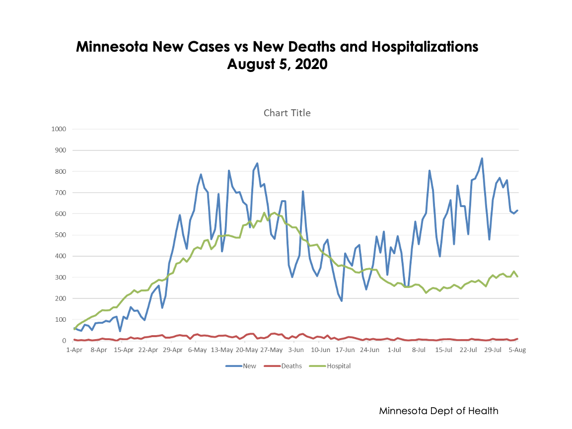
Rational assessment of facts and data is the best antidote to fear and anxiety. Here is the current chart, thanks to C. Nelson, on the daily cases, hospitalizations and deaths in Minnesota. See that huge recent surge in cases the State keeps talking about. No, you don’t. See how hospitalizations have stayed as high as they were in May. No, you don’t. See how deaths have jumped up. No, you don’t; they have largely flatlined. So when people reference the garbage tossed out by fear-mongers, show them this.

Another great chart! Thanks! Just sent it to some loved ones who used to live in MN.
Unfortunately, facts don’t matter. I have several friends who are very smart, but their minds are made up that everything and everybody must be shut down until this magically goes away. As Joe Biden would say, they prefer truth over facts.
Could you put deaths on a secondary axis? Or link to the data and I’ll do it. I think it would show, importantly, the real relationship between cases and deaths, and hospitalizations and deaths.