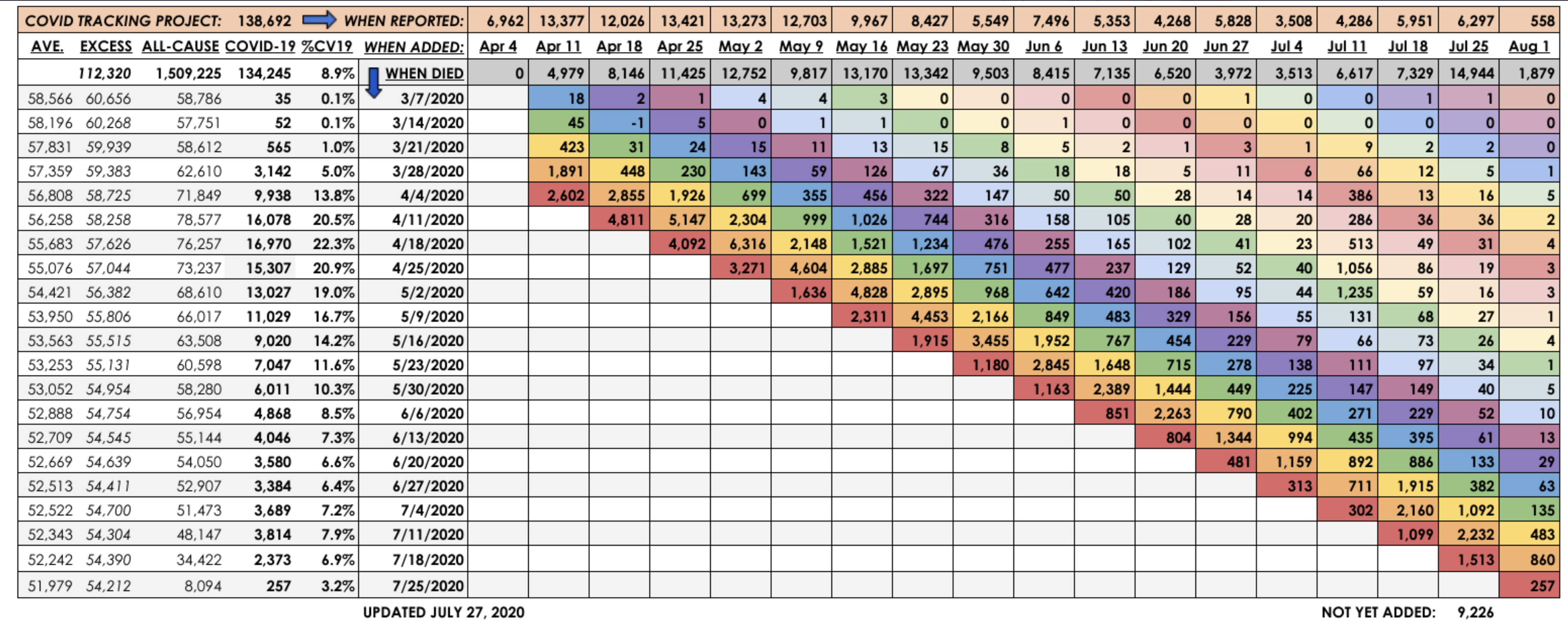
Below is the latest update of Kyle Lamb’s chart taking CDC data and showing actual week of death versus when the deaths were reported or added by the CDC. You can see the deaths from the case surge in the southern and southwestern states beginning to show up, but there also continue to be a number of deaths added to even earlier weeks. I would anticipate a couple of more weeks of significant death additions, but since cases and hospitalizations have rolled over, and severity is down in this wave of cases, we aren’t going to come close to anything experienced in the earlier weeks of the epidemic.
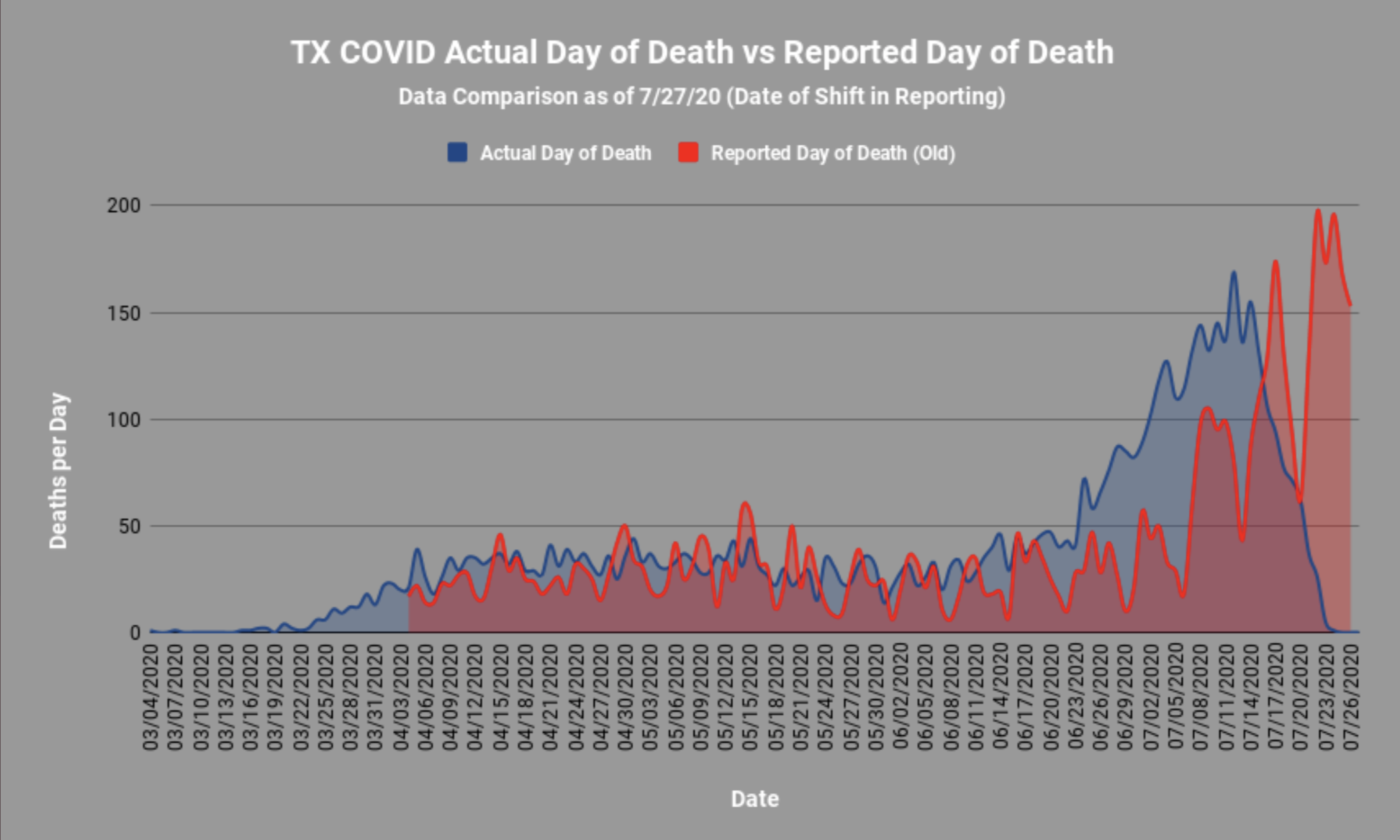
In addition, there is a chart showing the comparison of date of death versus date reported for Texas. As all these analysis do, it shows a distinct left-shift for actual dates of death. This chart also shows the artefacts of how reporting occurs, tending to lump on certain days of the week, which also distorts the reality of the epidemic. Note that the last few days are very incomplete for Texas, due to the usual reporting lags. I would expect we will see a plateau and then the usual long right-side tail that tapers down fairly rapidly.