Arizona, Florida and Texas are taking a lot of heat, clearly politically motivated, for supposed out-of-control epidemic surges. Look at this chart and tell me who was out-of-control. Again, on a population basis, NY was dreadful, inexcusably dreadful. Might be more susceptible old people in Florida and Arizona than New York too, so I suspect on an age adjusted basis New York looks even worse. In all sincerity, Governor Cuomo should say nothing, absolutely nothing. It appears that the epidemic just basically ran wild in NY, with reports of very high antibody prevalence in some areas. And if you did this chart on the basis of cases, with a similar testing approach, you would get the same chart.
✅ Subscribe via Email
About this Blog
Healthy Skeptic Podcast
Research
MedPAC 2019 Report to Congress
June 18, 2019
Headlines
Tags
Access
ACO
Care Management
Chronic Disease
Comparative Effectiveness
Consumer Directed Health
Consumers
Devices
Disease Management
Drugs
EHRs
Elder Care
End-of-Life Care
FDA
Financings
Genomics
Government
Health Care Costs
Health Care Quality
Health Care Reform
Health Insurance
Health Insurance Exchange
HIT
HomeCare
Hospital
Hospital Readmissions
Legislation
M&A
Malpractice
Meaningful Use
Medicaid
Medical Care
Medicare
Medicare Advantage
Mobile
Pay For Performance
Pharmaceutical
Physicians
Providers
Regulation
Repealing Reform
Telehealth
Telemedicine
Wellness and Prevention
Workplace
Related Posts
Commentary
December 2, 2023
Update on One of the Worst Climate Lies
The infamous Mann hockey stick which showed large temperature rises is revealed to be even…
Commentary
November 30, 2023
How Are Family Finances Really Doing?
A detailed look at American family finances suggests that the wealthy are doing great but…
Commentary
November 30, 2023
Is the Economy “Strong”?
While the economy supposedly is cooking along, unsustainable government and consumer spending are the major…
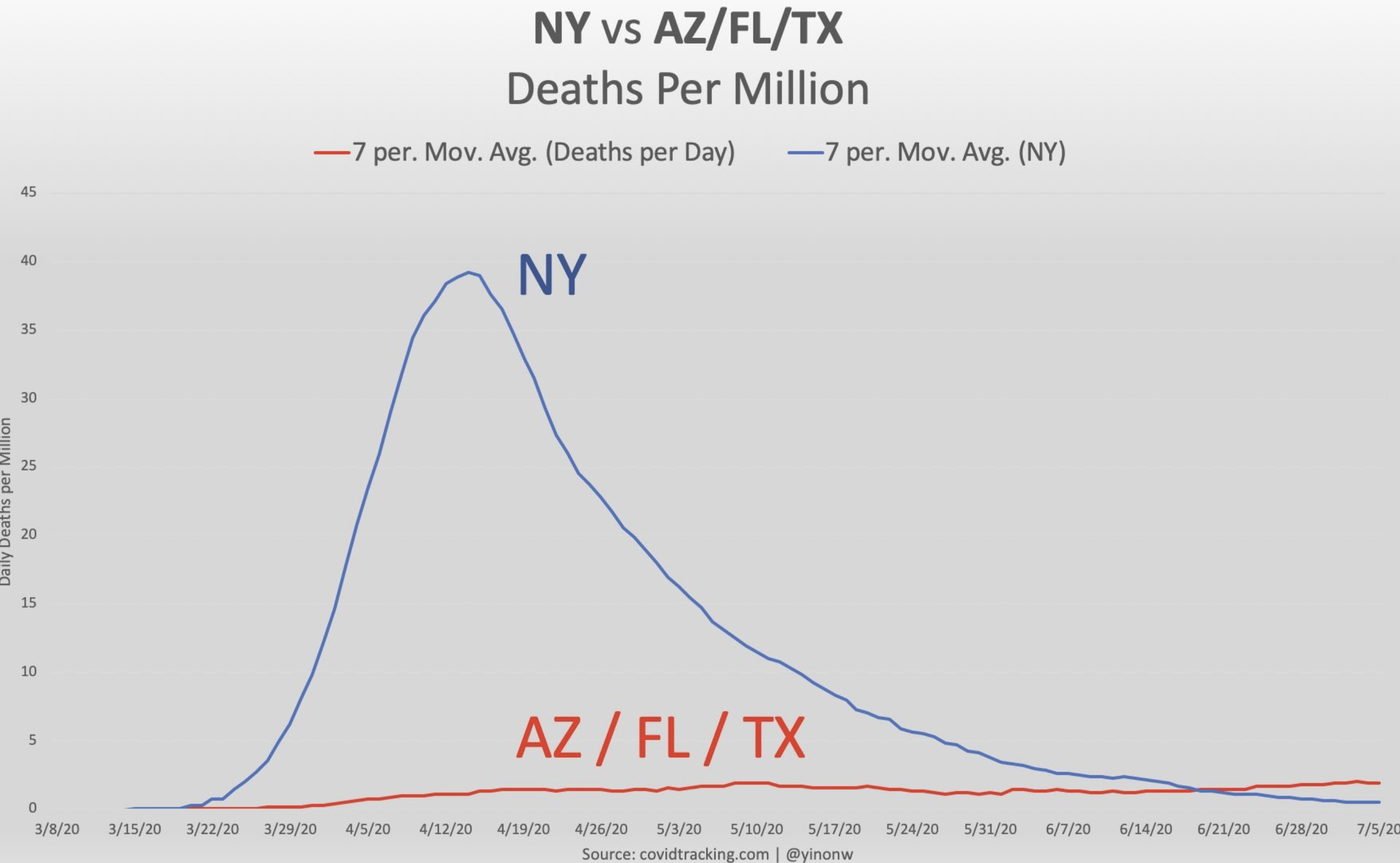
Wow! Is that chart right? Wow.