I am going to post a few graphs in the next posts. I got these graphs largely from Twitter, and being technologically inept, I am proud that after weeks, I finally figured out how to copy them. I also want to give a lot of credit to some of the people doing very good work analyzing and presenting data from around the country on Twitter. Kyle Lamb, Phil Kerpen, Aaron Ginn, Wyatt Sheepie (probably just a twitter handle), so I want to acknowledge their work and I am using it for many of these graphs. There are others I probably missed, but will try to mention as I repost these graphs. And please, if you use Twitter, check these people out or let me know if you see others worth following. And I want to thank the readers who have sent me links or helped me with technology issues, including C. Nelson and D. Wennen and others would didn’t want to be listed; all of that help makes better information for people to share. And please do share as widely as you can, it is the best way to make a dent in misleading data often used to justify public policy.
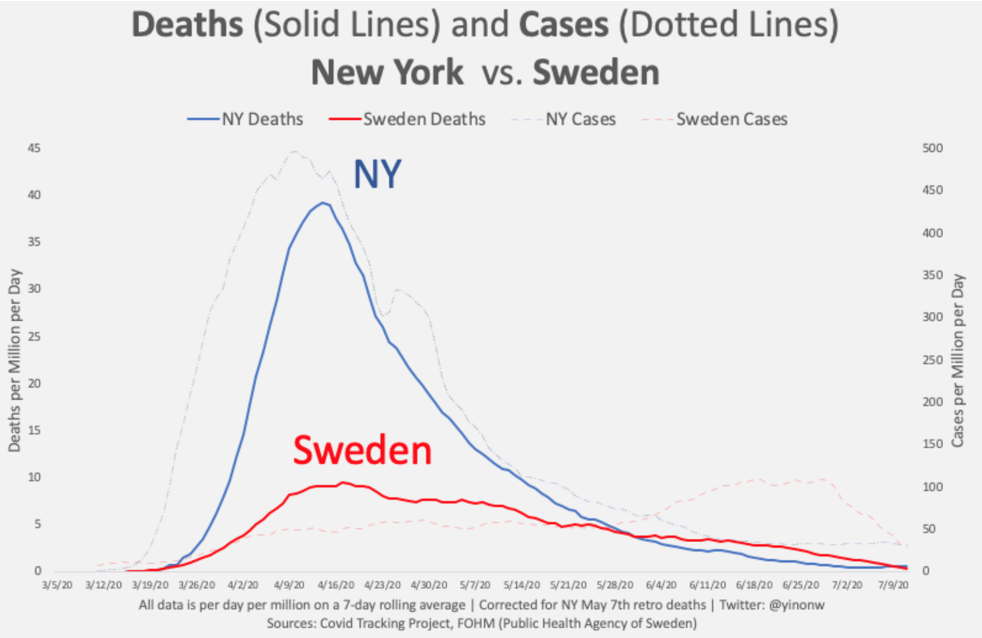
This chart shows the relative course of the epidemic in New York and Sweden, by cases and deaths per million of population. Per capita rates are the only appropriate way to compare places. New York, of course, is the home of the New York Times, whose false hit piece on Sweden I recently covered. It is pretty obvious which location handled the epidemic better. Note the recent bump up in Swedish cases, caused by an expansion of testing rules, but the continued fall in deaths. New York looks like an unmitigated epidemic (and an unmitigated disaster). Sweden looks more like someone was trying to control and delay spread. As in the US, deaths in Sweden are very heavily concentrated in the elderly and in care homes.