You may recall that last week I posted about death reporting and the importance of doing that by date of death, not the date the state or other agency is reporting. The CDC does the best job of reporting by date of death, although there is a lag. Some states do this as well, but not Minnesota. I want to emphasize that you cannot truly understand important trends in an epidemic without this data. We generally need much better data on when and where (hospital, community testing, etc.) a case is determined to exist, and on hospitalization date of admission, date of discharge and consequent length of stay. What is very clear is that the recent increase in cases in any state is accompanied by a much lower rate of hospitalizations and deaths. I am not sure of the full explanation for this, but I don’t think it has anything to do with the virus mutating to some weaker form, as some have suggested. I believe it is linked to both better treatment protocols and front-loading of the epidemic with the most susceptible, especially in elderly group residential clusters.
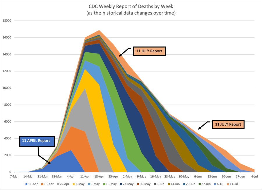
In any event the first chart below is color coded to show when deaths were reported by the CDC and when they actually occurred. The color is from date reported, and they stack on the week they occurred in. You can see that for any particular reporting date, take the most recent, July 4, for example, most of the deaths reported are actually from earlier weeks–you can see that many of those deaths were from April and May. Some of this is due to a dubious changing of cause of death to coronavirus, but most is just the result of processing lags. If this chart were purely by week of report, the peak and deaths would be right-shifted substantially, and the tail would be running out higher and longer. You would have a very different perception of the severity of the epidemic than is given by the date of death approach. The table then shows you by week how many of the deaths that CDC reported that week were attributed to earlier weeks. And what it calls backlog is only the deaths from more than 4 weeks earlier. So just an example of how you have to be so careful to understand data.
| Total | Most Recent 4 Weeks | Older Than 4 Weeks (Backlog) | Backlog % | |
|---|---|---|---|---|
| 11-Apr | 4979 | 4961 | 18 | 0% |
| 18-Apr | 8146 | 8145 | 1 | 0% |
| 25-Apr | 11425 | 11395 | 30 | 0% |
| 2-May | 12752 | 12590 | 162 | 1% |
| 9-May | 9817 | 9387 | 430 | 4% |
| 16-May | 13170 | 11545 | 1625 | 12% |
| 23-May | 13342 | 10960 | 2382 | 18% |
| 30-May | 9503 | 7769 | 1734 | 18% |
| 6-Jun | 8415 | 6809 | 1606 | 19% |
| 13-Jun | 7135 | 5655 | 1480 | 21% |
| 20-Jun | 6520 | 5226 | 1294 | 20% |
| 27-Jun | 3972 | 3064 | 908 | 23% |
| 4-Jul | 3513 | 2868 | 645 | 18% |
| 11-Jul | 6617 | 2340 | 4277 | 65% |

Great chart.