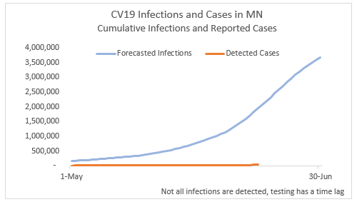
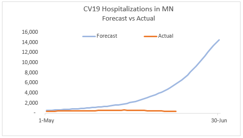
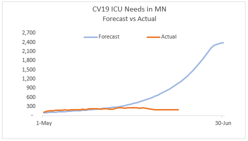
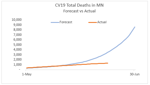
Below are several charts from the Minnesota model, provided by a friend. The state has been fairly transparent in providing the model code. These charts are from the mitigation scenario we are currently in, the only difference from the outputs the state has previously showed us is that the stay-at-home order was ended on the date it actually was, not the date projected by the modelers, which was slightly earlier. These are central estimates, which means they are the middle of the range of scenarios, the most likely estimate. You will observe there was some closeness of some of the categories for a while, and that is because the model was calibrated to fit with actual data in its early days. But here we are in the third week of June and we aren’t following a path anything like the model suggests.
The Governor kept talking, until a couple of weeks ago, about climbing the curve, and you see that in these charts. But look at the lower line–that is the actual, there is nothing approaching the projections and it just keeps getting further and further away. He isn’t talking about the model any more, for obvious reasons. Now he says it is just one data point. That is the exact opposite of his use of the model when he was issuing his extreme shutdowns. This is embarrassing for all of us, that we didn’t push back collectively on this horrendous mistake. And it is pathetic that he has never once acknowledged how far off the models were.
You will recall too that the heart of this model is its assumptions about the number and type of contacts people have and the effect various mitigation efforts have on those contacts. The model initially assumed a very high level of contact reduction from stay-at-home and business shutdown orders. But the data was not consistent with that level of reduction so in version three, the impact was reduced. The real effect is turning out in the last few weeks to be even lower than the revised assumptions, which means there are more contacts and supposedly more cases. So these estimates, according to the model, should be even higher than shown on the graphs. Now, as the chart says, the orange line is detected cases, those confirmed by an infection test. There likely are a number of missed infections, but it is not over 1.5 million, which is what the projections suggest.
The cases number is really absurd, but again it follows from errors in contact model. Basically every young Minnesotan would be infected by now according to the estimates. The errors in the rest of the projections really just follow from the case miss. I hope we have learned not to trust or use these kinds of models for policymaking.

Model was on the money on May 1, well done!