The diagram below is designed to help think through how coronavirus epidemic models could be built. In this diagram I am assuming that you pull 1000 people randomly from the US population and that you assume they all were exposed to the virus. (In reality, it is unlikely that 100% of a population is eventually exposed to the virus.) What happens next just follows down the diagram. This is the end state, after the epidemic has run its course (Actually the end of the virus’ initial run through the population. The population is changing–people are born, people’s health status changes, etc. so in future years, some set of susceptible individuals remains. This is not unlike a new flu strain, say H1N1. The first year is bad, but thereafter the effects are more limited and there is a relatively steady state of infections.) You can use information developed during the epidemic or other information to pick the numbers to fill in the blanks. Obviously, the percent of infected and not infected individuals must sum to 100%, but over time it is possible that some initially uninfected persons could be re-exposed, or during more continual exposure might become infected, even during the initial run through the population. To the extent this increases the infected percent over time, it decreases the end-state not infected percent.
This is your end state, then you can build a model that shows the dynamics over time that lead to this end state, transmissibility rates being one of the most important factors. And more importantly, since it is very unlikely that any epidemic would occur without some attempt to mitigate its spread and effects, you can add into your model how you believe those mitigation measures will affect the end state numbers, if at all. Do they just spread out the time it takes to get to the end state, or do they actually change it?
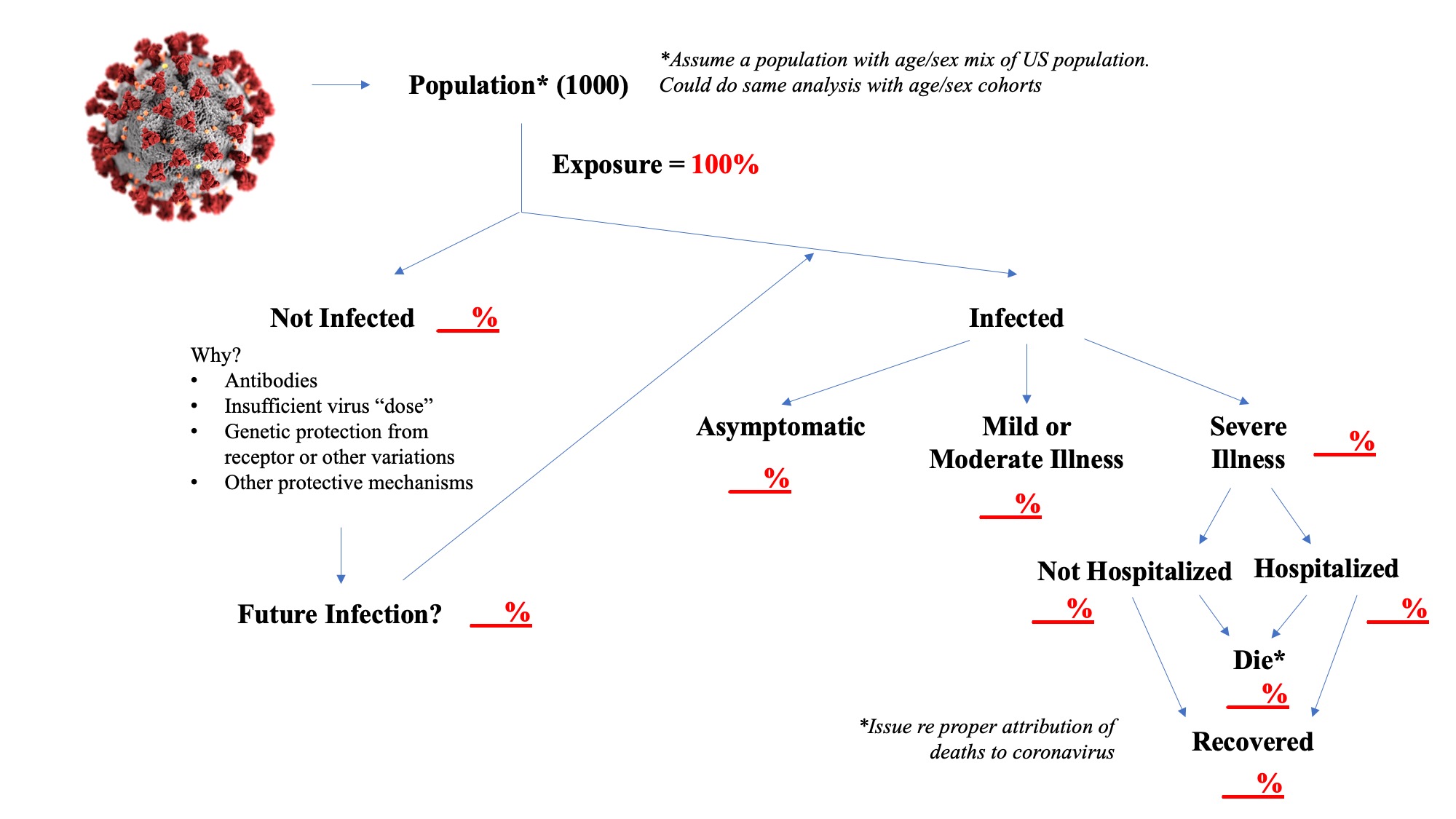
Identifying the not infected percent and understanding why they avoid infection after exposure is rather critical. Some models appear to assume eventual 100% infection rates, but events to date would suggest that this may not be an accurate assumption. There may be some pre-existing antibody that protects these people, individuals may vary in their response to a “dose” of the virus, or there may be other mechanisms, for example, some studies have indicated that genetic variation in ACE receptors may limit infection.
The assumption I have used, which I believe is widely accepted, is that only cases of severe illness end up being hospitalized or leading to death, by definition. Similar to identifying persons who evaded infection, identifying those who are asymptomatic is important. Note that not all cases of severe illness will end up in the hospital. Many patients may have advance directives or surrogate decision-makers may decide to leave the patient at home or in an institutional setting such as a nursing home. Therefore, a number of coronavirus patients may be dying at home or in these institutional settings. The hospitalization rate is important because of concerns about adequacy of health resources to meet the needs of severely ill patients. You could further subdivide this into ICU use and ventilator use if you thought that important. The assumption here also is that recovered patients do not become re-infected. Despite anecdotal stories suggesting the possibility of re-infection, I don’t believe there is actual evidence that it has occurred as opposed to incomplete clearance of the virus and a resurgence.
The reference to uncertainty regarding death rates is solely a reference to attribution of cause, not number of deaths. If the patient had severe coronavirus illness they either died or they didn’t. This diagram assumes that the only deaths are among those “with” severe coronavirus illness, it ignores the fact that in any population there are deaths that occur. Eventually, researchers will go back and re-assess whether they think the death was caused “by” coronavirus, which can be a complex question when there are significant underlying health issues. The concept of excess deaths, or the mortality risk faced in any event by those who died with coronavirus comes into play in those analyses.
So have fun filling in the blanks yourselves and thinking about what your model would look like. You can assume some other population size as well, a million people, the whole US population. And it is very useful to stratify the analysis by age cohorts in particular. The hard part, I think you will discover, is finding solid evidence on some very unknown figures, like the infected percent and the asymptomatic percent.
Actually building a model is difficult work, it involves complex math. It is easy to criticize modelers when their projections look so far off, but that is a communication issue as much as anything. In the early stages of an epidemic, you don’t have good information on the parameters in the diagram above and you don’t have good information on transmissibility rates. So modelers, in my opinion, should say don’t use this for decision-making or use it with extreme caution. But a model does provide a good framework for trying to understand what is happening and what could possibly happen.
