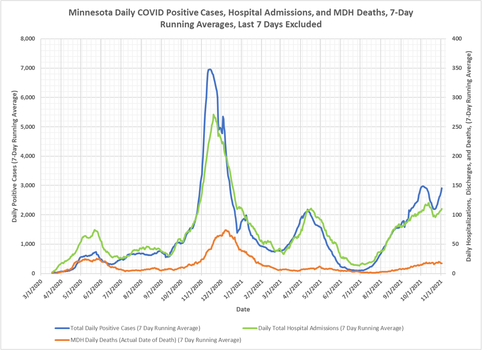
Another one of Dave’s regular charts, giving the overview. You can see that after a brief blip down, we are headed backup. I have no idea if this is some bizarre testing issue or what is going on, but a clear tick back up. And now we know, a lot of these events are in the fully vaccinated. This chart is lagged about a week to allow for completeness, but the more recent days data support the notion of u-turn.