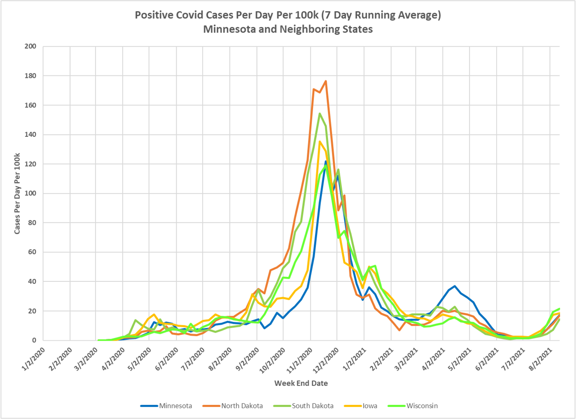
This chart, courtesy of Dave Dixon, shows the remarkable convergence of the epidemic trajectory in Minnesota and its neighbors, Iowa, Wisconsin, North Dakota and South Dakota. Be interesting to see what this bump looks like. Wonder why Minnesota had the worst bump in the spring–could it be because we were the only state with a mask mandate?