This is the big picture look at the epidemic. Helps you breathe nice and deep and slow, avoid that hysteria that reading Strib headlines or watching CNN would otherwise induce. One chart with everything. A small blip so far, we will see how it develops. Thanks to DD.
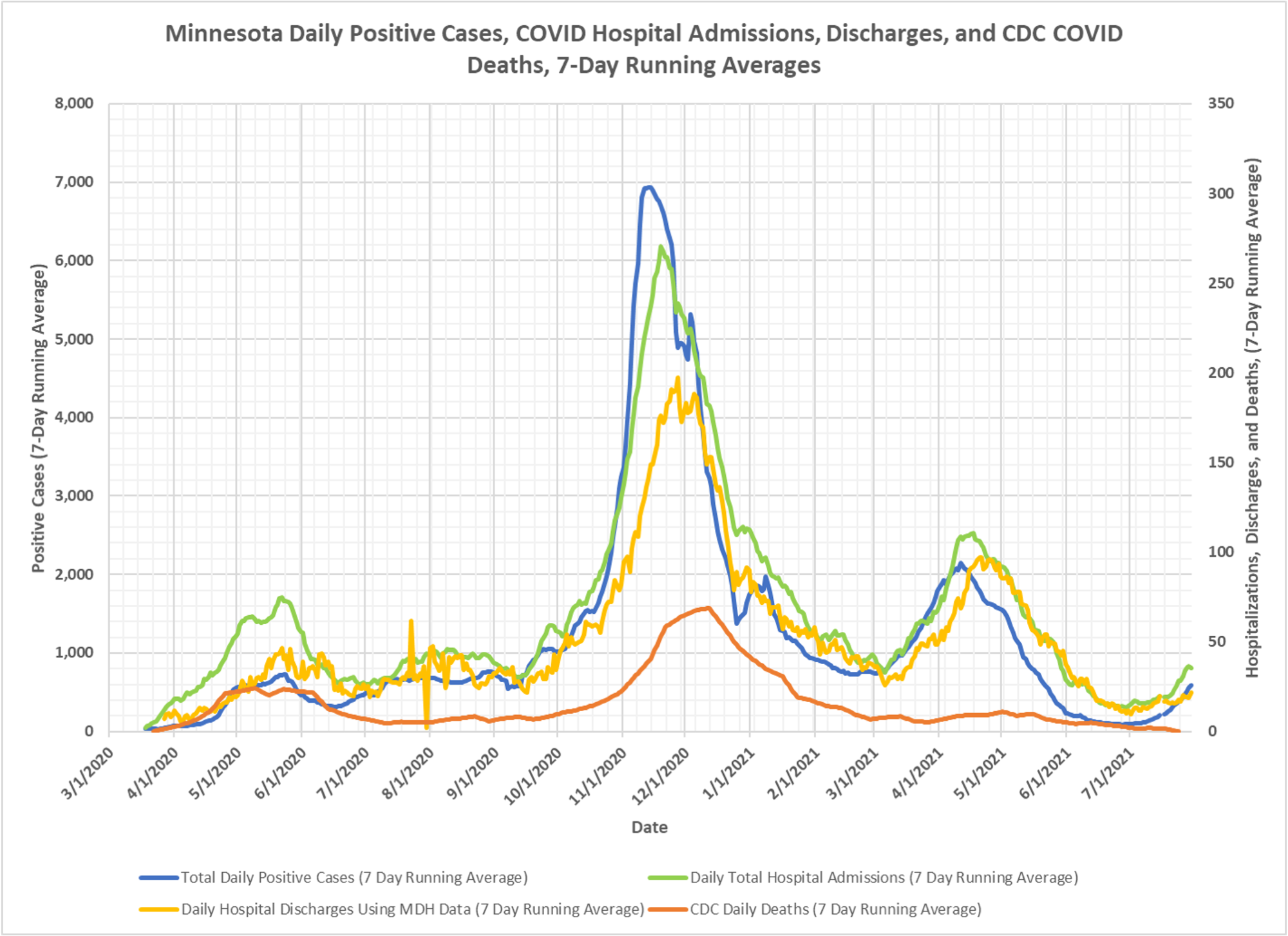

This is a great chart. Would love to see it updated every month going forward.
It gets published about once every couple of weeks.