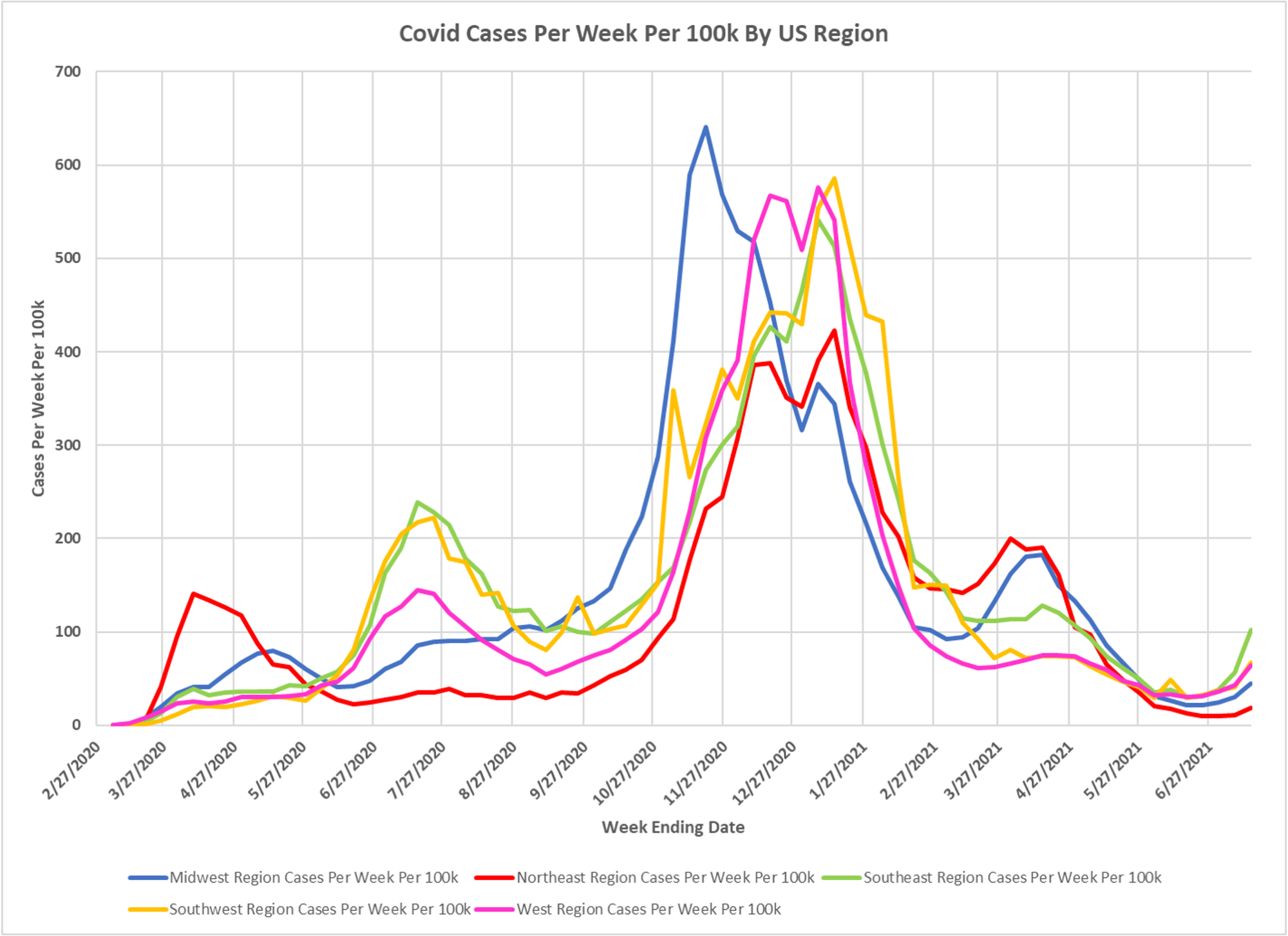
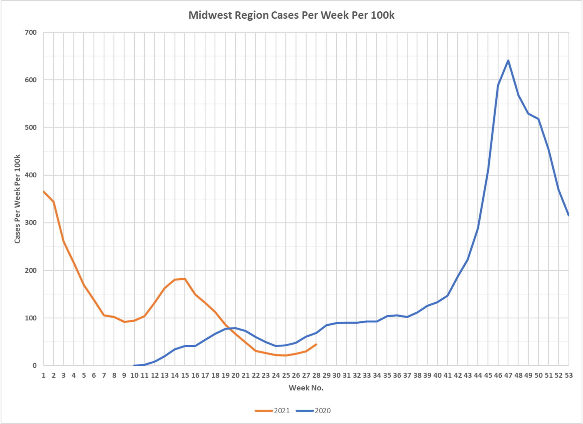
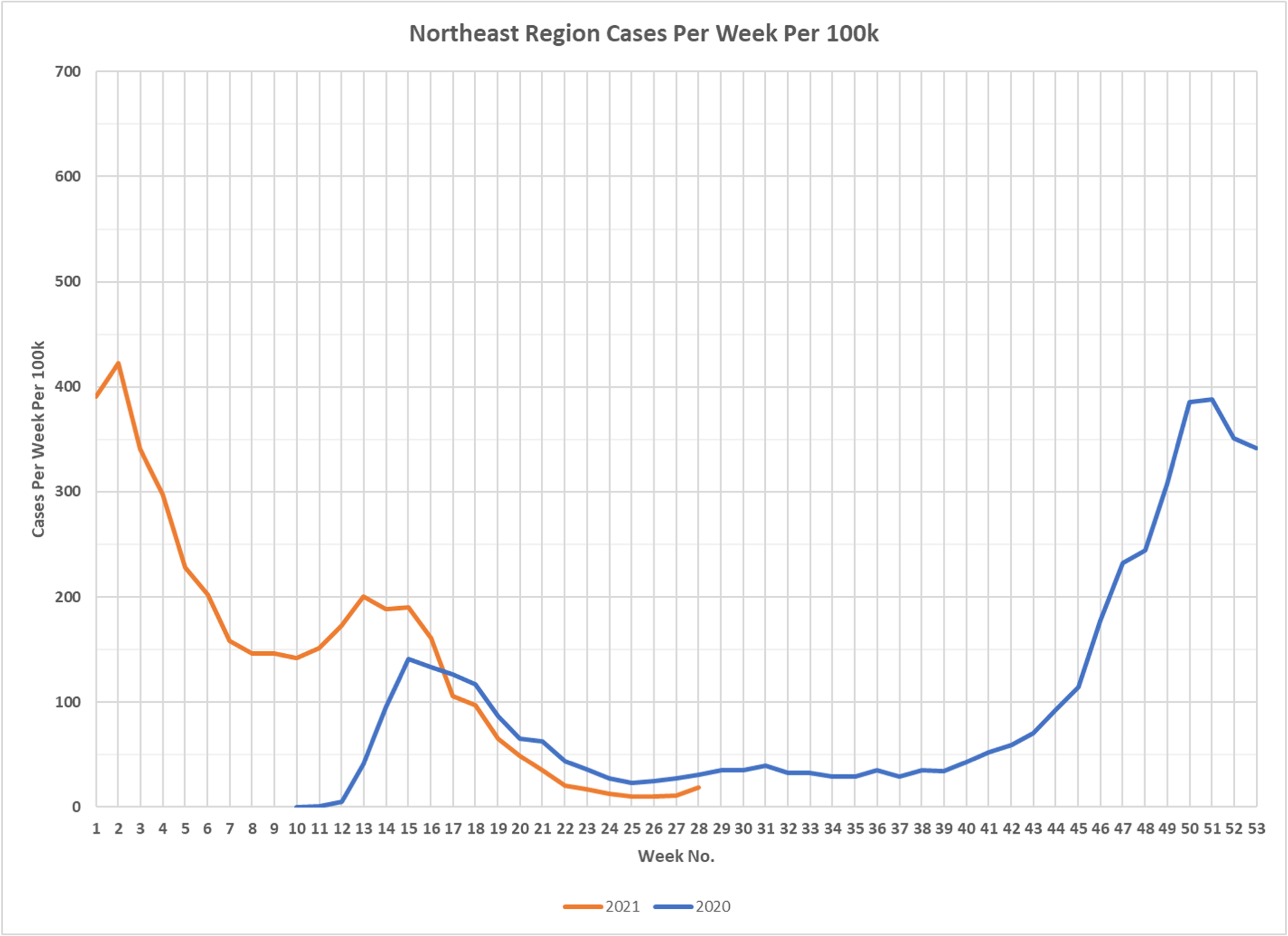
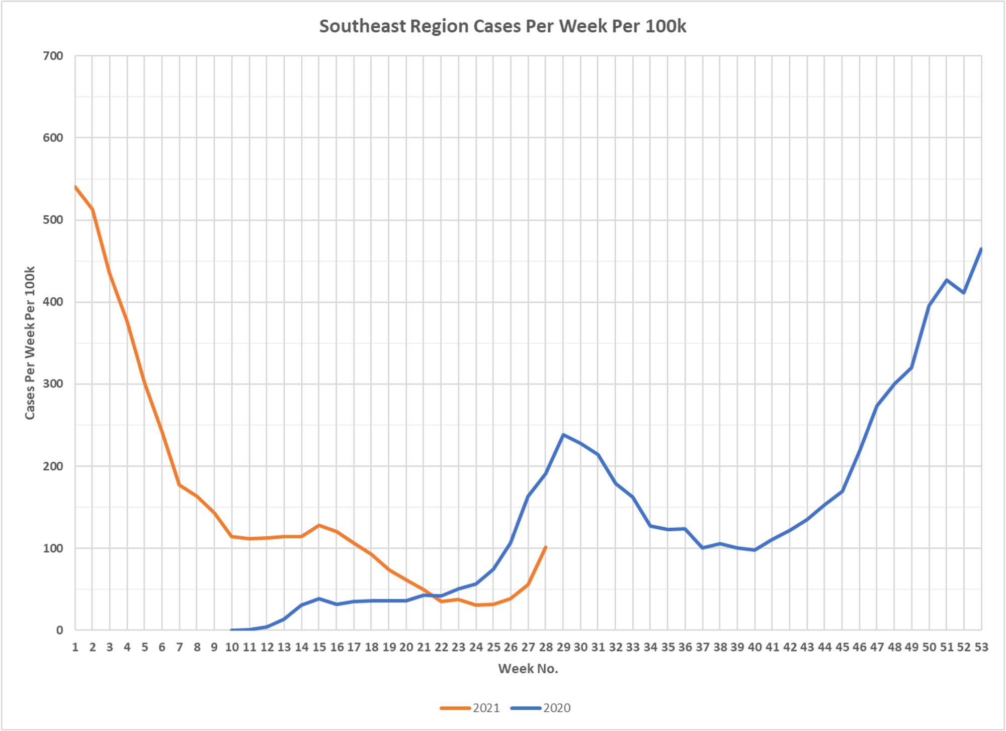
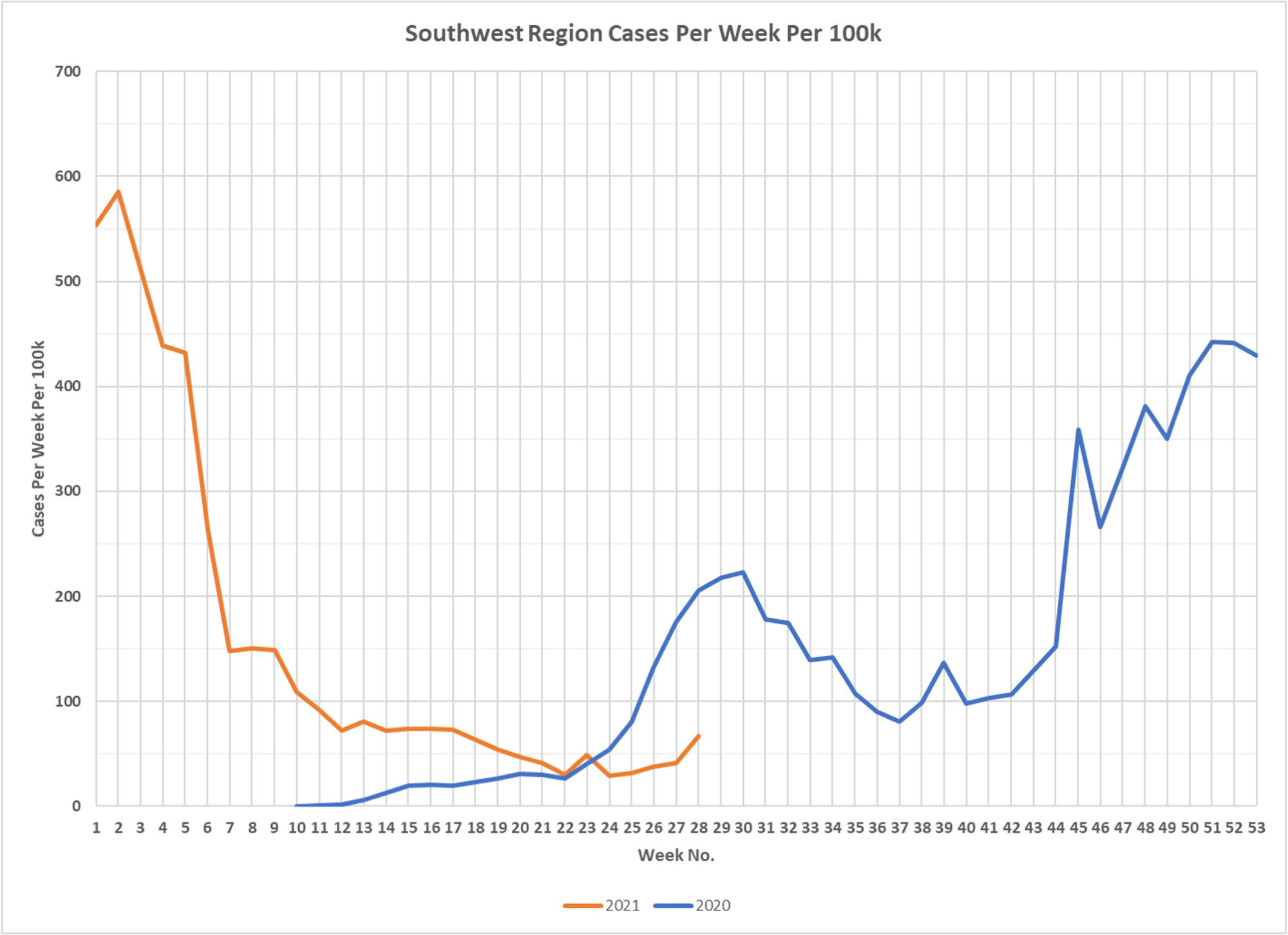
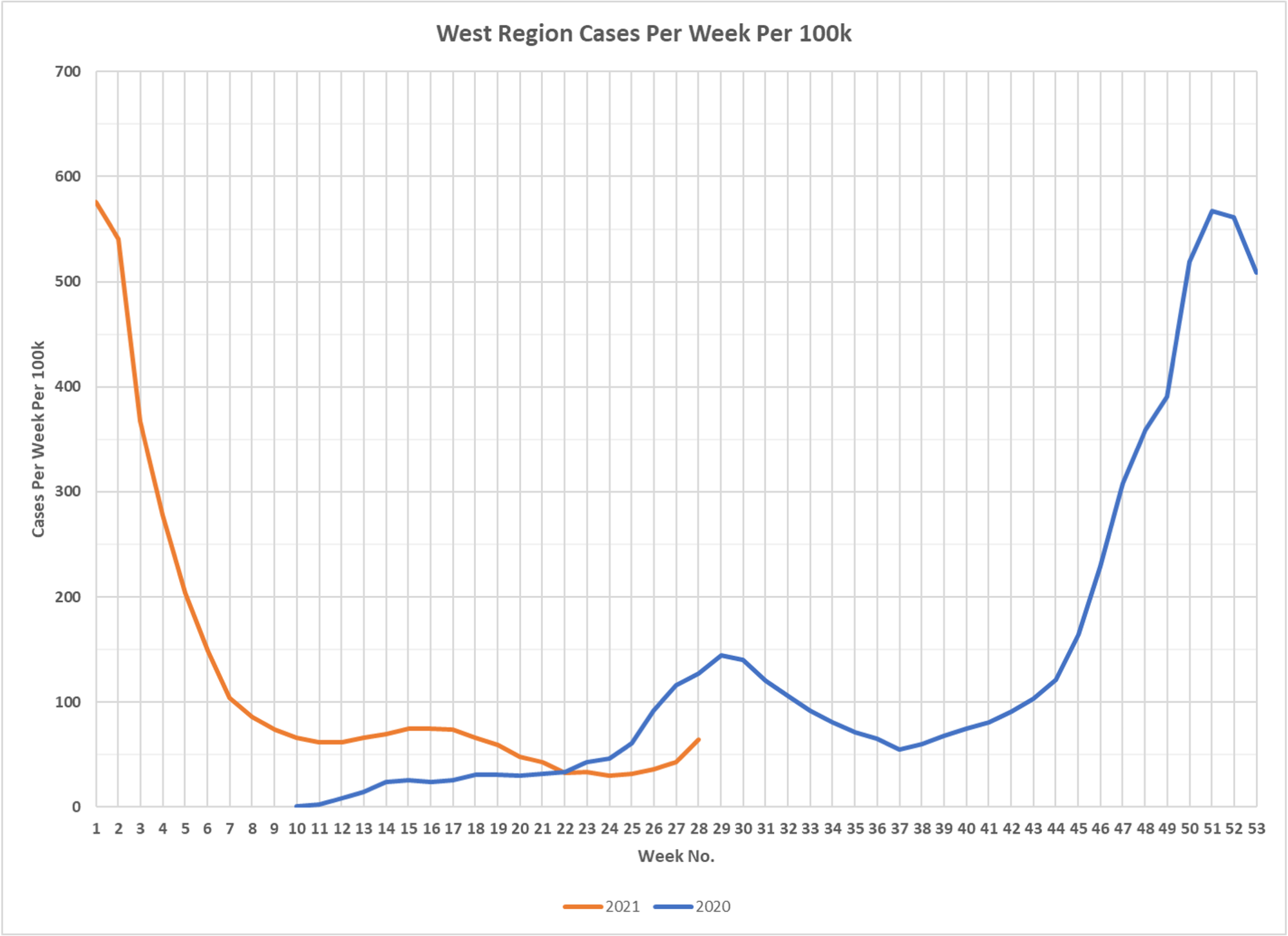
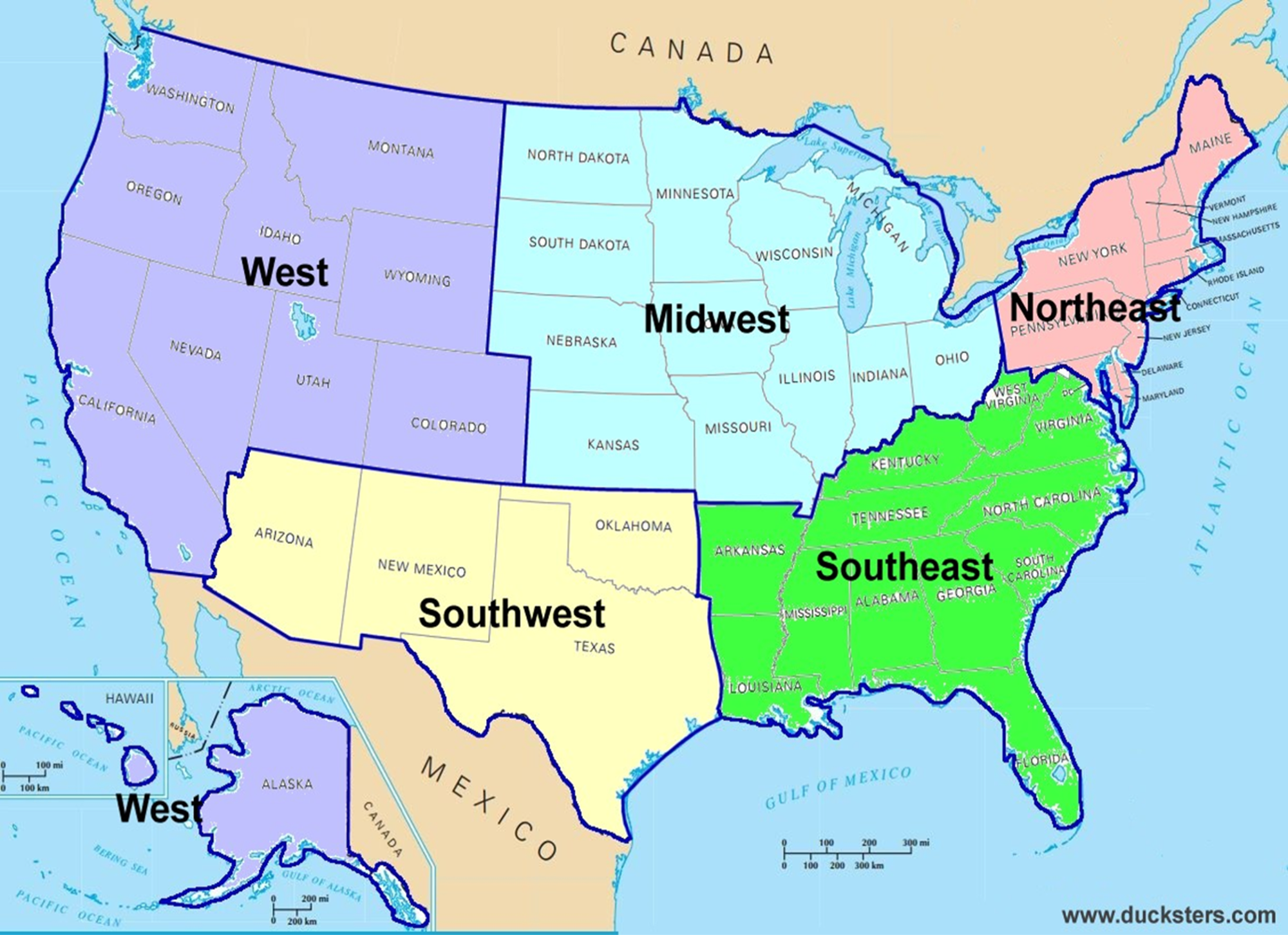
More exemplary work from DD. Charts from each of the major US regions showing case trends throughout the epidemic. You notice the different wave forms by region, note the similarity year-over-year, despite often different testing and you see that this year is not like last year in number of cases, nothwithstanding Delta, less masking, no lockdowns and everything else.