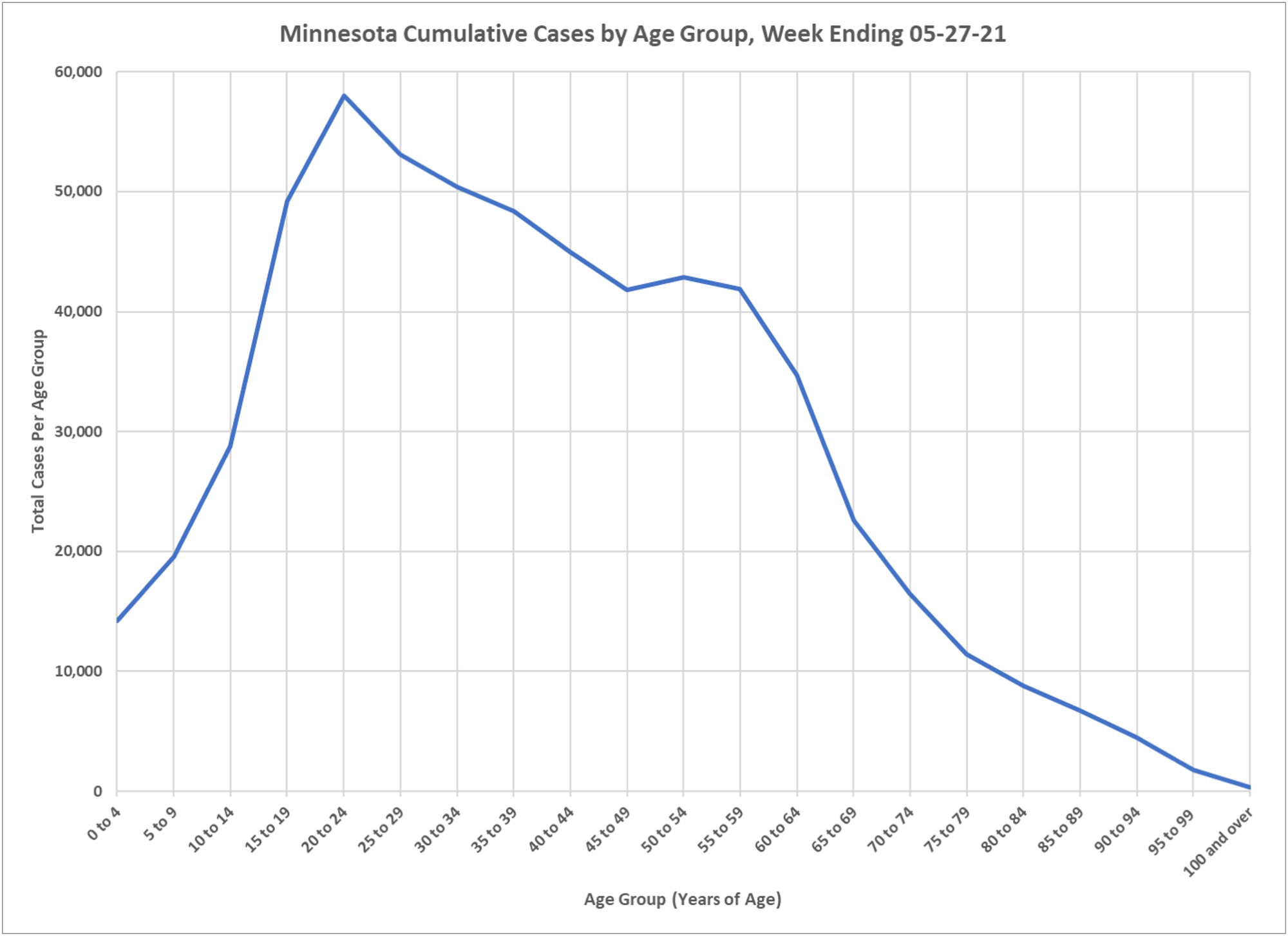
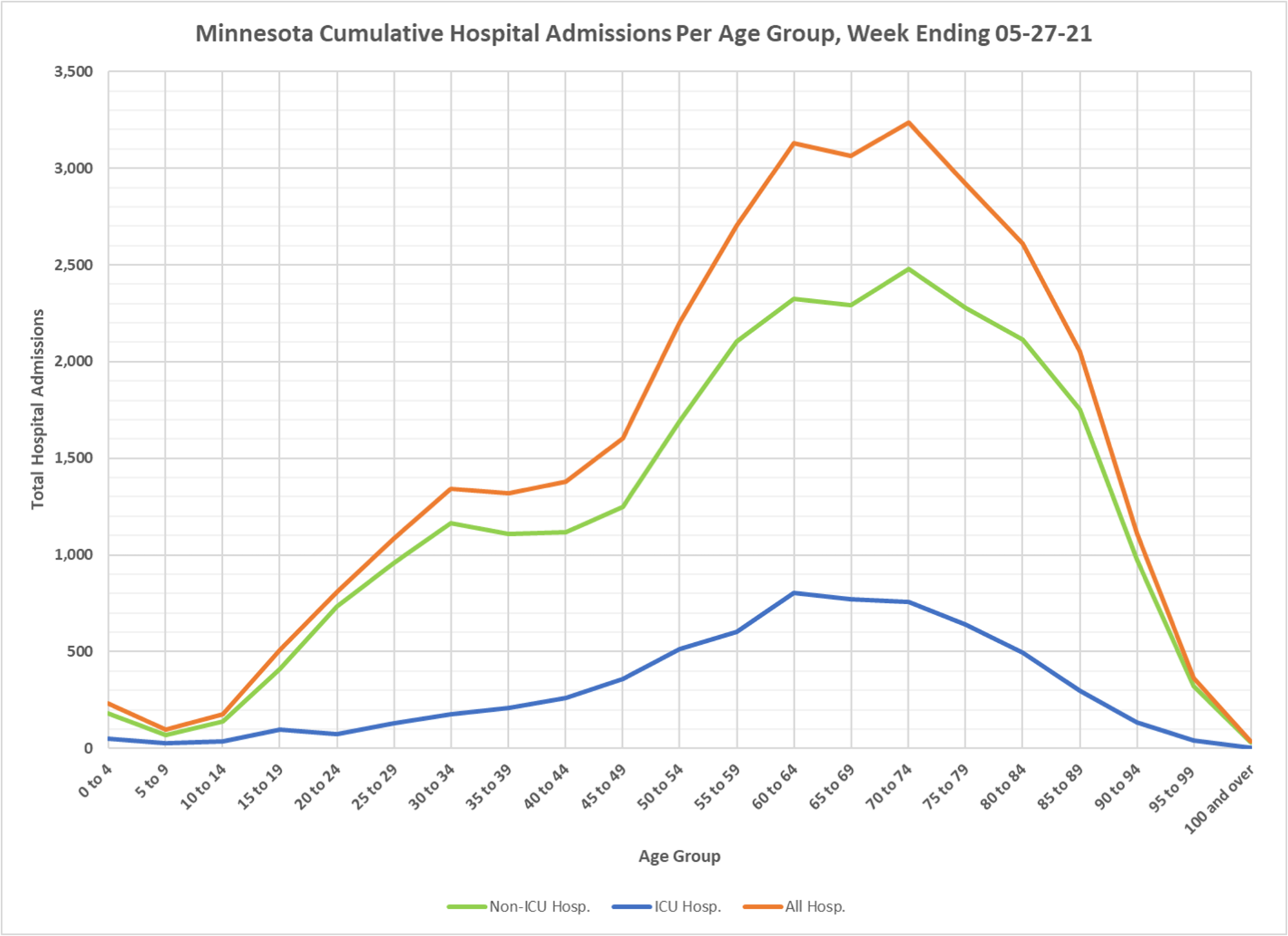
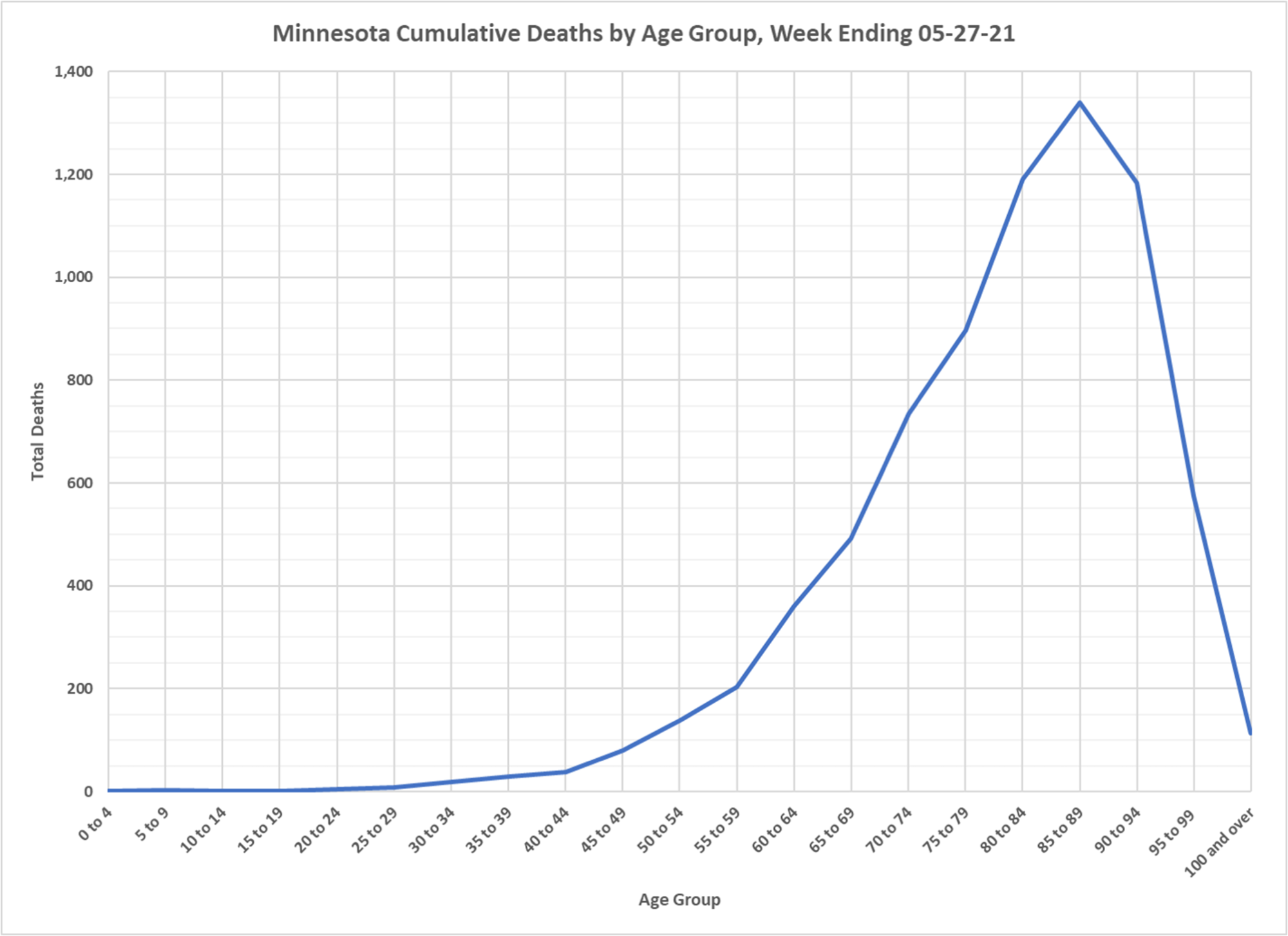
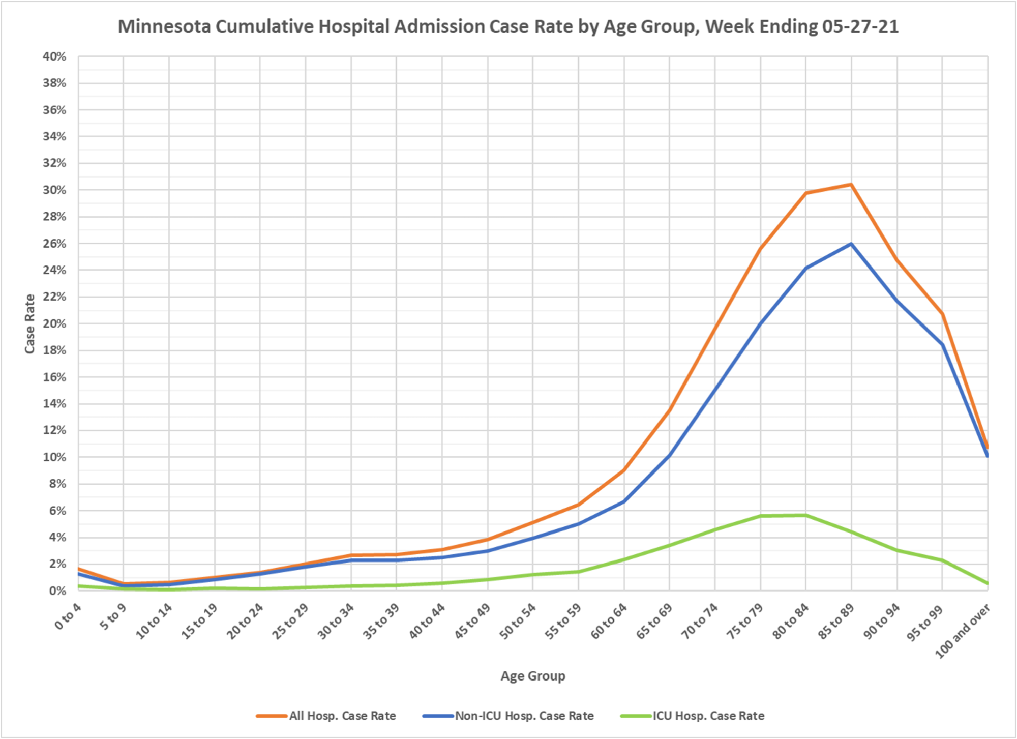
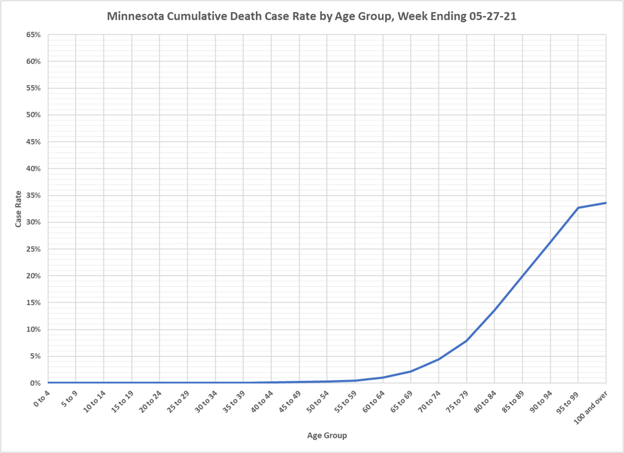
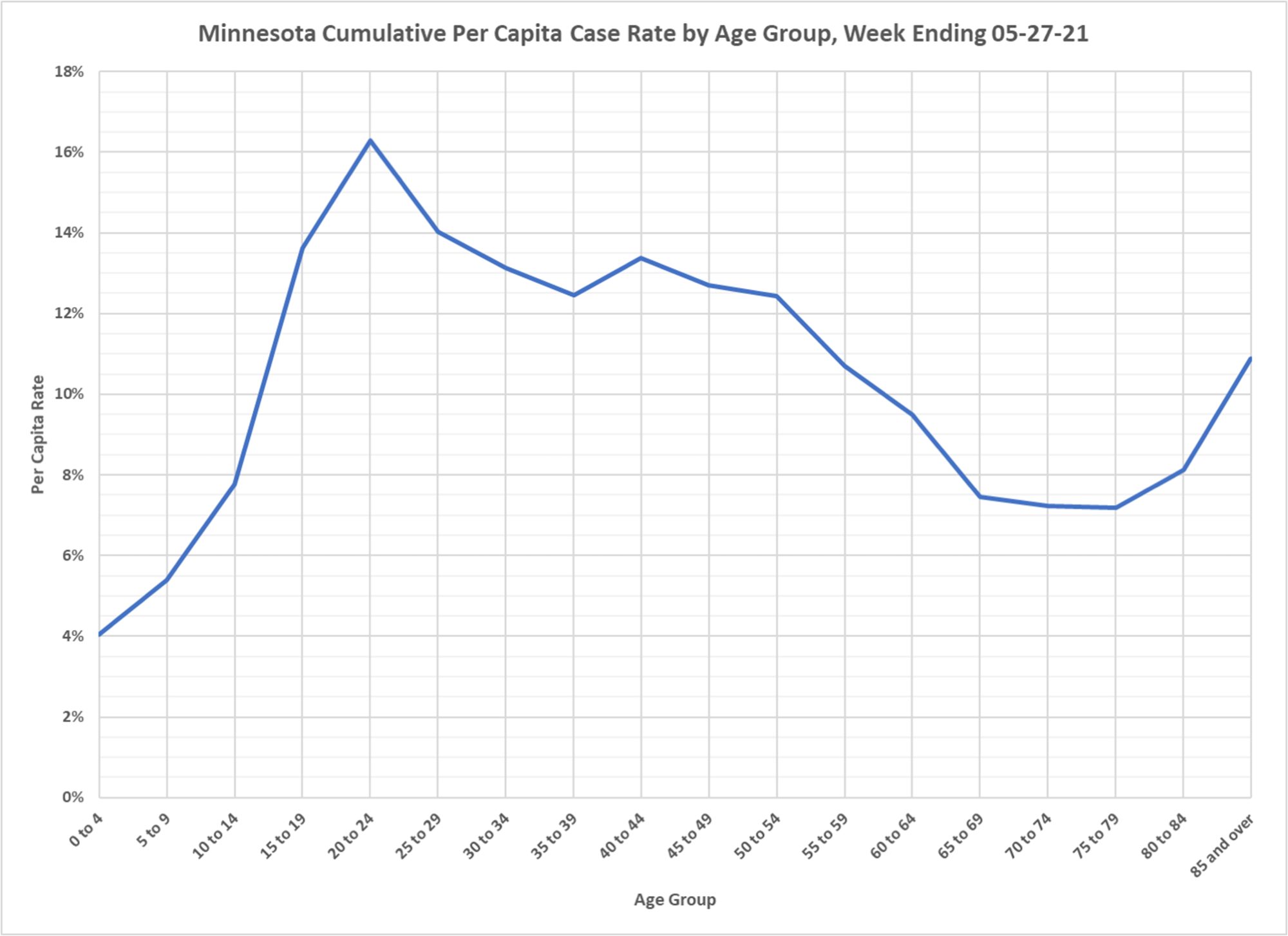
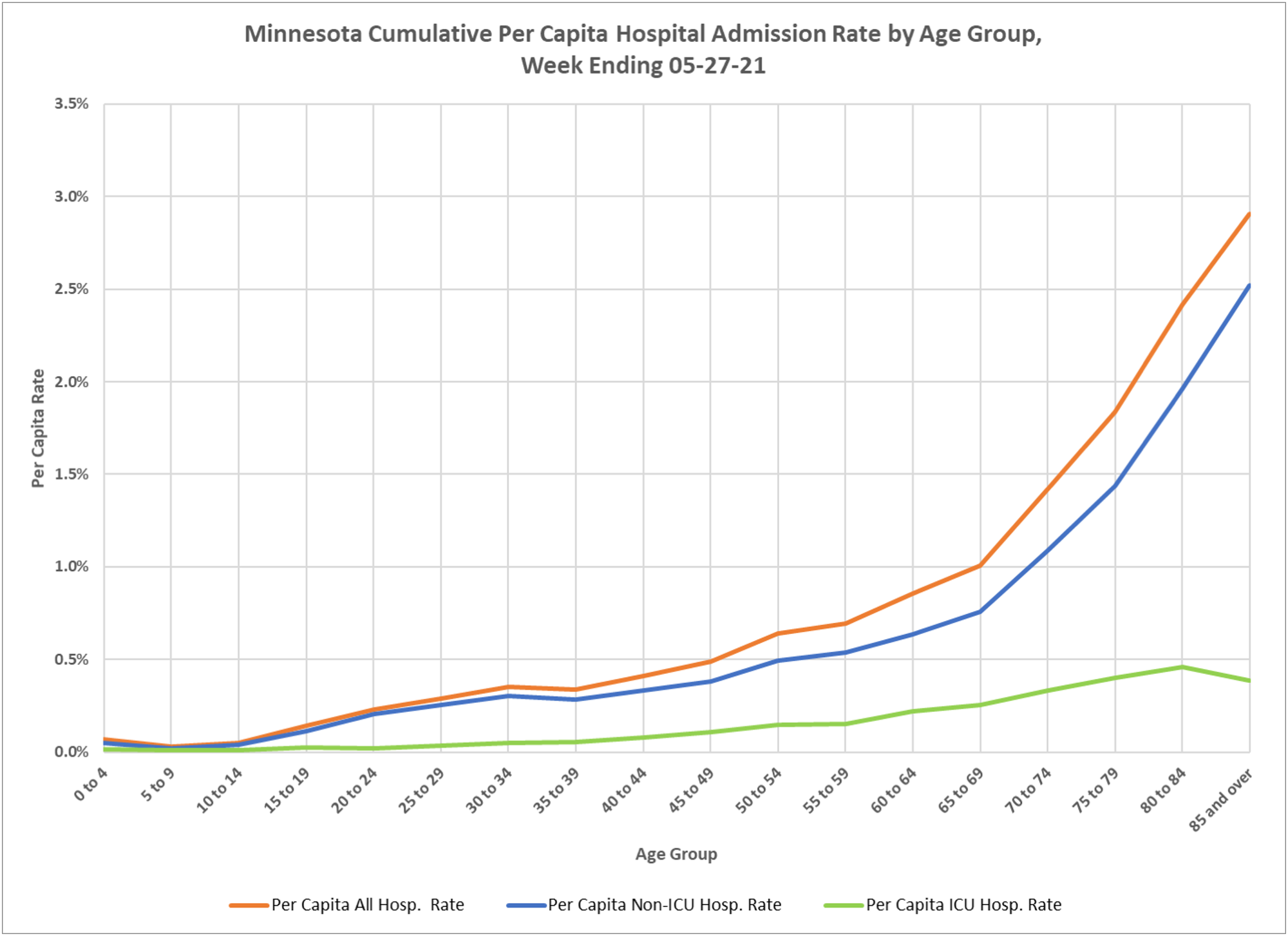
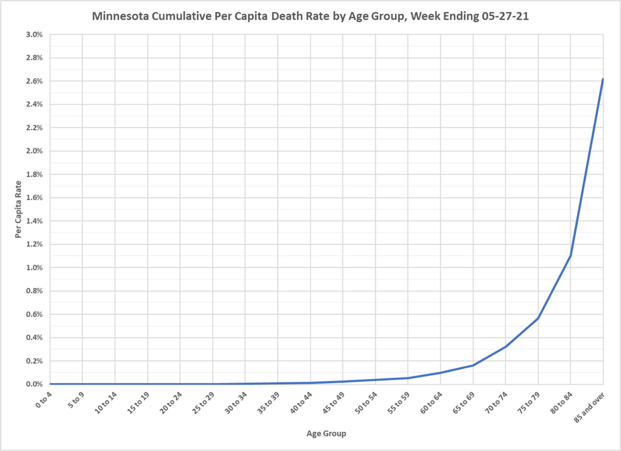
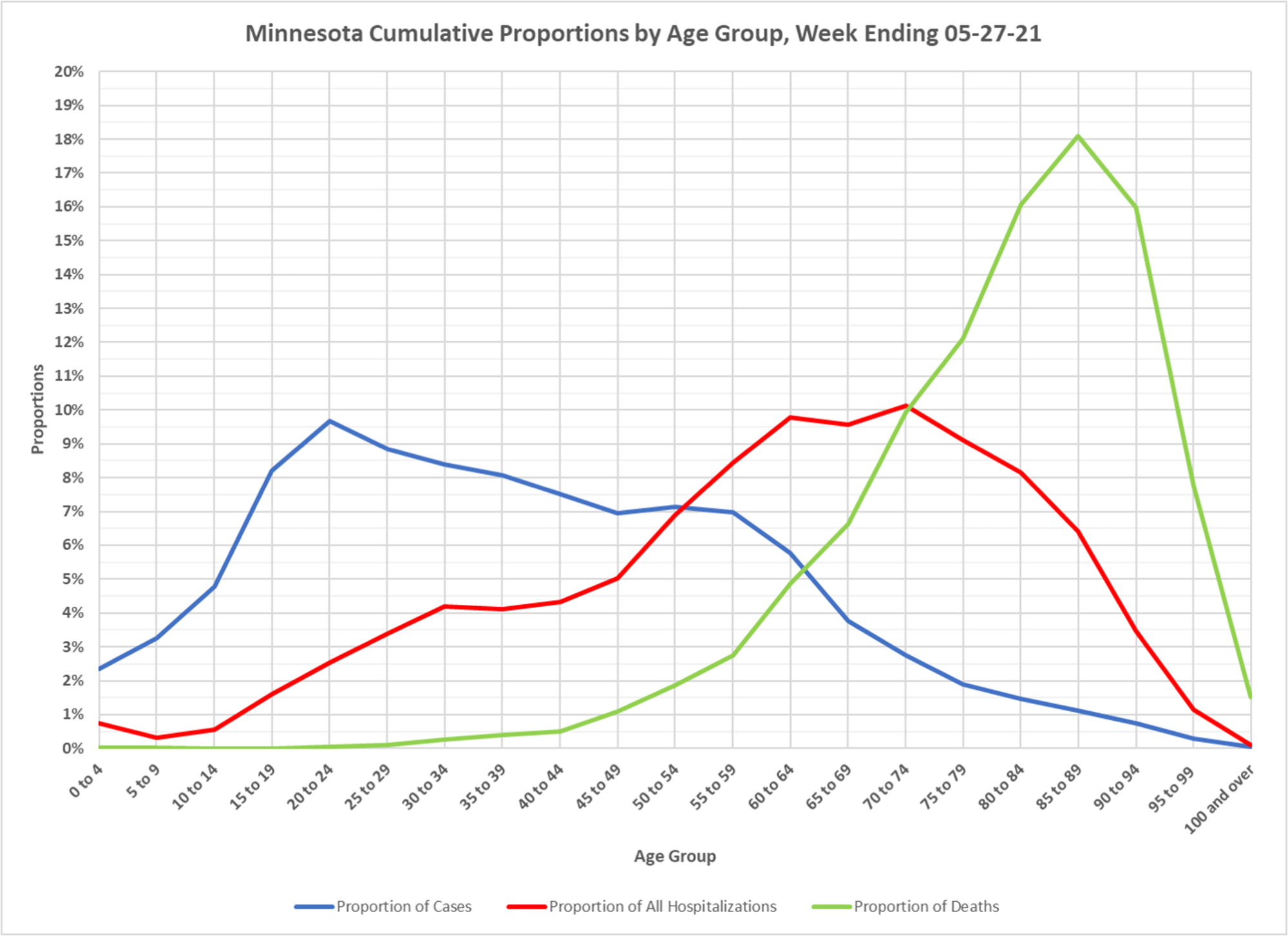
Thanks to DD, another set of cumulative metrics. These don’t show changes over time, but for the whole epidemic you can see the age structure. Deaths extremely concentrated in the very old. Hospitalizations strongly bunched in the old and very old. Cases skew to the younger and middle aged groups, which are larger in absolute number in the population. Great set of charts to see what age groups are really most affected.

Great to see all of the younger people with exposure to this. Arguably, they will be much less vulnerable in the future as they age. It’s a real shame we didn’t let everyone under 60 go about their normal lives, get sick (maybe) and get better (99.xxx%). Oh well, central planning to our rescue. Just another historical debacle for this approach to anything from the government … will we ever learn?