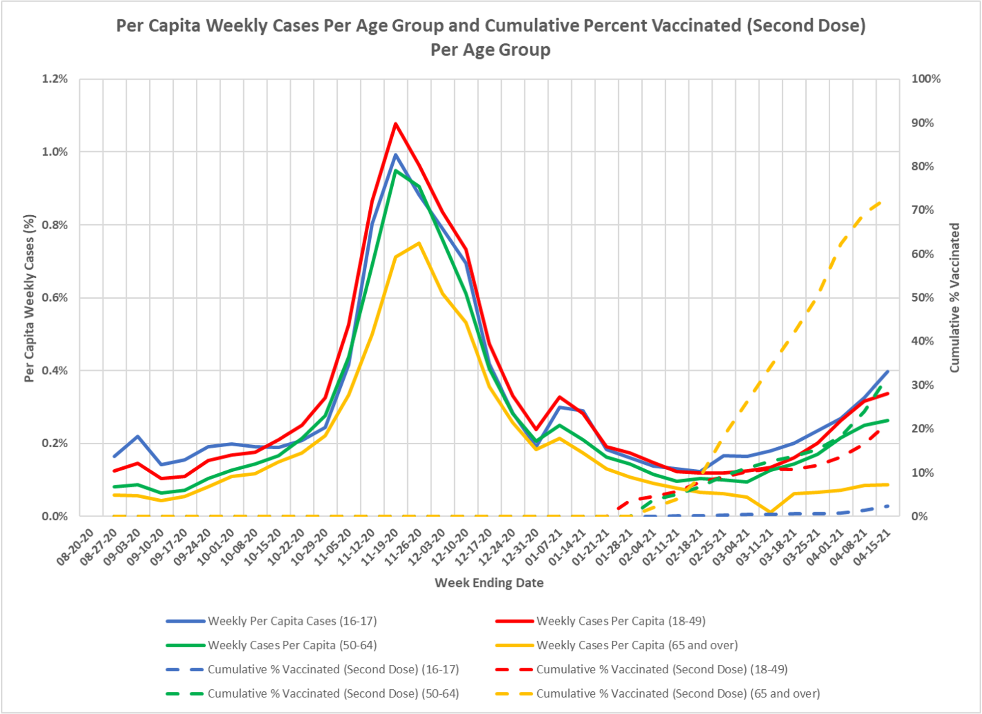
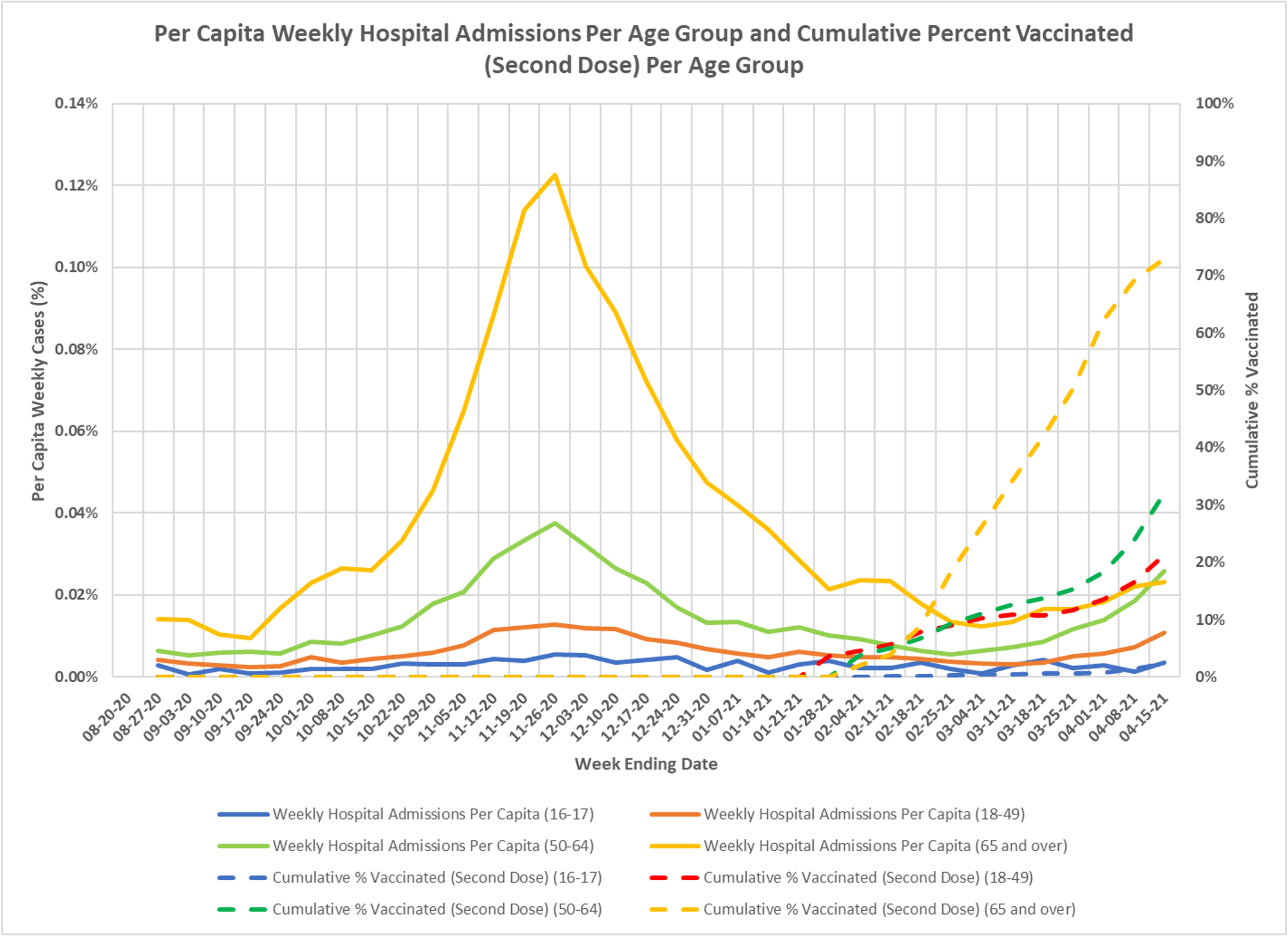
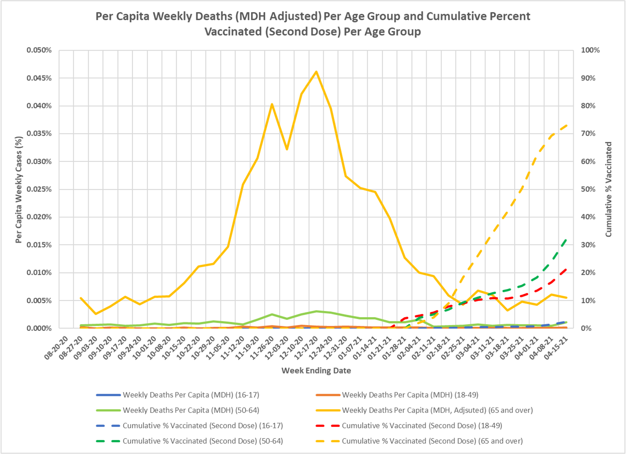
These charts show per capita rates for cases, hospitalizations and deaths, by age group, with vaccination rates layered in. These are a bit busy, and because of the stupid way DOH reports on vaccinations, the age brackets are too wide, but you can see that cases, hospitalizations and deaths appear to be rising more slowly in the more heavily vaccinated older groups. Once again, thanks to DD.